|
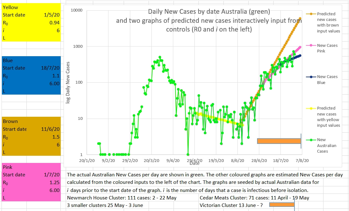
The illustration below shows the green curve of new Australian cases progressively flattening. At first the Victorian cluster matched the brown graph which is set to follow an R0 of 1.5. Then the Australian cases flattened to follow the pink graph which is set to follow an R0 of 1.25. And now the Australian new cases (green) appear to be flattening more and following the blue graph which is set for an R0 of 1.1. The Graph of Australian new cases has highs and lows - hopefully the two recent high new cases figures are just that - highs to be followed by lows to keep the cluster on track for ending. The graph below appears to show the Victorian cluster flattening. The average R0 over 8 days (R8) is shown in very light blue. It has been falling adequately. But is still above 1. The crazies who have not followed sensible and reasonable instructions and laws need to be reined in to ensure the R0 continues to fall.
0 Comments
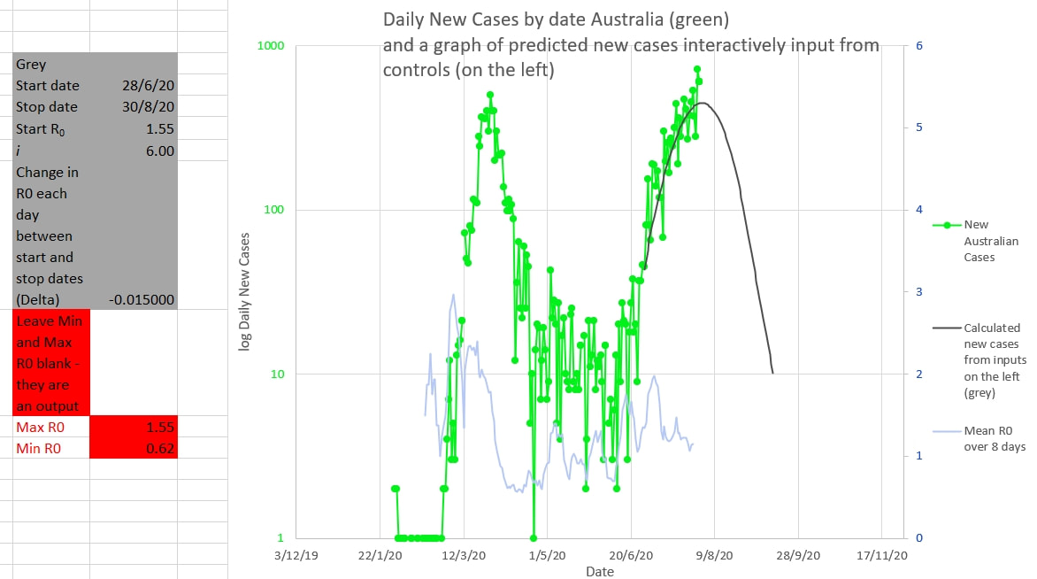
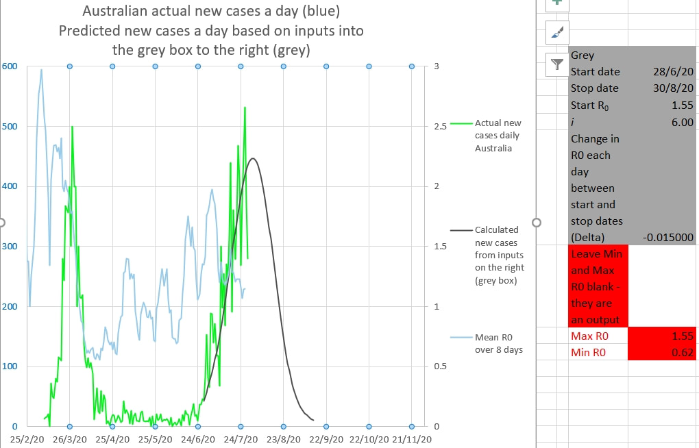
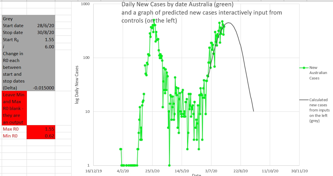
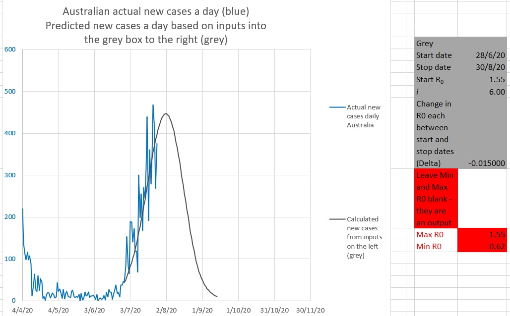
Victoria is still on track to end the cluster by mid September. The grey graph below is drawn using the inputs in the grey box to the right, using the actual Australian cases up to the chosen Start date. The inputs are changed until the grey graph matches the green graph of actual new Australian cases as closely as possible - the same height and same curve as the green graph. The R0 changes each day by the amount called 'Delta' in the grey box. The mean of R0 over 8 days is shown in light blue. The grey graph suggests that cases will be down to single digit numbers by mid September. The same thing is shown on the chart below. The daily cases are in log scale. Why decrease the R0 of the grey graph by a small amount each day? Because the apparent R0 during the 'first wave' decreased each day by a small amount. The apparent R0 during the 'first wave' decreased each day almost linearly (in a straight line) from about 3 to 0.55 from the start to just after the peak of the wave. It seems counter-intuitive, but that is what it was seen to do. Intuitively it might have been expected to drop down to a new steady R0 soon after restrictions were applied or to have changed exponentially or logarithmically. But that was not the case.
Fro the Model calculating the grey curve click here Residents in Aged Care facilities need extra precautions and care. They probably should be treated by the same strategy used for passengers on cruise ships. That is, either very early and very aggressive isolation and quarantine measures, OR early removal of individuals to other safer accommodation. It is possible that this is because the R0 for these individuals is much greater than the average 2.2.
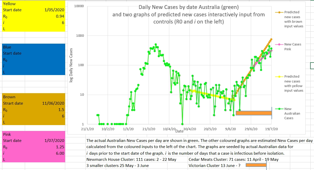
R0 depends on the place or space under consideration as much as it does on the virus itself. The virus that causes Covid-19 is said to have an average R0 of about 2.2, but that is an average. The average person lives in an average home with an average number of family members and uses an average amount of public transport etc and for them the apparent R0 is about 2.2. But if a person lives in a dormitory with many people, or has a large number of family members living in the same house, or travels a lot on crowded public transport, then the chance of infection, and therefore the R0, goes up. The same for crowded workplaces where social distancing is difficult. The same for cruise ships. And the same for Aged Care facilities. In those cases the R0 is probably much higher than 2.2 and the virus spreads quickly. It spreads exponentially. And exponential spread goes from 'no problem' through 'there might be a problem' to 'there is a severe problem' in a flash. Should Aged Care facilities be managed with the same care as a Covid hospital ward early or should the residents be moved out (where possible) to safer accommodation early? I think the answer is Yes. Curve matching suggests that the Victorian Cluster is slowly coming under control. The actual Australian cases are shown in green below. The grey curve is produced by inputting values into the grey box on the left of the chart. The input values can be changed until the grey curve matches the green green curve of the Australian cases. The best match appears to be produced by inputting an initial R0 of 1.55 starting on 28/6/2020 (which is consistent with estimates of the R0 at the time) and decreasing R0 by 0.015 (Delta) until 30/8/2020 - which results in a final R0 of 0.62 (which is consistent with the observed R0 at the end of the March/April cluster). The grey curve certainly appears to match the actual Australian cases that it overlies. And it may continue to match the future daily cases, but that is not certain. The curve matching suggests that if current restictions continue the cluster may be down to single digit figures by mid September. It is probably not reasonable to predict new case numbers near or below 10 using this Epidemic Model. Click Here. The chart below shows the same curves without the new cases being in log scale The chart below shows the curves matching recent Australian new cases. The Victorian cluster appeared to have an R0 of 1.5 (the matching brown curve) initially, which then appeared to reduce to an R0 of 1.25 in late June (the matching pink curve). These curves are drawn from the data entered into the boxes on the left. The chart below suggests that the effective mean R0 over the past 8 days (called R8 in the Model) is at last approaching the critical value of 1 a point at which new infections would no longer be exponential.
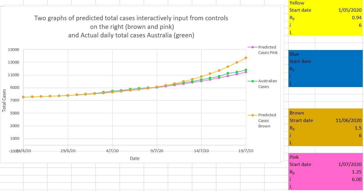
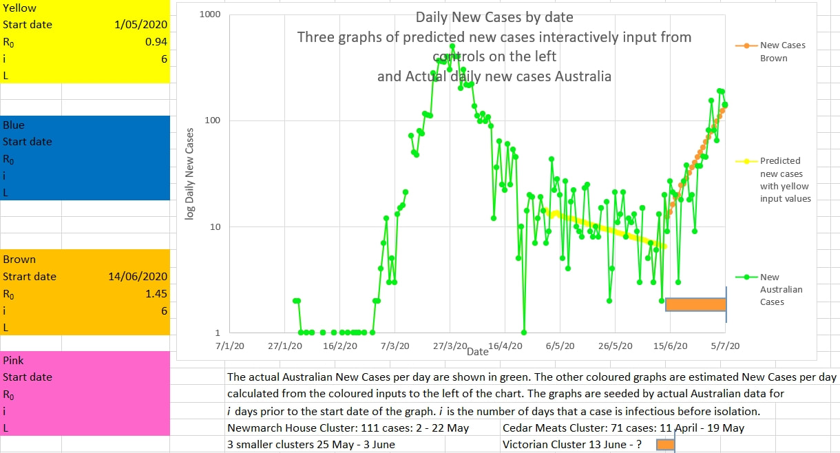
The graph below suggests that the R0 in Australia has fallen from 1.5 to 1.25 since the middle of June. The green graph is the total cases a day in Australia and the brown and pink graphs are 'best fitted' to the green graph by inputting various values of R0 and i (days a case can infect others until isolated) into the brown and pink boxes on the right.
The pink graph below, which is 'fitted' to the actual Australian new cases a day using the values input into the pink box to the left of the chart, suggests that the apparent R0 is falling from 1.5 (the brown fitted graph) to about 1.25 (the pink graph). However, it is still too early to call a change of trend because the trend-line, shown in a graph yesterday, remain unbroken.
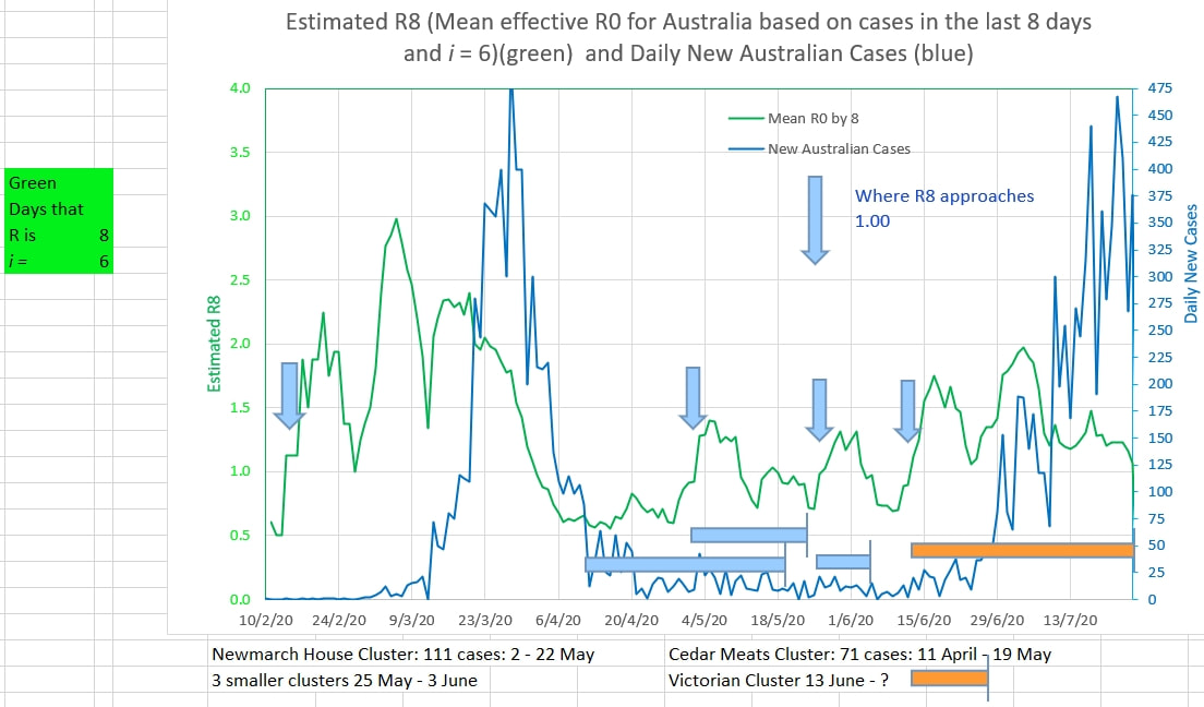
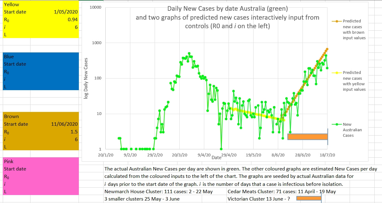
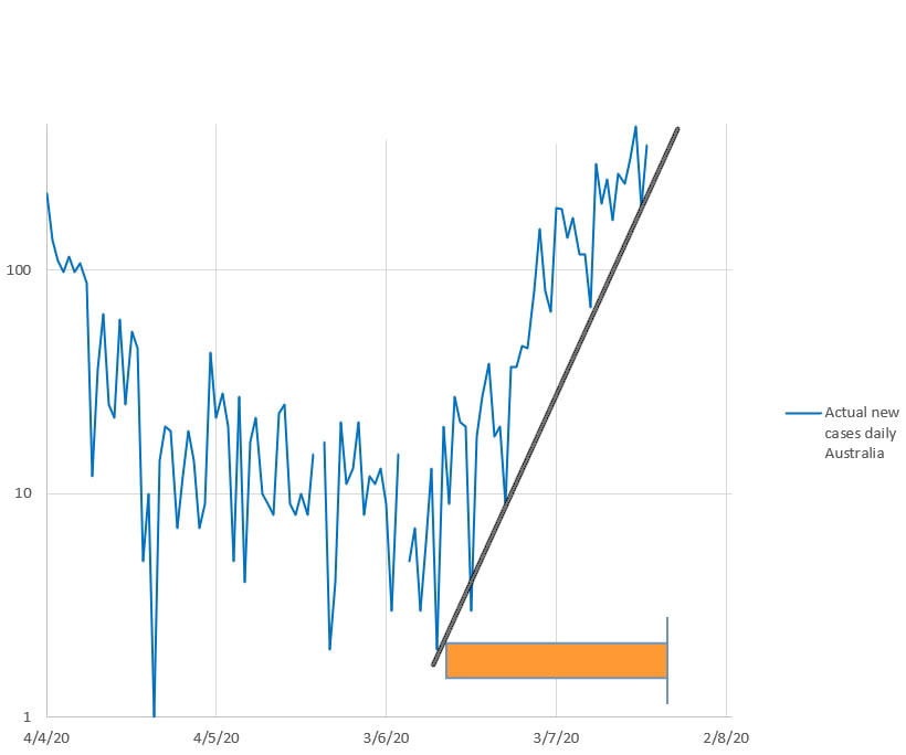
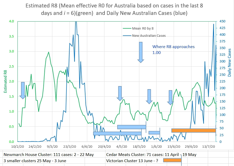
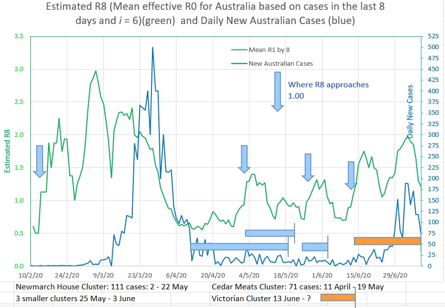
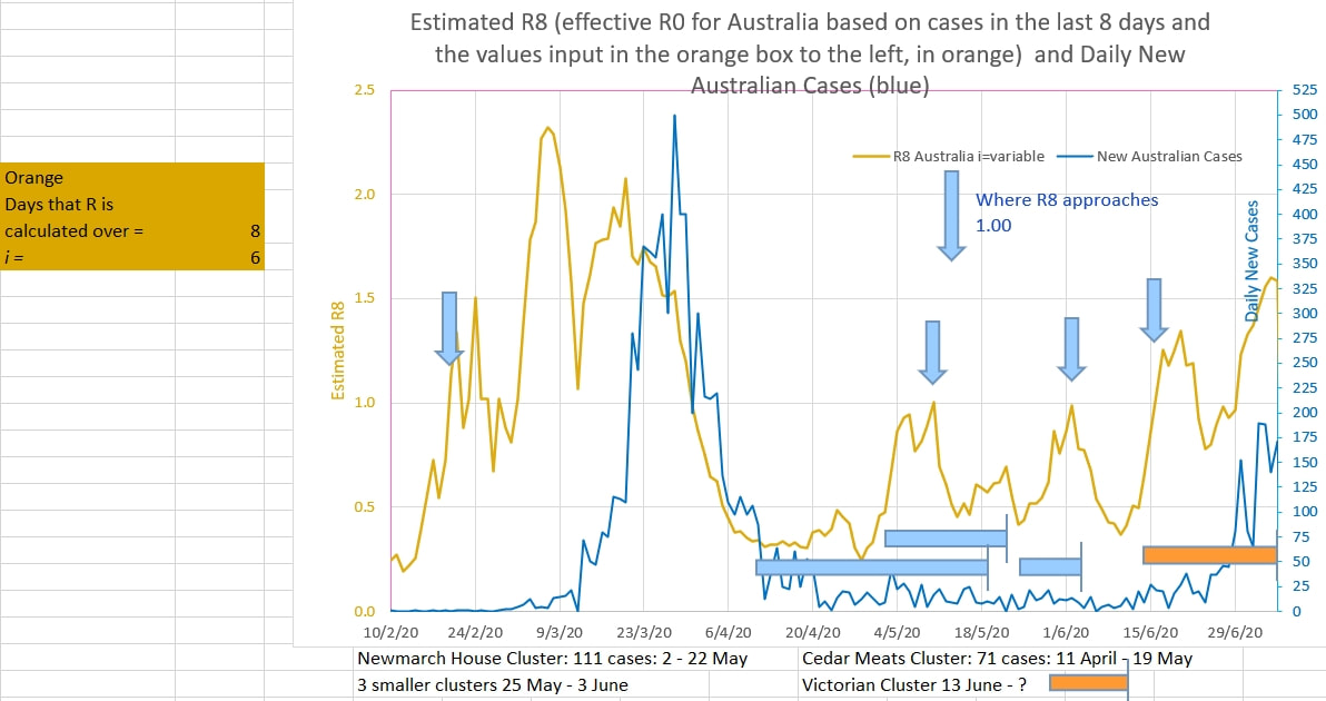
Earlier hopes that the Victorian cluster was coming under control were unfounded. It appears that the R0 continues to be 1.5 The R0 appeared to be as high as 0.94 in Australia prior to the onset of the Victorian cluster - perilously close to the critical epidemic threshold of 1. Perhaps an apparent R0 near to 1 does not give a safe enough margin. The graph below of daily new cases does not appear to have broken the upward trend of the cluster. The chart below suggests that the value of 1 in R8 (the 8 day average of the daily estimated R0) is a good indicator of an impending exponential increase in cases, either as an epidemic or cluster. See the Mathematical Model Here
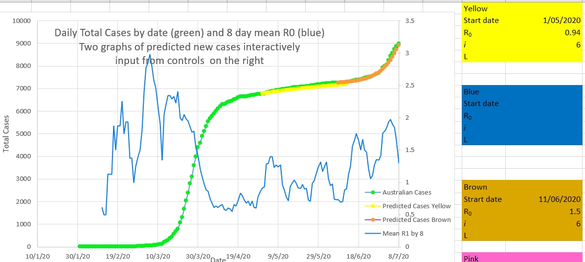
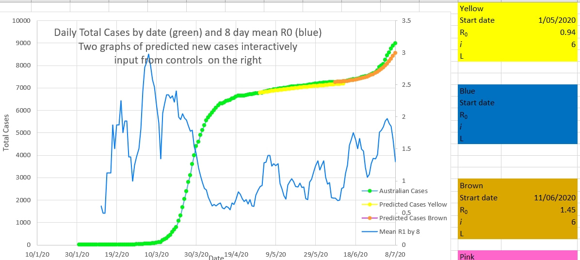
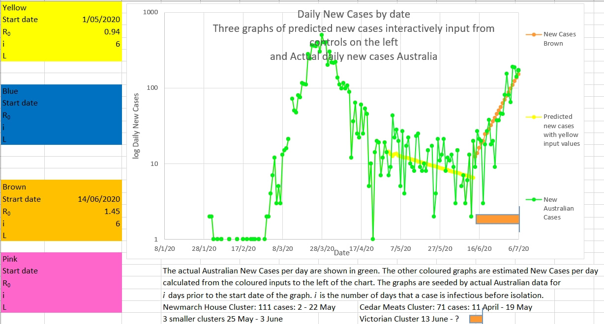
The Victorian cluster appears to be coming under control. The recent trend in new cases (brown on the chart below) appears to have ended and new cases will probably continue to decline (on average) from now on. The apparent R0 has been 1.5 during the onset of the cluster. Inputs for R0 and i (the number of days a case is infectious before being isolated from the population) are input into the brown box to the left of the chart. The brown graph is plotted using these inputs. The inputs are changed interactively until the brown graph best fits the actual cases (green). An i of 6 best fitted the graph during the first wave in Australia. It is likely that Australia's rapid removal of cases into isolation, because they were symptomatic or tested positive, was successful in reducing i to 6. The inputs required to best fit the brown graph to the green actual cases suggests that the R0 during that period was 1.5 The mean R0 over 8 days (green) suggests a declining R0 together with declining new cases per day (blue). The cluster may come under control fairly rapidly, as long as no case is outside the lock-down perimeters. When fitting the curves above to the new cases it is important to fit the curve to the total cases. A good fit on either one of the new cases or the total cases does not necessarily mean that there will be a good fit on the other, as shown below where an R0 of 1.45 or 1.5 fits the new cases equally well, but 1.5 is definitely a better fit on the total cases.
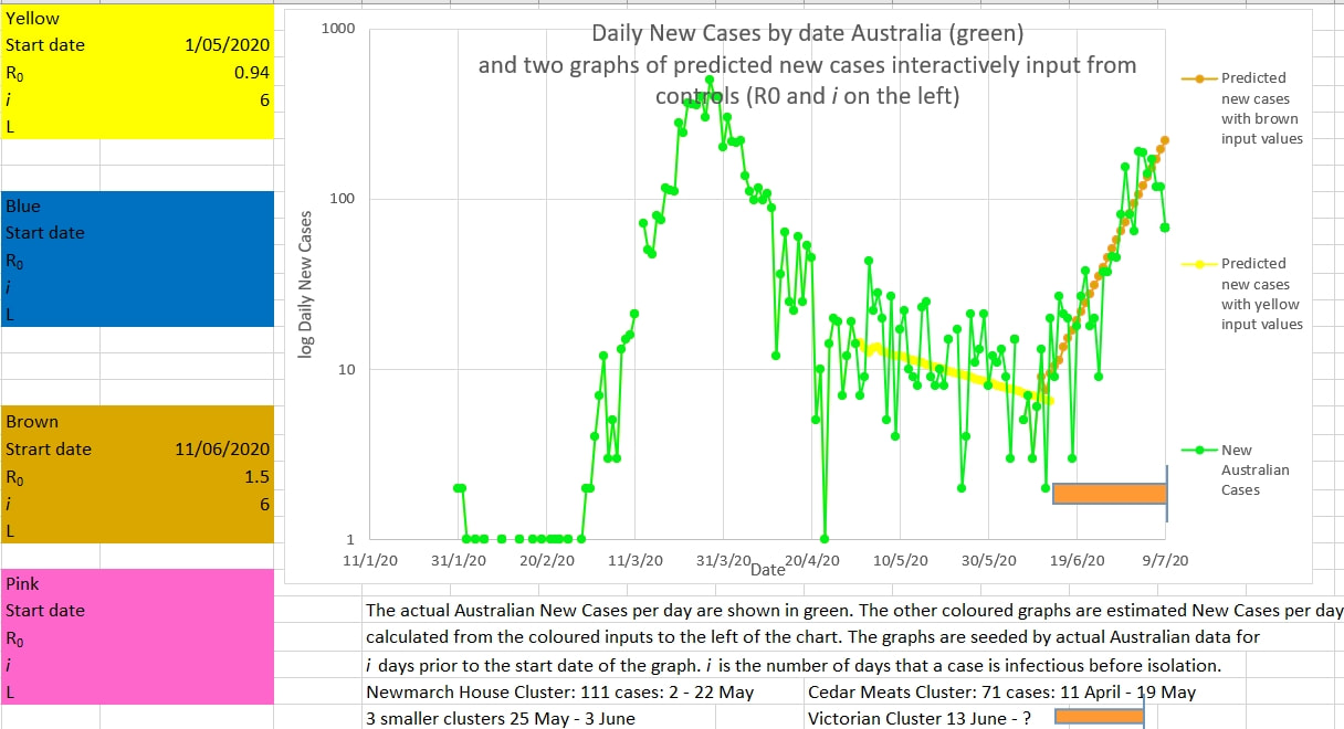
The Victorian cluster may be nearing its peak. If the new cases a day is 100 or less then it is likely the cluster cases have peaked and daily cases would fall. 100 is below the upward trend line of the lowest lows that have been reported during the rise in cases. In traditional chart trading crossing the trend of the lowest lows of an uptrend signals a change of trend to downwards. The math model for graphing the yellow and brown graphs is here . The input values in the coloured boxes on the left of the chart are inputs for the yellow and brown graphs - R0 is the input infection rate and i is the input number of days on average a case is infectious to others before being removed from the population by effective isolation. R8 is the estimated R0 calculated from the cases over the previous 8 days. i is input into the orange box to the left of the chart and is the number of days on average a cases is infectious to others before being removed from the population and isolated. i was estimated to be 6 during the first wave in Australia using this model.
The closure of the Vic - NSW border is welcome. So is the Victorian judicial inquiry into the security of the isolation process. Looking at the successive lows in the recent graphs of new cases in Australia, if appears that the daily new cases needs to be under 100 to signal control of the Victorian 'cluster'. After the 1 May, when restrictions were eased, the effective estimated R0 was 0.94 which is very close to the epidemic R0 of 1 or more. So only a slight error in process or policing or compliance would result in a large cluster or second wave. And it did. It would appear that the only effective way to deal with a cluster or second wave is to act fast and effectively - the 'hit it hard and fast and early' policy. The critics will claim that time and money was wasted because nothing happened. But that is the point. In preventive medicine the biggest success is when nothing happens. When the R8 is 1 or more then something is definitely happening. And it needs to be Hit Hard and Hurriedly.
R8 is the estimated recent apparent R0 calculated from the cases over the preceding 8 days. The chart below also suggests that the New Cases would need to be below 100 to be lower than the trend of the recent 'lowest lows', and signal a new downward trend. It could be tomorrow. |
AuthorDr Michael Cole FRACP LLB Archives
September 2021
Categories |



 RSS Feed