 updated 21 September 2021 Australian collected data updated to 13 September 2021 was used to extrapolate the case fatality rates (CFR) for children aged under 12 (<12s). The extrapolated CFRs were reduced by 0.013/0.04 because the current all age CFR in this this (NSW) wave appears to be 0.013, whereas the all age CFR of the collected data is 0.04 (probably reflecting the improvement in treatment and resources over time. It may be that this reduction based on the difference in CFRs during the two waves is unnecessary because the high CFR of 4% during wave 2 (Vic) was due to clusters in aged care prior to a vaccine being available. The age specific CFRs may not have changed. The childhood estimates of CFR are likely conservative and represent minimum values. Childhood CFRs were extrapolated from a linear relationship between the log of the CFR and the Mean Age of the Cases and Deaths because that gave the lowest estimates of the CFR. 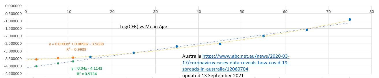 The extrapolations suggested that the likely minimum risk of dying from Covid19 unvaccinated was 31 in a million for ages 0 to 4 49 in a million for ages 5 to 9 and 68 in a million for ages 10 to 11. The overall CFR for <12s was 45 in a million. 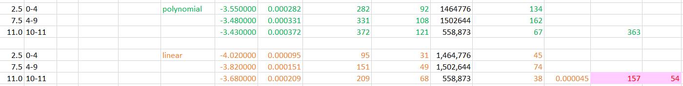 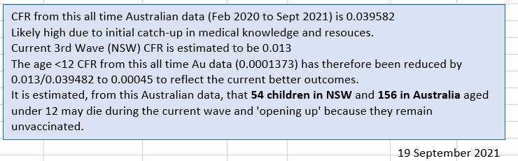
0 Comments
updated 21 September 2021 The Case Fatality Rate (CFR) in Australia appears to be at a low rate of 1.3%. About the same as the US. Not surprisingly the CFR was high in many countries early on in the pandemic before treatment was refined, resources mounted and older groups vaccinated. What is surprising is that the CFR was comparatively high during the second wave (Vic). The overall CFR% during the second wave appears to have been 4.0% and at time reached 6.0%. The clusters in aged care and lack of vaccine may explain the higher CFR The changed CFR in Australia makes it difficult to extrapolate projected deaths in particular age groups based on earlier data, because the CFR is currently low, whereas earlier data includes periods when the CFR was higher. 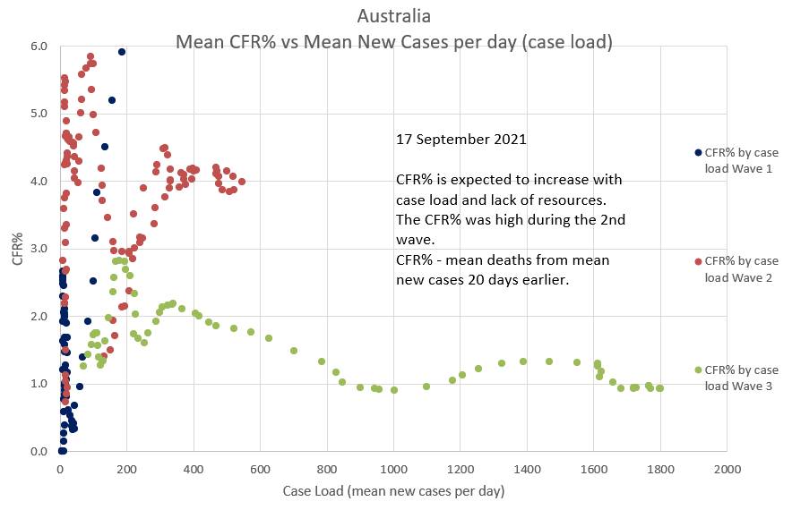 The CFR% and lag time between diagnosis and death can be estimated by plotting projected deaths, using a suggested CFR% and lag time, against the actual deaths. The two will only superimpose when the 'suggested' CFR% and lag time are consistent with the those of the actual deaths. Various 'suggested' CFR%s and lag times can be entered into the green box to the left of the chart in an effort to make a portion of the green graph superimpose the relevant portion of the blue graph. The graphs below suggest that the during the current (Wave 3) in Australia CFR% is 1.3% (0.013) and the lag time between diagnosis and death is 20 days. (Reported data is used, but there is a delay before infection and death are reported). 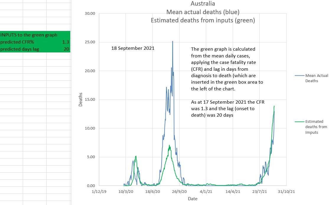 In Australia it appears that during an epidemic wave the effective R (effR), or its mean over 8 days, (R8), goes down slowly. It does not appear to 'wash in' as has been suggested. It may be due to a 'network effect' where the virus initially spreads through individuals with behaviours that can be conceived as having a high 'personal R' (Rp). Later these individuals spread the virus to individuals who have low personal Rs (low Rp) and who do not re-spread the virus. Then the effR (or its 8 day mean, R8) would indeed reduce slowly after restrictions are applied. On the other hand, if individuals anticipate freedom from restrictions they may become less compliant with restrictions causing an increase in effR. This appears to have happened in NSW where an initial slow reduction in effR gave way to a sudden large increase in effR just as a 'road map out' related to vaccine targets was mooted. There was also a slight decrease in daily vaccination rates. In the chart below the 'projected R8' or 'projected effR' is used to drive the projections in the graphic. In reality it is the other way around; the effR is derived from the data. However projected R8 can be conceived as a 'summary' of all the many factors which play a part in driving the epidemic. In this way various suggested effRs can be used to estimate the outcome with regards to new daily cases. The calculation includes the effects of one and two doses of vaccination. 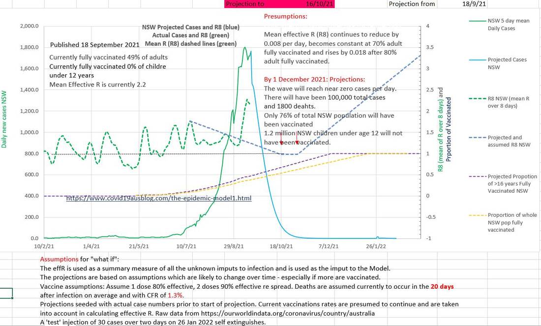 Cumulative deaths are projected to be 1800. 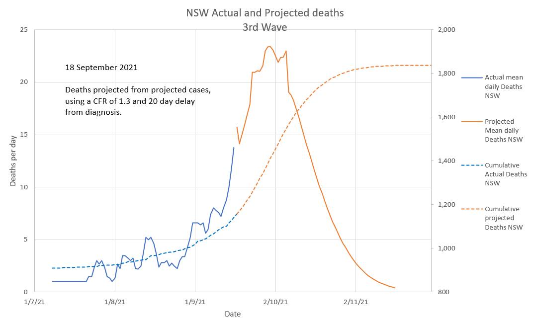 The number of cases in isolation has decreased to near zero this last week and the number that should have been in isolation to end this wave by bringing the effective R (effR or Re) below 1 has increased. Contact tracers are definitely swamped. But effR is being decreased by the restrictions in place. 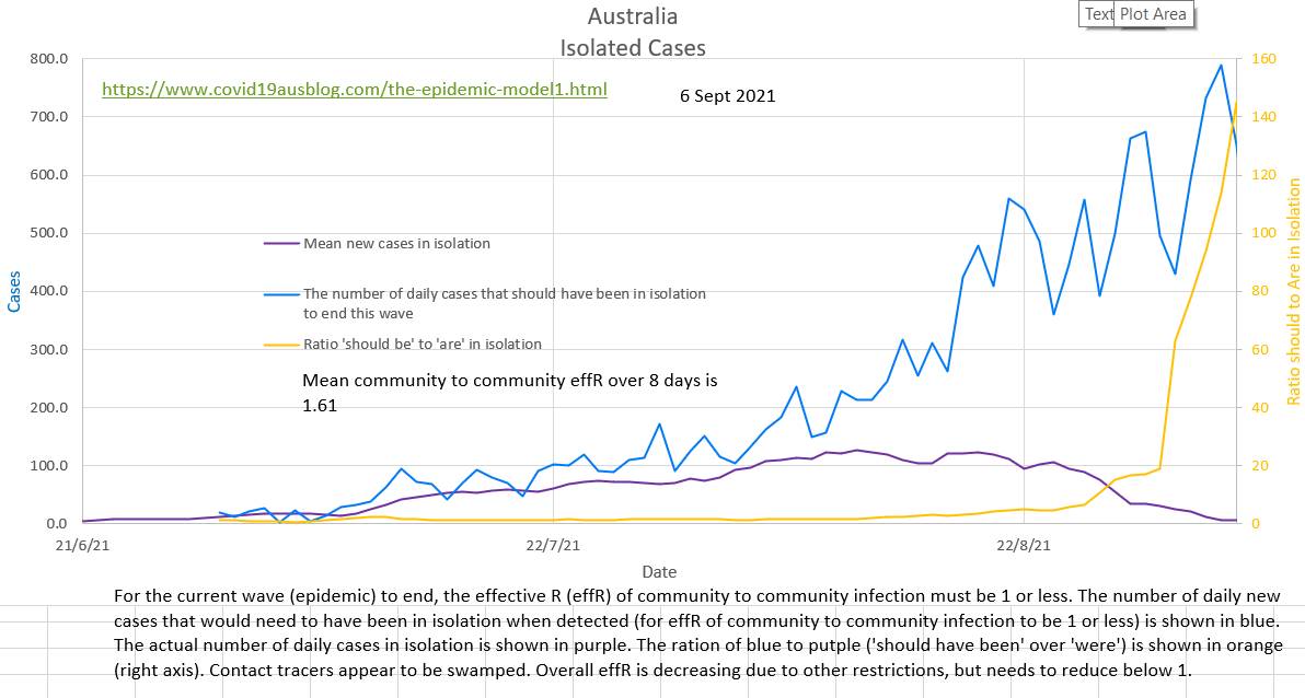 For contact tracers to be successful in ending this wave the blue graph below needed to be below the red graph. 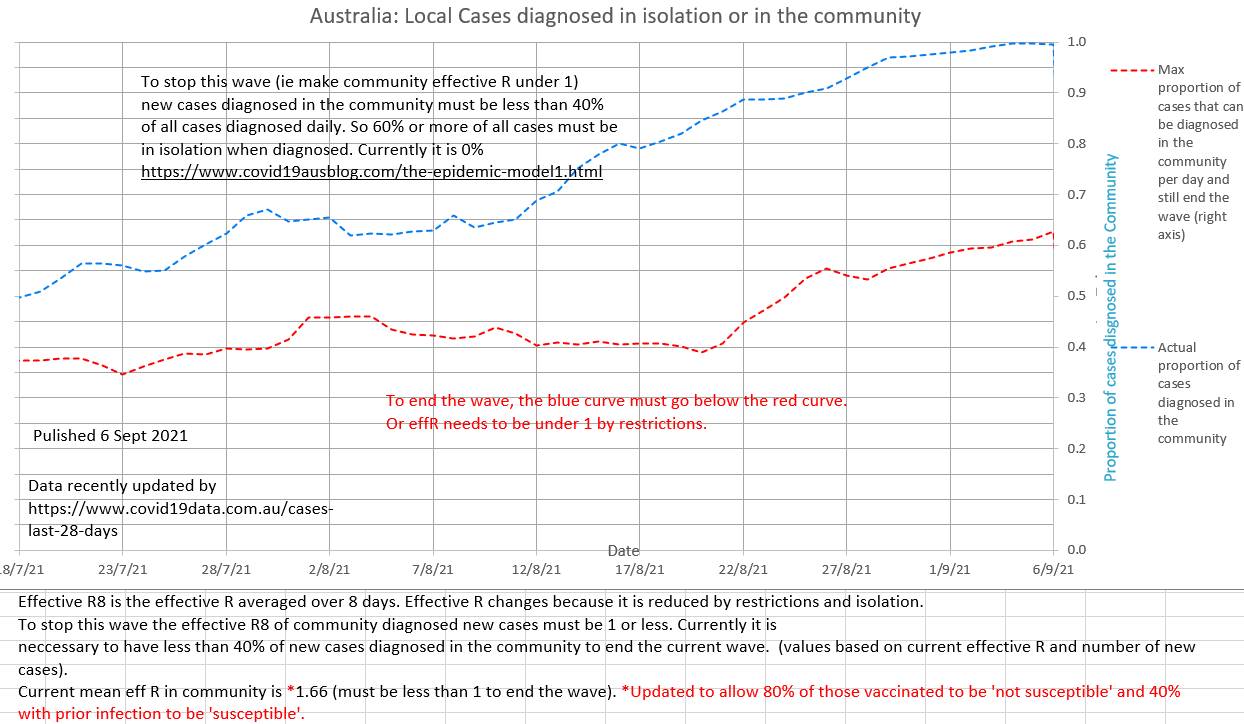 The current effR is 1.61. In our opinion it is not correct to ignore past infections and vaccinated individuals when calculating effR; they are both 'not susceptible' (to the degree that they are efficacious in preventing infection) and excluding them causes an underestimation of effR. 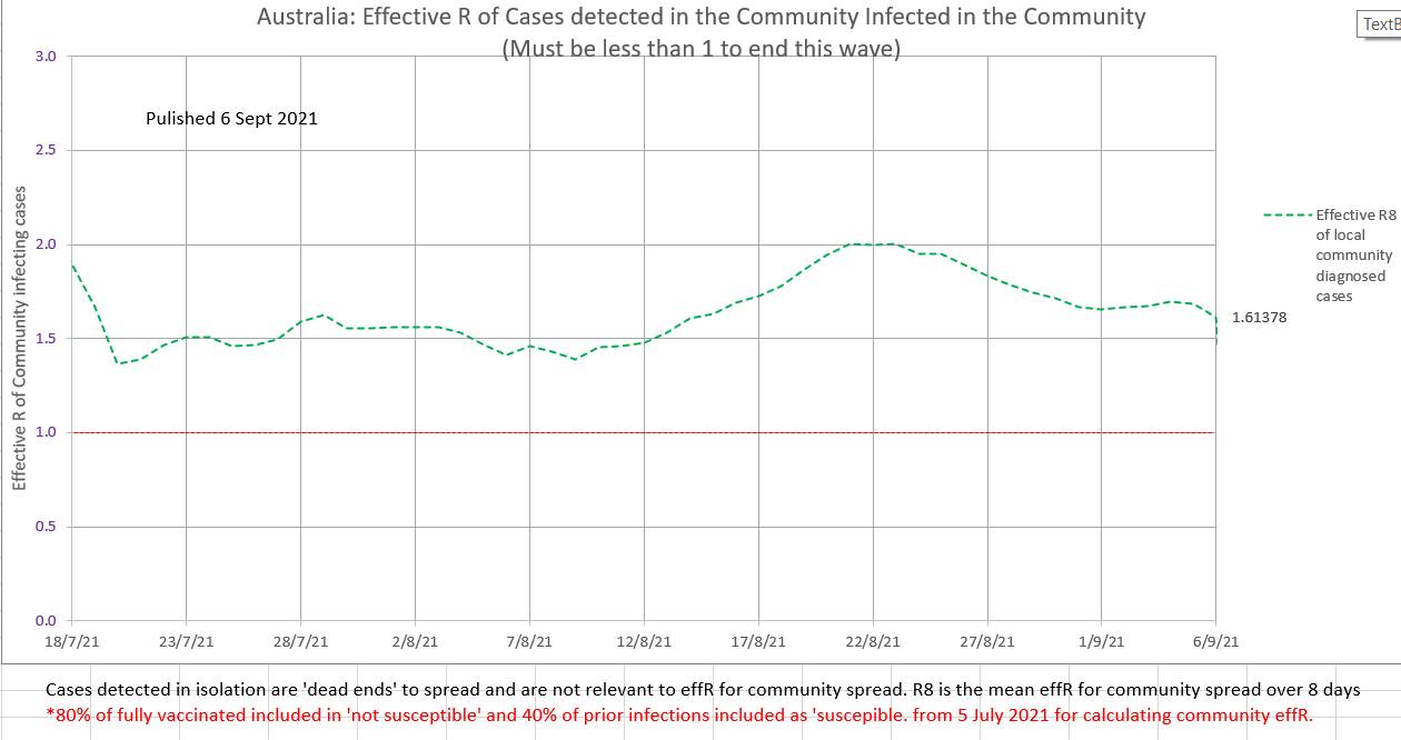 The current wave is still epidemic. EffR has not yet shown a steady decline. 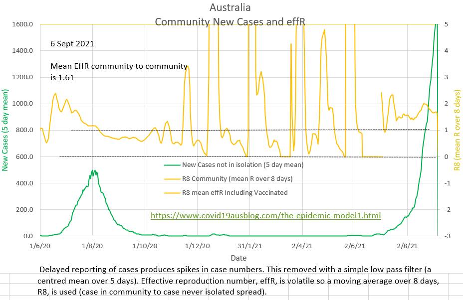 In spite of an obvious wave vaccination rates have not increased. Perhaps at 53% fully vaccinated those who wish to be vaccinated have been? Some states report a lack of emergency and ICU beds while also arguing in the Supreme Court against mandated restrictions. The pink area covers the same four week period covered by the CDC forward projections. But this graph also shows a projection of an unchanged current Covid policy till the end of the wave. 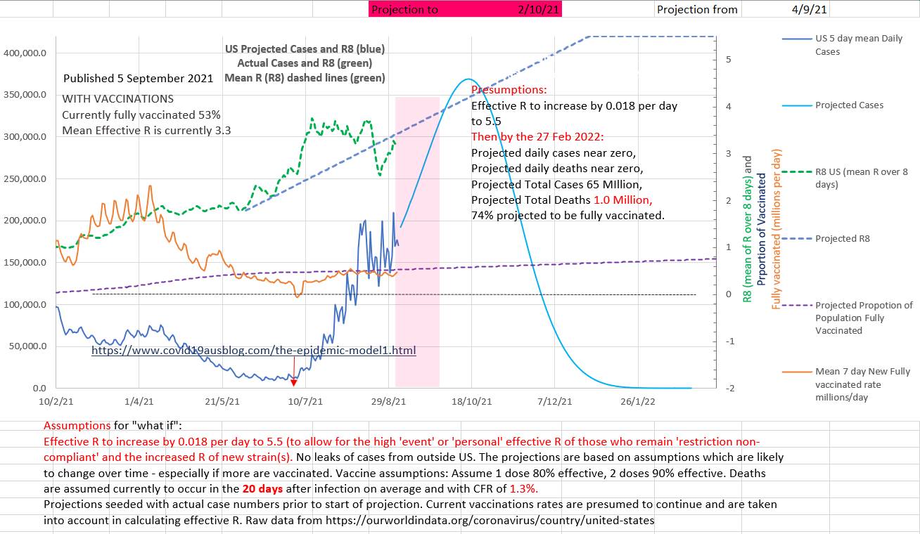 The CFR appears to have been steady at 1.3% and deaths to occur on average 20 days after the infection is reported. 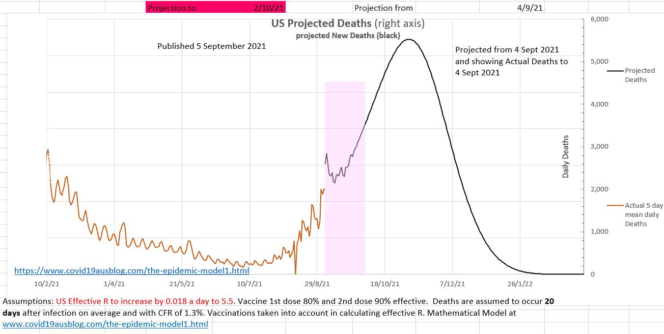 Why did it come as a surprise to politicians and health advisers that so many disbelieved everything about Covid-19 and the vaccines and restrictions and isolation and telling contact tracers the truth?
Where were the sociologists and psychologists and historians? Did even one of them say something like 'don't forget that a large percent of the population will jack up about your policies'? I think we always totally underestimate the irrationality of humans. Stuart Sutherland (Sussex Uni prof Psych) wrote a 380 page book called 'Irrationality: the enemy within' with 380 pages packed with a history of human stupidity. Why did anyone think otherwise? There are also a number of little known facts that systematically prevent individuals from giving the facts (truth) to contact tracers (or anyone). In 1948 Alfred Kinsey published research that found that nearly half the population has an affair at some stage. If it is still the case then they won't want to share where they have been with a contact tracers. It is estimated that 10% of children don't have the father they think they have. During the AIDS epidemic a hospital in Australia trialed a scheme to use pre-collected parental blood for their own child but had to abandon the scheme after just 4 cases because of a difficulty explaining a child's anomalous blood group. And what about those who are up to no good? Just not telling is Australia's version of the fifth. Currently the effR in Australia is 1.34 (in community to not isolated spread). EffR may be reducing slightly, due to increased restrictions, not due to isolation which been disappointing). 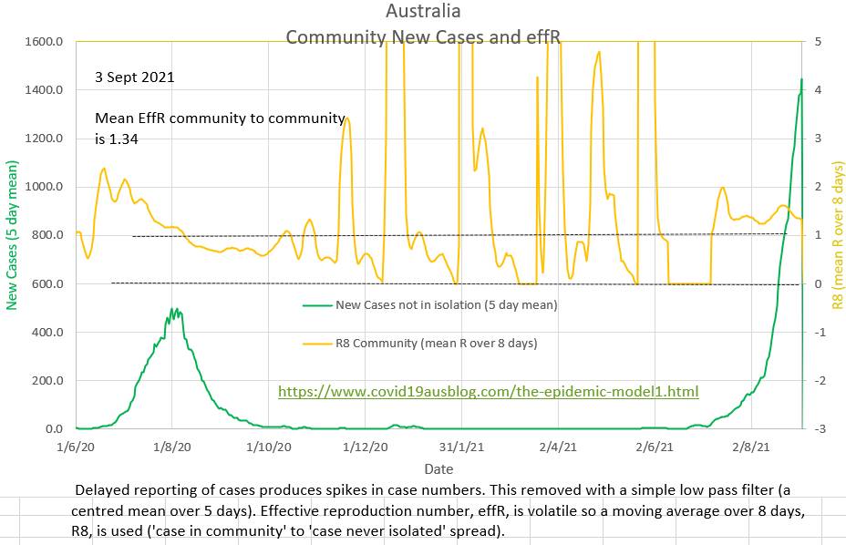 The ratio of the cases that 'should have been' isolated to the cases that 'were' isolated is shown in orange. It's calculation does not require effR. But it does require R₀, which is presumed to be 5.0 Lately zero cases have been reported as in isolation, which is difficult to believe. Perhaps a political decision has been made not to publish the numbers? 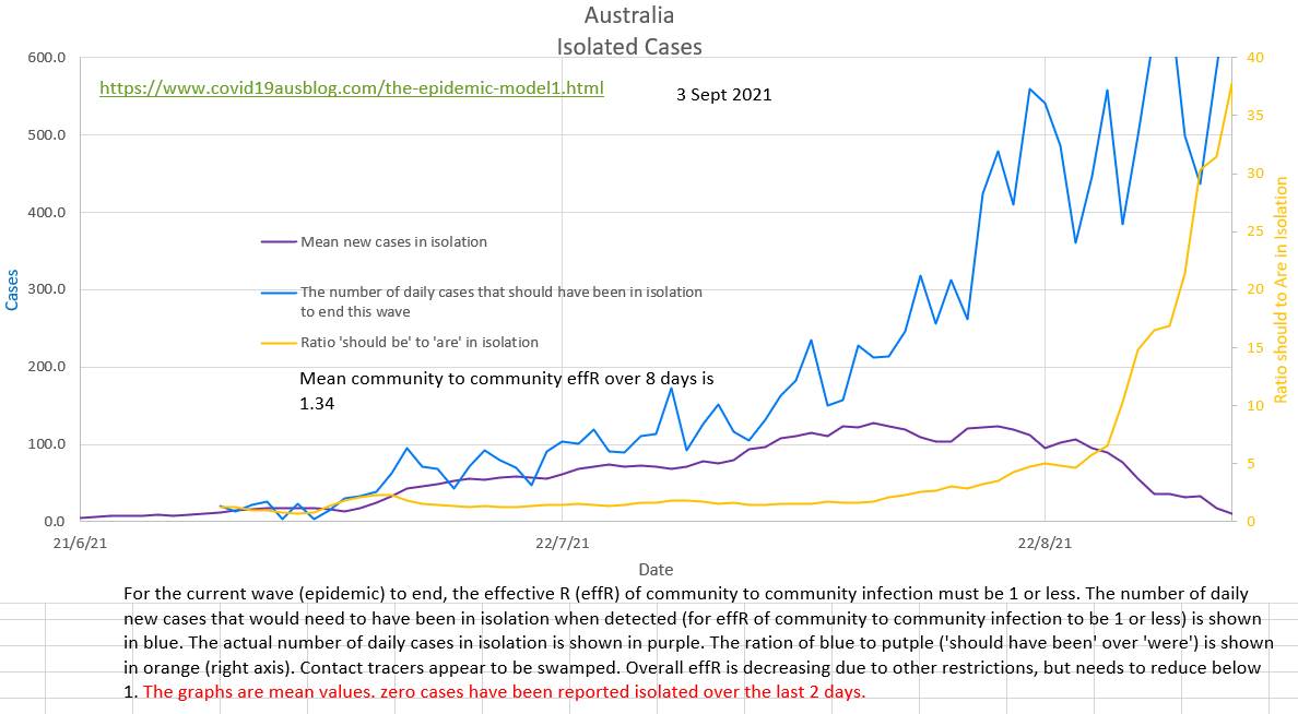 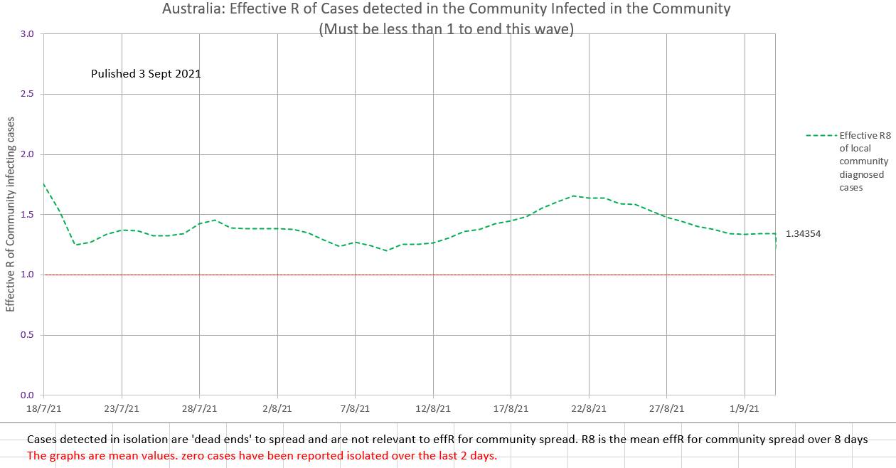 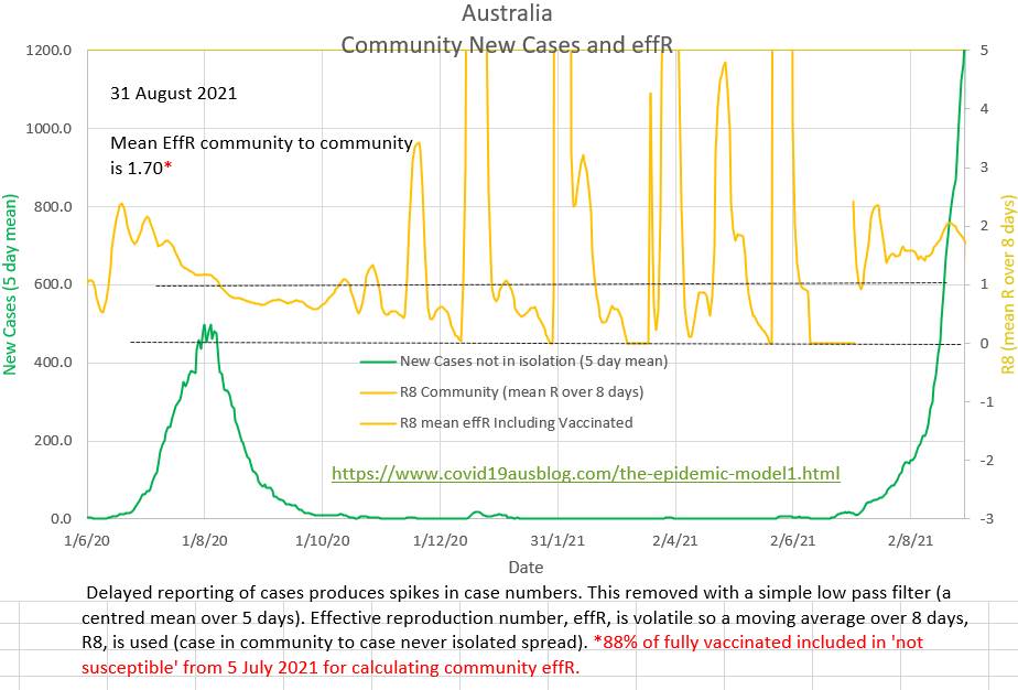 The ratio of the number of cases that "should have been" in isolation to the number of cases that "were" in isolation is currently about 20 and the contact tracers appear to be overwhelmed. 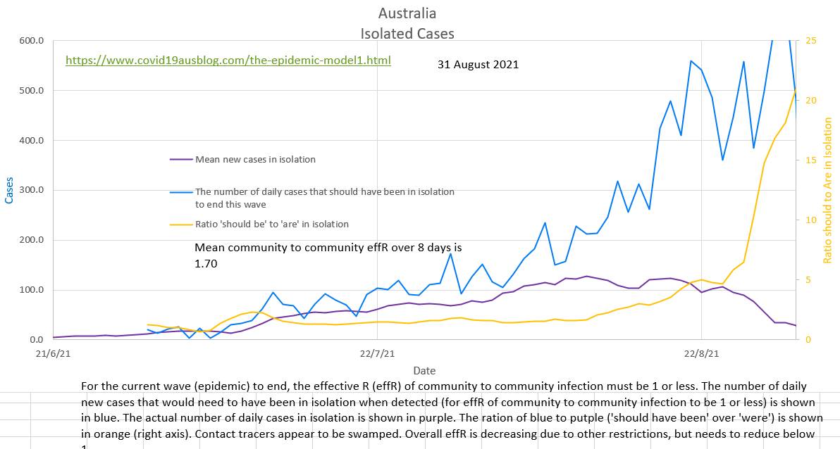 Only 2% of the daily cases are isolated at present. It is estimated that about 40% of daily cases must have been isolated (diagnosed in isolation) for the community to community spread effR to be below 1 and end the current wave. 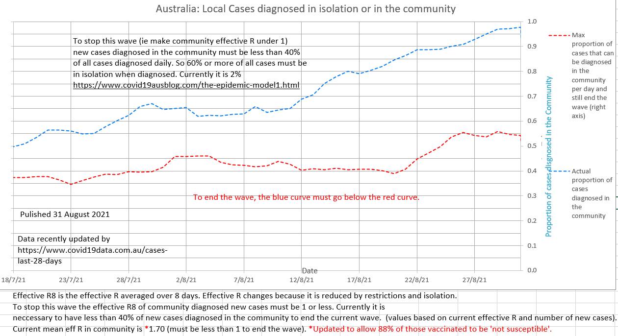 Since 22 August the general restriction in place do appear to be reducing the effR of community to community spread, although it is still high and exponential at 1.70 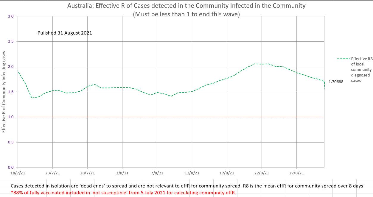 Surprisingly, since the US is experiencing a major wave, vaccination rates are slow and some state governor are arguing in supreme courts that various types of restrictions cannot be enforced. If the current trend continues our model projects over 350,000 new cases a day in October 2021 and 51 million total cases and 1 million total deaths by 20 February 2022. Some states already report that they are running out of supplies and available beds in hospital (eg https://www.texastribune.org/2021/08/27/texas-schools-covid-19-cases/amp/) . Currently the effR is 3.1 and 52% of the population is fully vaccinated. 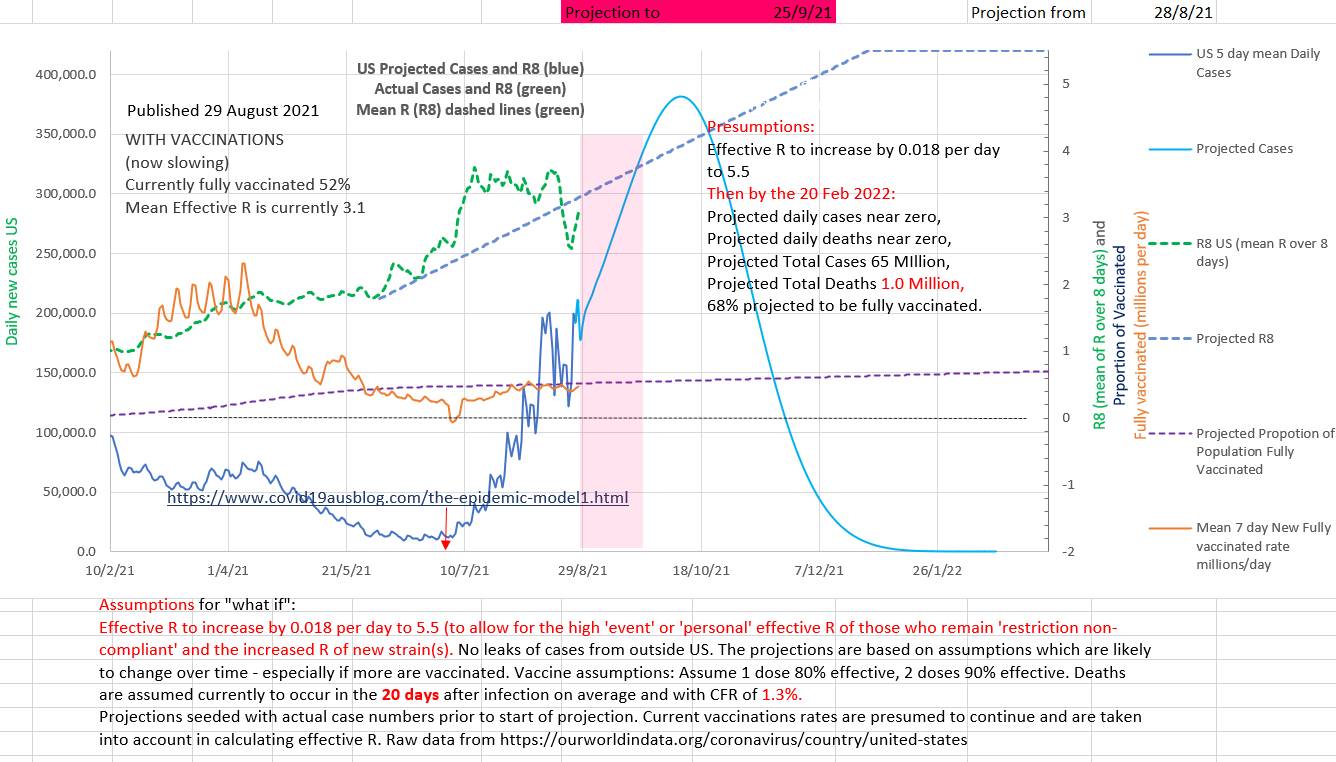 Unless vaccination rates or restrictions increase the epidemic of deaths are projected to increase by our model, perhaps peaking at over 5,000 a day in November. 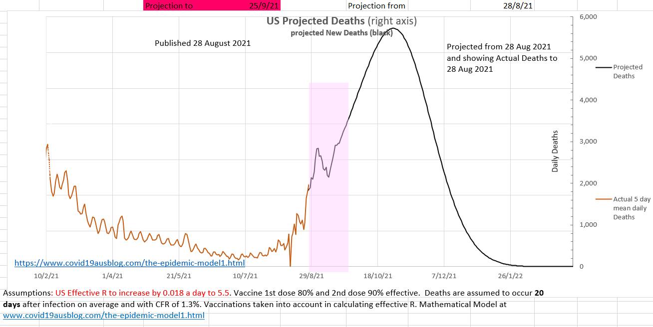 The grey graph below shows the 5 day mean of the actual daily deaths. A suggested case fatality rate (CFR) and average days from diagnosis to death can be entered in the green box on the left. The suggested values can be changed in the green box until the green graph best matches the grey graph of actual cases. When the green graph matches the grey graph near today's date, then the CFR and days to death in the green box are the current CFR and days to death. Various values for CFR and days to death (CFR from 1.3 to 1.7 and days to death from 17 days to 21 days) have been used to make the green graph fit the grey graph for other time periods. 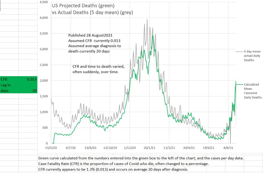 The object of isolation is to stop the spread of Covid-19 in the community. But how many of the cases detected in a day should have been in isolation? Community case to community case spread will slow and stop when community to community effR is 1 (or less). And it is possible to calculate the number of cases that would occur in the community if the effR was 1. All the rest of the day's new cases should have been in isolation. If they were, then the current wave will end, if not the current wave will continue. Plotting the number of cases that were isolated and the number of cases that should have been isolated shows that each day Australia is far from isolating the necessary number of infected cases. The effR of community to community spread is probably showing a slight downtrend, but contact tracing with Delta strain Covid-19 has not managed to isolate the necessary number of cases. 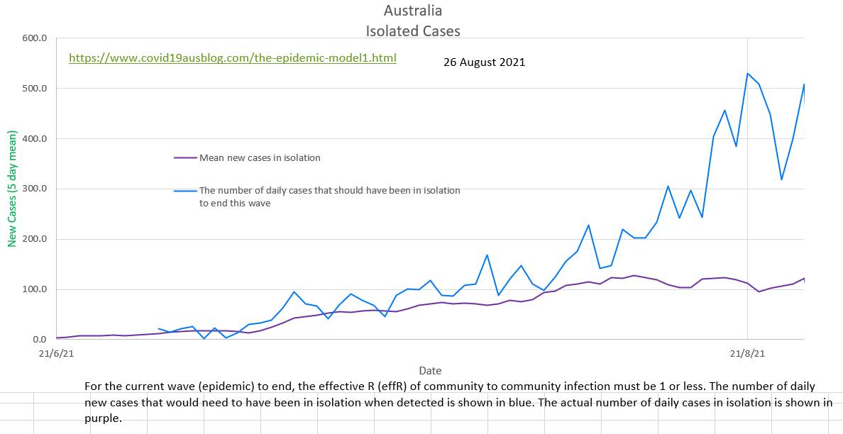 https://www.covid19data.com.au/cases-last-28-days updated and backdated its data today. The volatile daily effR is 1.26, but the more stable and meaningful mean effR of community spread (R8) is 1.59 and possibly showing a slight early down-trend. The maximum proportion of cases that can be detected in the community and still end the current wave (ie bring community effR to 1 or less) is 40%. Currently it is nearly 90%. Delta strain is difficult to trace before it spreads, so ensuring early isolation of contacts is difficult. 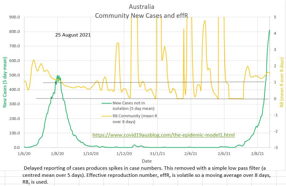 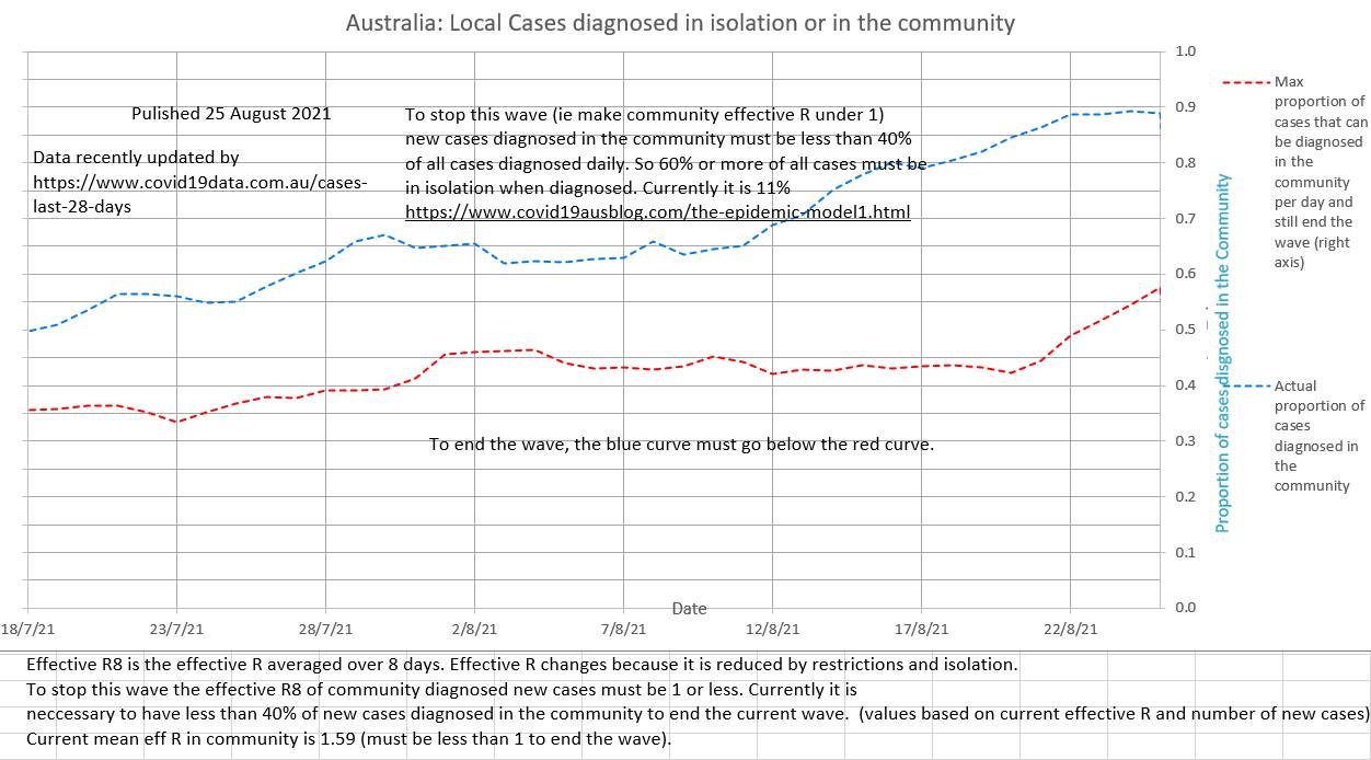 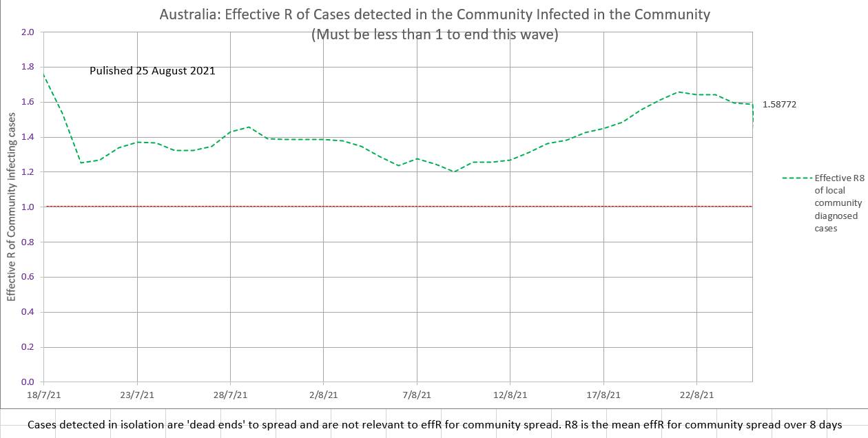 |
AuthorDr Michael Cole FRACP LLB Archives
September 2021
Categories |
 RSS Feed