|
Cases continue to rise in the US during the current wave. The effR is 2.51 which appears to be decreasing for an unknown reason - perhaps some states are following restrictions. The projection is for a total of 65 million cases and 1 million deaths by mid February 2022 at the end of the wave and epidemic. The CFR remains 1.3 and the average time to death is about 20 days. 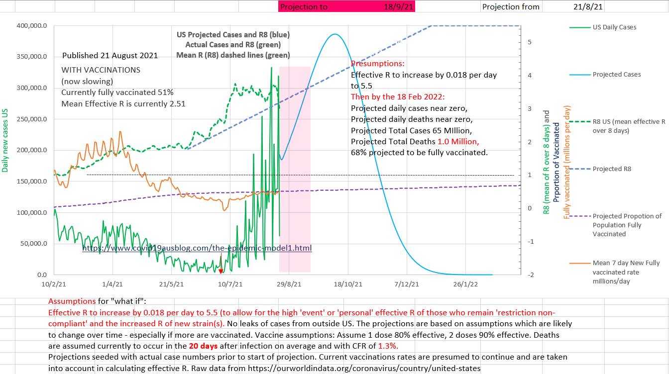
0 Comments
Vaccination of EVERYONE (100% of the population, including children) is the way forward. IMHO it is not ethical to leave children unvaccinated in the face of a potentially fatal disease if the benefits of vaccination are greater than the risks. And the benefits greatly outweigh the risks based on all the evidence and its rational assumptions for the future both for Pfizer and AstraZenica. AstraZenica is safe by any reasonable standard. And it is legal to have a child vaccinated by your local doctor 'off label' if she believes that the the benefits outweigh the risks and documents the discussion and obtains a signed consent. Australia needs to have isolated 60% of the daily new cases. Currently they have achieved about 11% (5 day average). The graph below shows community cases - the opposite of isolated cases. The 'goal posts' of 57% for the maximum proportion of new daily cases that can be in the community and still end this epidemic wave is the goal post for today only. It will fall to about about 40% maximum allowable community cases as case numbers fall. The blue curve needs to be continually and convincingly under the red curve. 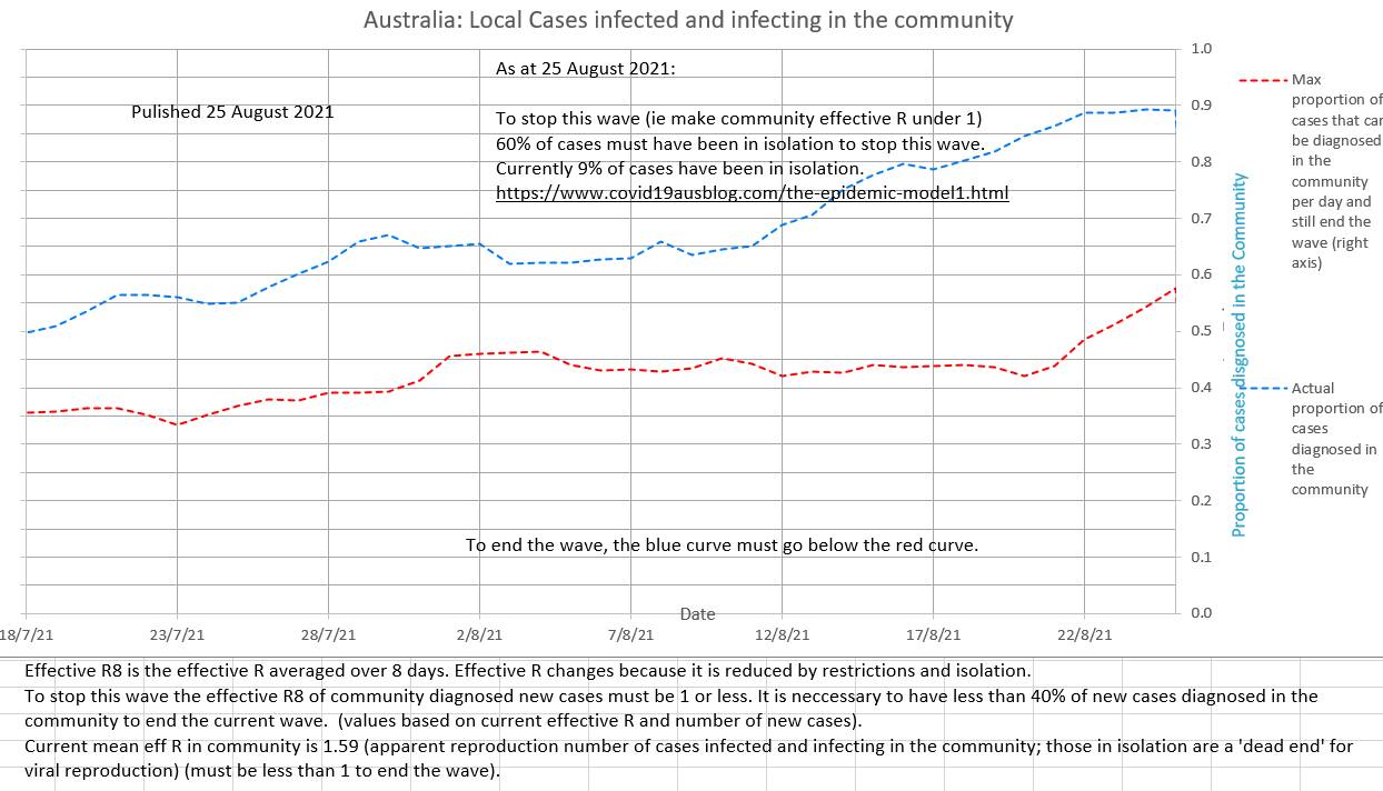 The effR for community to community spread (the effR that counts, since those in isolation are 'dead ends' for spread) is still high and not convincingly decreasing at 1.59 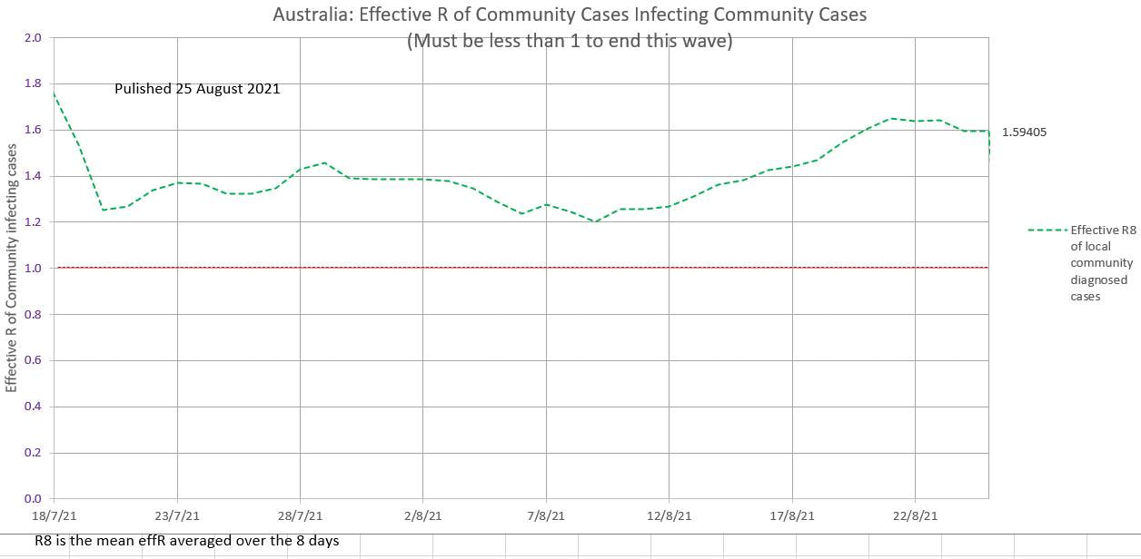 Cases continue to climb on a 5 day average. 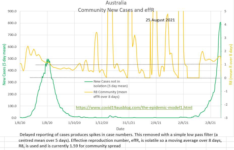
Vaccination appears to be the way forward. Restrictions and lockdown will probably not contain Delta strain Covid19 because the reproduction number R₀ is too high and the normal distribution of human behaviour, at its extremes, predicts non-compliance. Cases infected and then potentially infecting in the community (community cases) continue to rise as does the effective R (effR) which is about 1.6, which is epidemic, instead of the 1.0 required to end the wave. Cases in isolation are 'dead ends' to spread and are not relevant to community effR. 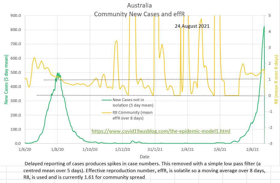 60% of daily cases should have been in isolation in order to end the wave, but only 9% of mean daily cases over the last five days have been in isolation. 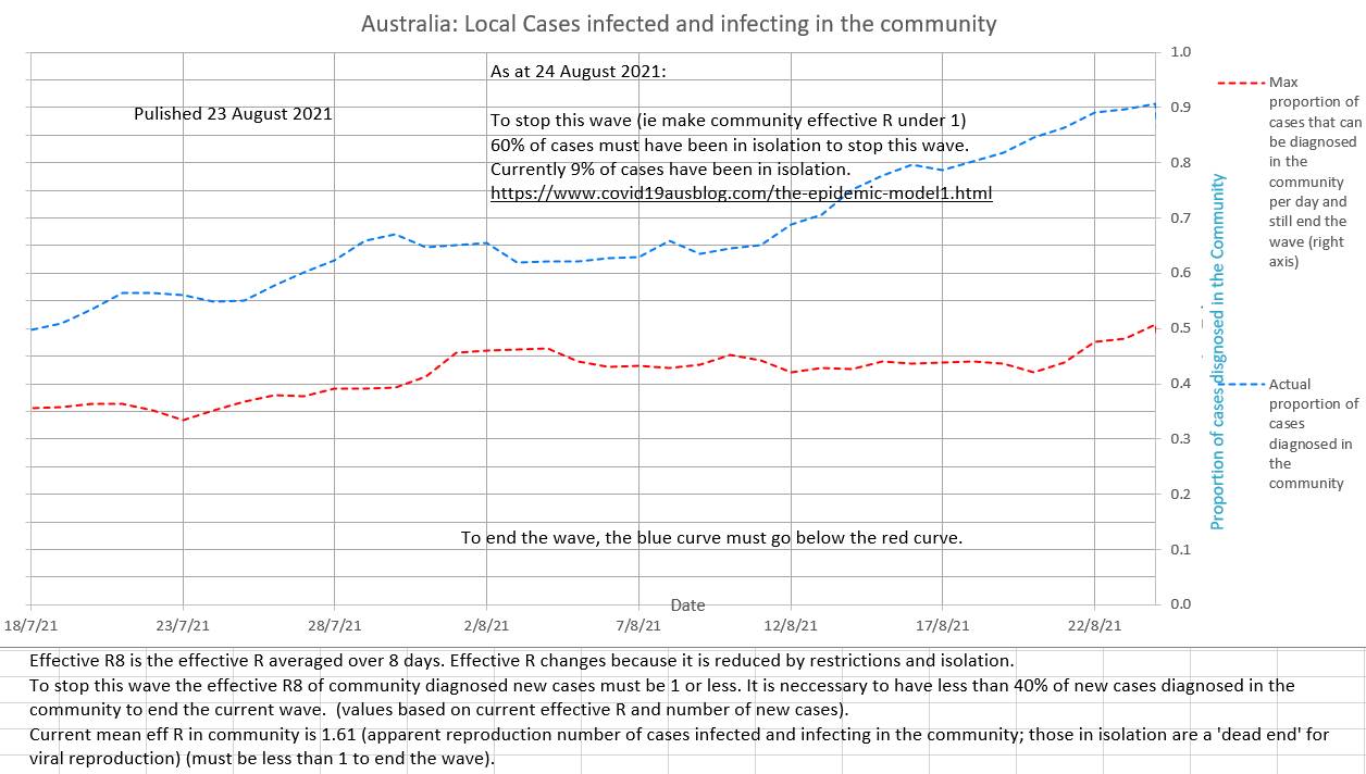 Restriction will probably not halt the current wave and there will always be leaks in Australia's border (quarantine and isolation). Vaccination appears to be the only way forward. It will reduce, but not stop, the spread. But the main advantage of vaccination is that it is very good at preventing severe disease and death. The whole population who wish to be vaccinated should be vaccinated. Those who choose not to vaccinate have a right to do so. But it is not ethical to fully open up until all adults and all children who wish to be vaccinated have been given an opportunity to do so. 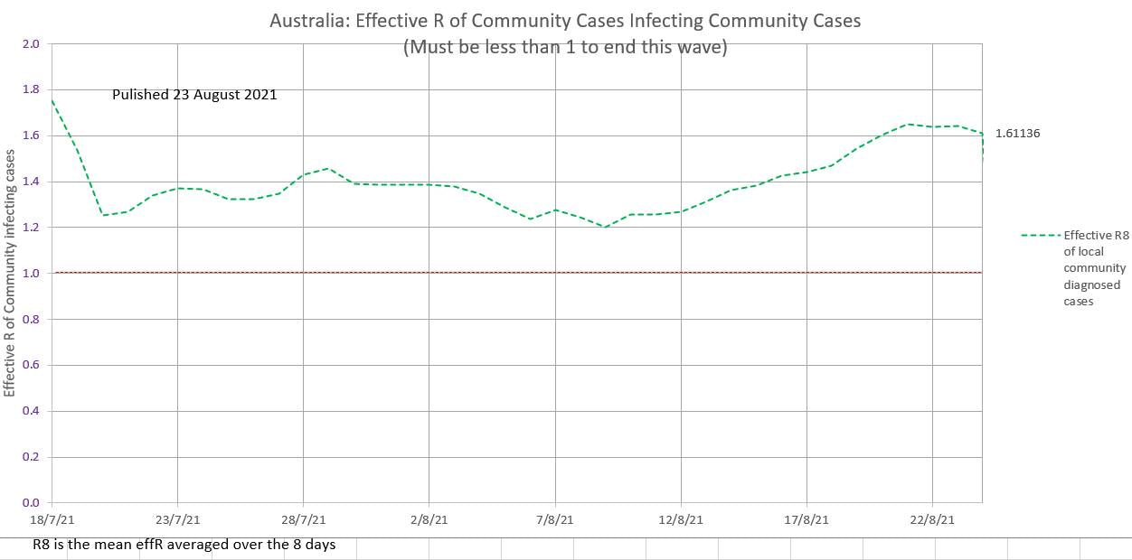 The chart below shows Australia's (pretty much Victoria's) locally acquired new cases and the mean daily R averaged over the previous 8 days. The mean R has been in the epidemic range recently and is still at a worrying 0.9. Contact tracing and compliance with restrictions is still necessary. Carefully ease some restrictions but still aim for zero new local cases. 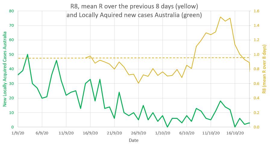 Victoria is easing restrictions just as the R goes down to 0.9 which is risky. An R of 1 or above signals epidemic spread, and the R has been above 1 for 9 out of the last 11 days. 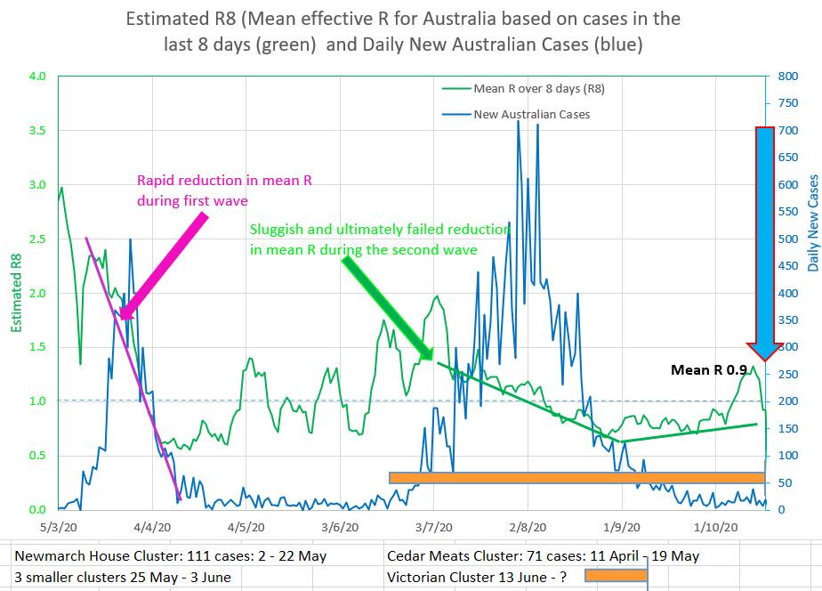 The chart below allows yellow, brown and pink straight lines to be fitted to the curve made by actual new cases in Australia (green). They are drawn by putting a value for R and the start date of the coloured graph into the appropriately coloured box on the left. That way the best fit of the coloured curves to the green Australian actual cases suggests that the value of R entered is the apparent R of the actual Australian cases. So the yellow graph suggests the apparent R was 0.75 during the late part of the second wave. The brown graph suggests a relapse during which the R rose to 1.2. And the pink graph suggests that the current Australian apparent R is about 0.85. 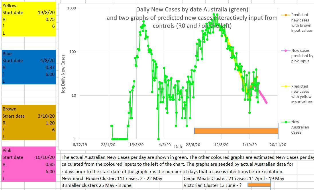 Another way to assess what the recent value of R in Australia has been doing is to try to fit a known curve (grey) to the curve of the Australian new cases curve (green). If a good fit can be made then the values used to draw the grey curve may represent the actual values in Australia. The best fit appears to be with the values input into the grey box to the left of the chart. The values producing the best or closest fit were an R starting at 1.15 on the 3/10/2020 and decreasing by 0.02 every day until 21/10/2020. Why set R to decrease by an small amount each day? Because it appears that R behaves in that way. It is counter-intuitive. You would expect R to decrease immediately, or at least quickly, to a new value as soon as restrictions are put in place. Everybody would comply with restrictions and the R would fall rapidly. But in fact, as can be seen in the top chart above, during the first and second wave the R fell consistently but slowly. The fact is that when restrictions are put in place the R falls much more slowly than the usual mathematical model of infection spread would suggest. Some have called this the wash-in period. But no part of the SIR model accounts for a wash-in period. It might be that individuals in the population have different risk factors for disease spread, like big families or habitually visiting bars, or alternatively by living alone and staying home. Different individuals may differ in their compliance. The initial observed high values of R may represent the virus spreading more easily through a network of high risk individuals (individuals with a high personal Ri). And the observed R may decrease once individuals in the high risk networks are progressively infected and the virus then can only spread through lower risk individuals (lower personal Ri). Perhaps there is another explanation. 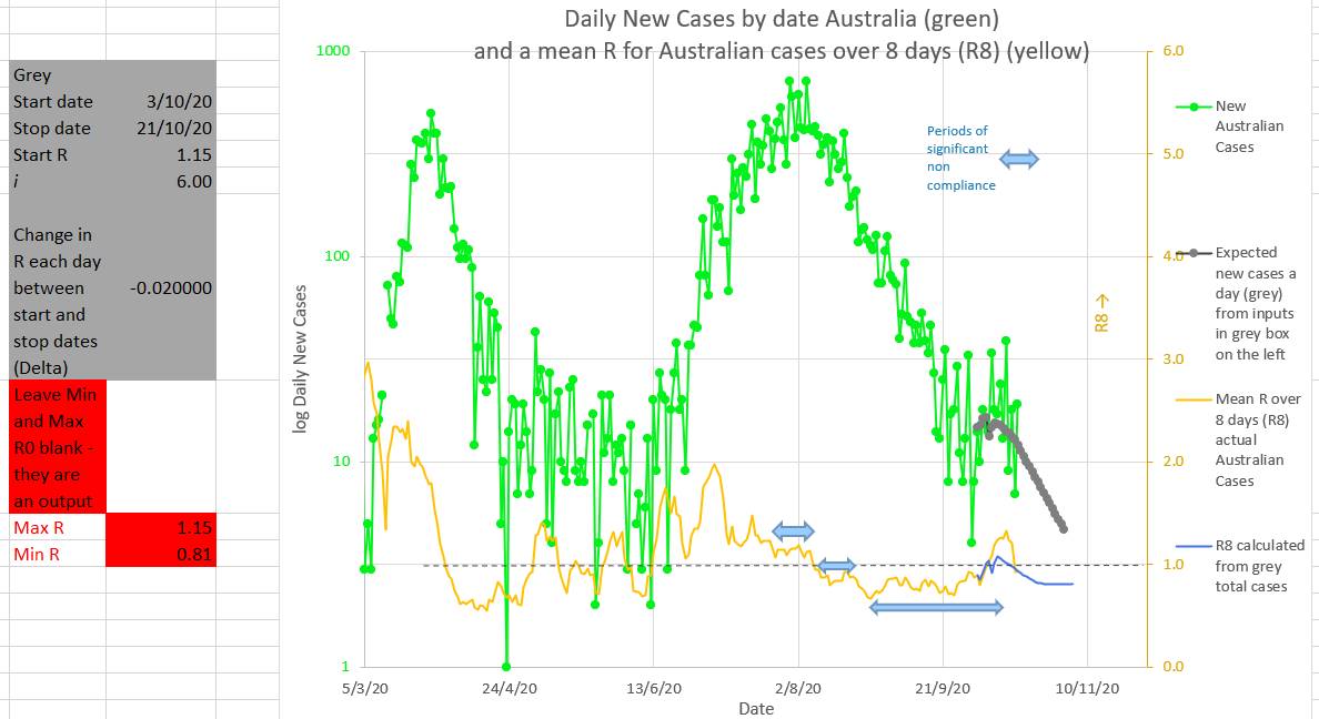 It may intuitively seem that fining or punishing individuals or companies for non-compliance would increase compliance. But, counter-intuitively, this strategy often fails. Individuals are more likely to better hide their noncompliance if they face a fine or some other punishment.
So is the best strategy to create a bit of a fuss but then not do anything much in the way of punishment? Or is the best strategy to offer rewards. Or rewards for whistleblowers? Maybe the best strategy would be to punish dishonesty when asked about compliance and hiding noncompliance once asked about compliance by an authority. That way individuals and companies would be encouraged to improve compliance, not because noncompliance is punishable, but because, once questioned, hiding or being dishonest about noncompliance will be punishable. It would also mean that an individual questioned about their movements, contacts or compliance would benefit from being truthful, which would be a great help to authorities and contact tracers. With a mean R of 1.3 this appears to be no time to ease restrictions. During the first wave the mean R fell rapidly from well over 2.5 to about 0.6 (green graph below). Unfortunately restrictions were eased on 1 May just as the mean R was rising and approaching 1 (the critical epidemic point). A series of clusters followed with the mean R slowly rising over time and compliance fatigue set in. Then the second wave hit. The decrease in mean R was sluggish and finally failed. The second wave was therefore higher and lasted longer than the first wave (blue graph below). Just when the second wave was nearly over compliance decreased and mean R has risen to 1.3 and rising. Signalling a new cluster at least and possibly a third wave. 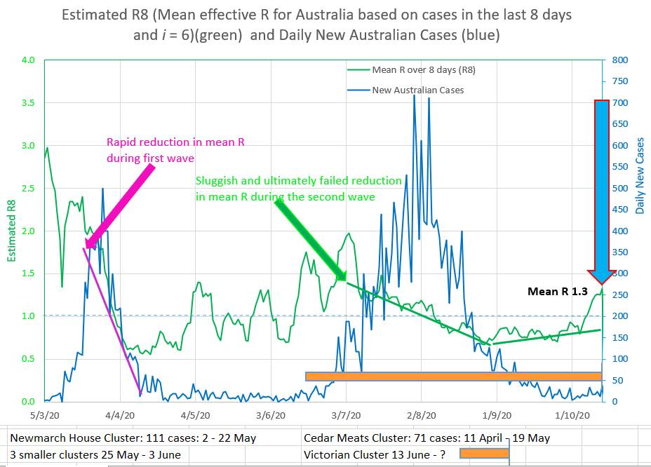 On the chart below straight lines of different colours are draw to 'best fit' the curving green graph of the new daily Australia cases. The straight lines can only fit a part of the curved green graph, but the straight lines give a good indication of where the green graph is going at that point in time. The straight lines are drawn by putting values into the coloured box of the same colour on the left. The yellow line shows that Australian new cases were decreasing during the second wave with an indicated R of 0.75. And the brown straight lines shows that the Australian new cases are now increasing with an indicated R of 1.2. Which agrees with the mean R over 8 days (R8) of 1.3. 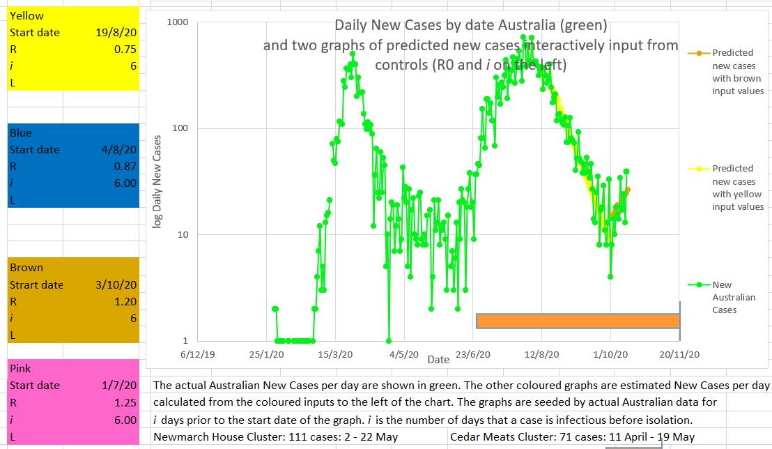 It is easy to see this cluster or wave in hindsight, but it was probably predictable by the 4 October by the fact that the mean R was rising and approaching 1. That was no time to be contemplating an easing of restrictions. 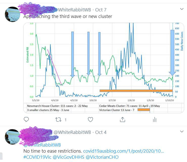 The number of new cases in Australia is falling, but falling less than required. The current mean R is 0.87 which is perilously close to the critical epidemic value of 1. And at the moment R is rising. These numbers probably signal a risk of another cluster or possibly the start of a third wave. What a pity that the low number of new cases seems to always make people and the government relax just at the time they should be holding firm and driving new cases towards zero and keeping the mean R low. Instead of falling the mean R has stayed the same or risen since 27th August 2020. The mean R has not dropped for 5 weeks (blue horizontal arrows on the chart below). It only requires a few members of the population to be non-compliant with restrictions for there to be a potential pathway connecting them up. If any one of them gets the virus then all of them get the virus and so a cluster starts and spreads. 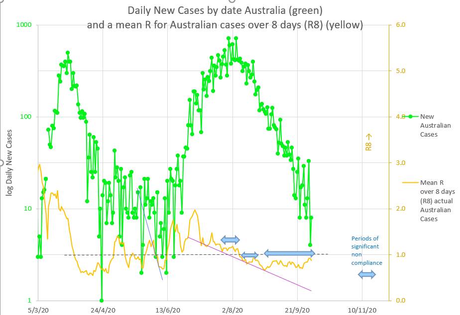 In the past a new cluster or new wave started each time the mean R was rising and approaching 1 (the blue vertical arrows on the chart below). When the mean R becomes 1 it means there are one or more pathways or network connecting non-compliant individuals together in such a way as to make it possible for each infected person to infect one further person. If anyone in the pathway or network is even less compliant then they can catch and spread the virus more easily and the mean R will rise. At that point there is a new cluster or new wave starting. Maybe NZ and QLD are right that this is not quite the time to ease restrictions. It is probably the time to lessen non-compliance in those few who contribute to the rising mean R. Mean R probably does not lie. 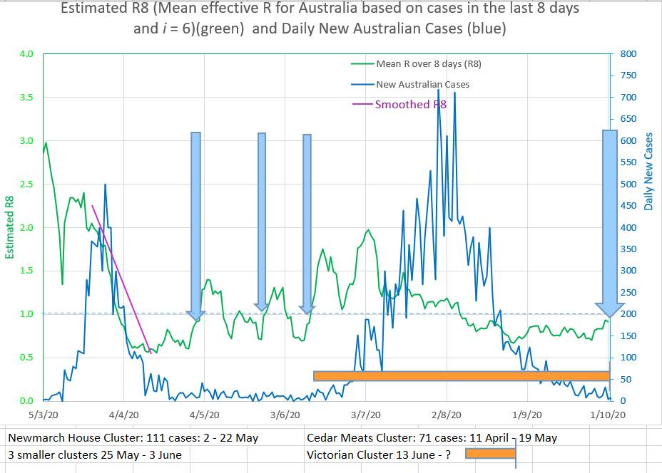 As a side issue: What is the meaning of R or mean R?
At its base, R, or a mean of R over a few days, represents the number of individuals infected by one infected individual. It seems common for an individual to be considered infected until they can be removed to the recovered or dead groups. In practice, though, an individual is only infectious until they are removed from the population by by the authorities by isolation or hospitalisation. After that they should not often be able to infect anyone. Thus R should represent the number of individuals infected by one Infecting individual. Not 'infectious' individual. That is by one individual who is potentially infecting others. Once the individual is isolated they may still be infectious but they are not infecting others and therefore do not contribute to the value of R. But at a less granular level, R may be a property of each individual (say Ri) in the population and may measure that individual's risk of catching the virus and of infecting others. Thus some individuals would have a low Ri and others would have a high Ri. Some might have an Ri of 0.2 and be of low risk of catching or transmitting the virus, while others may have an Ri of 2 and have a high risk of catching and transmitting the virus. Ri would probably have a 'normal' distribution. Thus there would be high Ri individuals in the population even if the mean R was relatively low. So there would be individuals with an Ri of 2, for example, in a population whose mean R was 0.5 An individual's Ri would be increased by living in a big family, sharing a dwelling with many others, for example a care facility or dormitory, working in an environment where isolation is difficult or in which the virus thrives, for example the cold room in a meat works, visiting pubs and clubs and shopping centers where many individuals meet, visiting many contacts, traveling on public transport, being careless with social distancing and hand-washing, being non-compliant with restrictions and being unable to understand. An individual's Ri would be decreased by living alone or with a few, staying home, keeping contacts to a minimum, not travelling on public transport, being careful with social distancing and hand-washing, being compliant with restrictions and by understanding the issues at play. Ri measures an individual's risk of catching or infecting others with the virus. A person with a high Ri is in contact with more individuals than a person with a low Ri and therefore with more high Ri individuals. Thus there is likely to be a pathway or network joining high Ri, or high risk, individuals together. As long as no one on the pathway or network catches the virus, nothing happens. Once one person on the pathway or network catches the virus there is already the potential path through which it infects the others on the pathway or network. And 'nothing happening' turns to a cluster in a short time. The concept of Ri may explain the fact that R does not fall quickly when restrictions are introduced as would be expected. Instead R follows a flat reverse S shape, but mainly follows ,a linear decrease over the course of the cluster or wave. The concept of Ri would suggest that many individuals would rapidly reduce their risk by reducing their Ri by following restrictions and infection control measures. But others would be less compliant or risk adverse and would not reduce their risk, Ri, to the same degree. Hypothetically the virus would continue to spread through these high risk networks. The observed R would be high because only those catching the virus or infecting other individuals contribute to the observed R in the population. R is the number of new infections on a day divided by the number of infecting individuals who have not yet been isolated. The rest of the population does not contribute to R in any way. As the cluster or wave continues two thing may happen. First, individuals may reduce their Ri further. Second, higher risk, high Ri, individuals are removed from the population by being infected leaving individuals who are high Ri, but not as high as the removed individuals. So the virus would still spread, but not as vigorously as before. The observed R would decrease. And the observed R would decrease slowly to a low value towards the end of the cluster or wave. Unfortunately, human behaviour being what it is, there is a tendency to ease up on compliance once the perceived danger is over. That is, before the virus is eradicated in the community. At that stage single community cases at intervals of less than 6 days signals the presence of networks of individuals with Ri of 1 or more, resulting in an observed R of 1. That is at the critical R for the start of a cluster or wave. (curve matching of Australian cases suggests that individuals are isolated after 6 days and play no further part in infecting others. One case ever 6 days suggests that one case is still infecting one other individual before being isolated and therefore the R is 1). Summary: A low number of community cases is not a good number of cases to be easing restriction on. An apparent R rising and approaching 1 is not a good time to be easing restrictions. Aim for zero community cases. An observed R of 0.6 or less is much safer than an R of 0.8 and higher. No value of R is completely safe. R is a summary value representing only those just infected and those who did the infecting. It is mathematically unconnected to the rest of the population. It is an assumption that the observed R represents a characteristic of the whole population. The concept of Ri is that Ri is a statistic of each individual in the population and is a summary measure of that individual's risk of catching and transmitting the virus. Each individual has a number of contacts. Potential pathways or networks for viral spread exists between individuals with high Ri. Early in a cluster, networks of high Ri individuals are more likely to spread the virus. Later, networks of lower Ri individuals will become more prominent. The concept of Ri suggests that the assumption that the observed R represents a characteristic of the whole population is not correct. Herding humans is as difficult as herding cats. There are good economic and psychological reasons for easing restrictions whenever possible. The problem is in deciding if and when it is possible. After the first wave Australia lifted restrictions on 1 May 2020, just when the R was near 1 and climbing. In retrospect (or predictably, since an R over 1 means an epidemic is under way) it may have not been the best time to ease restrictions as much as they did. The blue arrow in the chart below. Now Victoria is lifting restrictions while the R is above 0.8 and not definitely falling. It may be a time for caution. A low number of cases each day is not a good sign. It means the R is at or near 1 and a third wave is possible. To be a good sign the daily cases must be low AND falling. That means the new cases a day has to aim to drop to zero (for community transmission). Cautious lifting of restrictions so that R is kept at below 1 in the whole population is probably a reasonable approach. 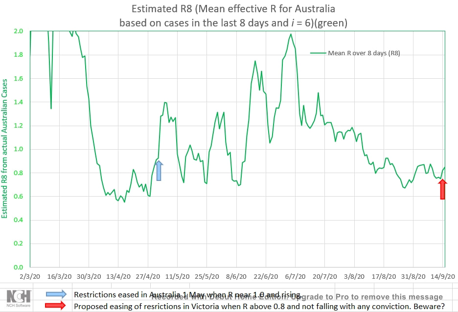 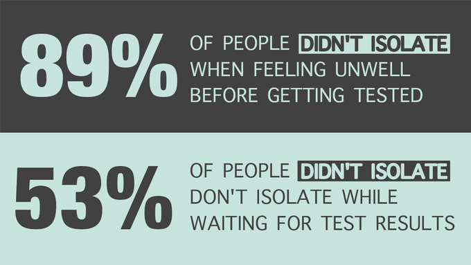 Astonishing. The non-compliance with restrictions and sound medical advice. But predictable from the the mean infection ratio over 8 days (R8) in Australia during the second wave. The reduction in R has been slow compared to the reduction in R during the first wave. See the chart below. And the R has actually climbed at times during the second wave, demonstrating a complete disregard for the restrictions and other people's health by a small number of the population. 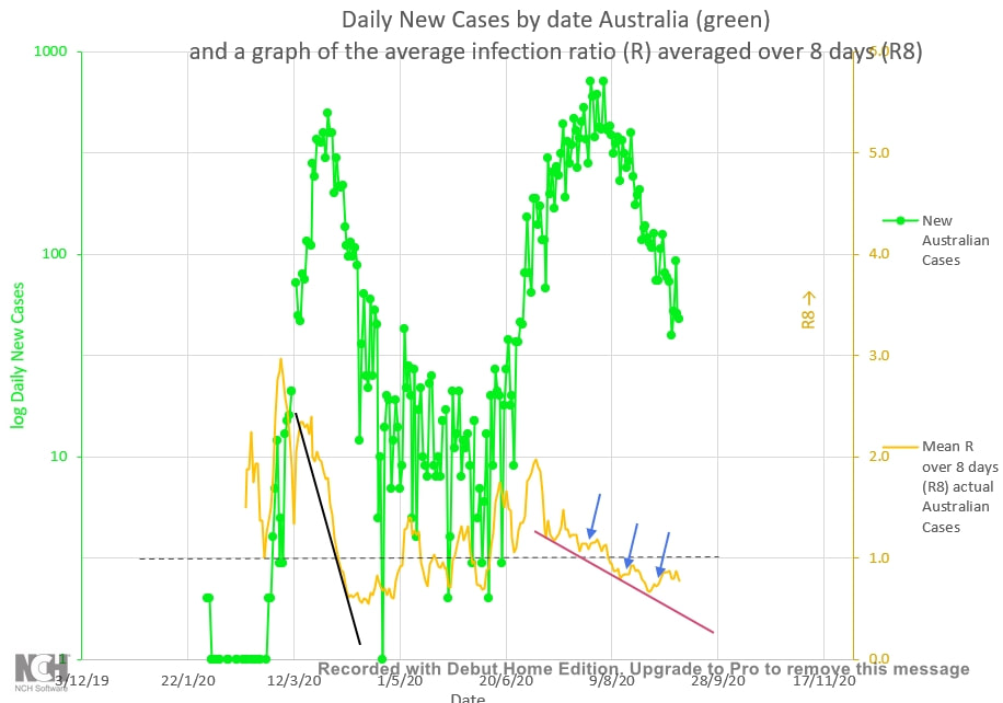 |
AuthorDr Michael Cole FRACP LLB Archives
September 2021
Categories |
- Home
- Covid-19 US stats and projections
- The Epidemic Model
- The concept of a personal R
- Contact
- Blog
- Proportion Needed to Vaccinate
- Vaccinating Children
- Cases in Isolation to end the wave
- Model Predictions for 'opening up' in NSW
- The Case Fatality Rate (CFR) in Young Children
- Effective R amongst the Still Susceptible versus eR
- Estimating the 'Safe' rate of reduction of Restrictions
 RSS Feed
