|
Victoria is easing restrictions just as the R goes down to 0.9 which is risky. An R of 1 or above signals epidemic spread, and the R has been above 1 for 9 out of the last 11 days. 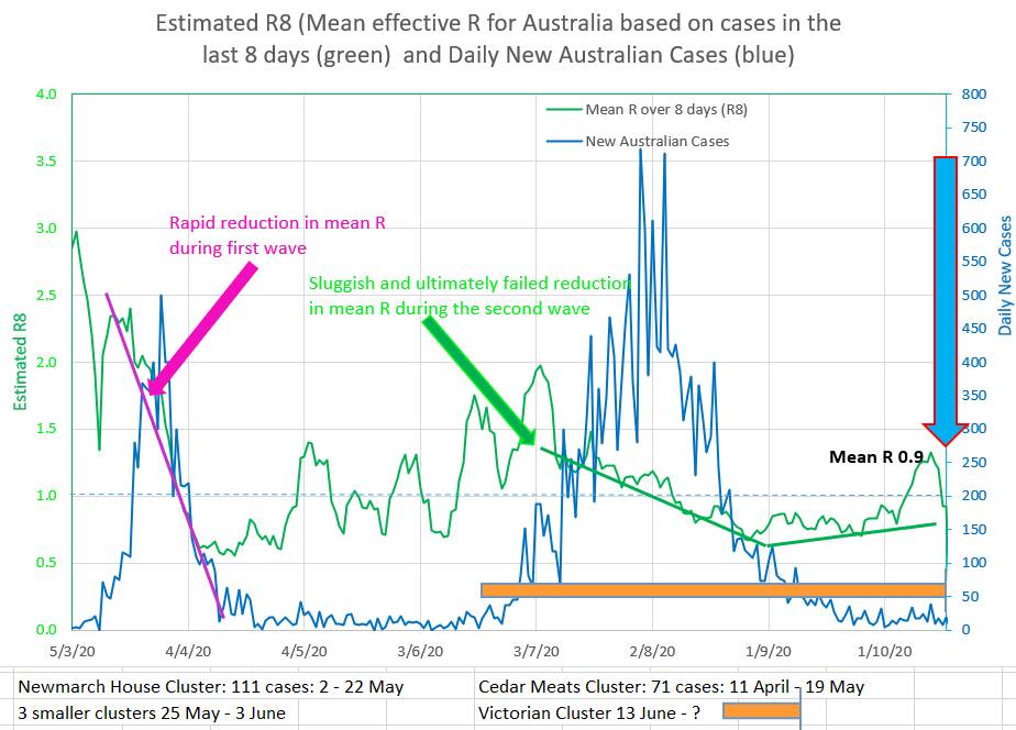 The chart below allows yellow, brown and pink straight lines to be fitted to the curve made by actual new cases in Australia (green). They are drawn by putting a value for R and the start date of the coloured graph into the appropriately coloured box on the left. That way the best fit of the coloured curves to the green Australian actual cases suggests that the value of R entered is the apparent R of the actual Australian cases. So the yellow graph suggests the apparent R was 0.75 during the late part of the second wave. The brown graph suggests a relapse during which the R rose to 1.2. And the pink graph suggests that the current Australian apparent R is about 0.85. 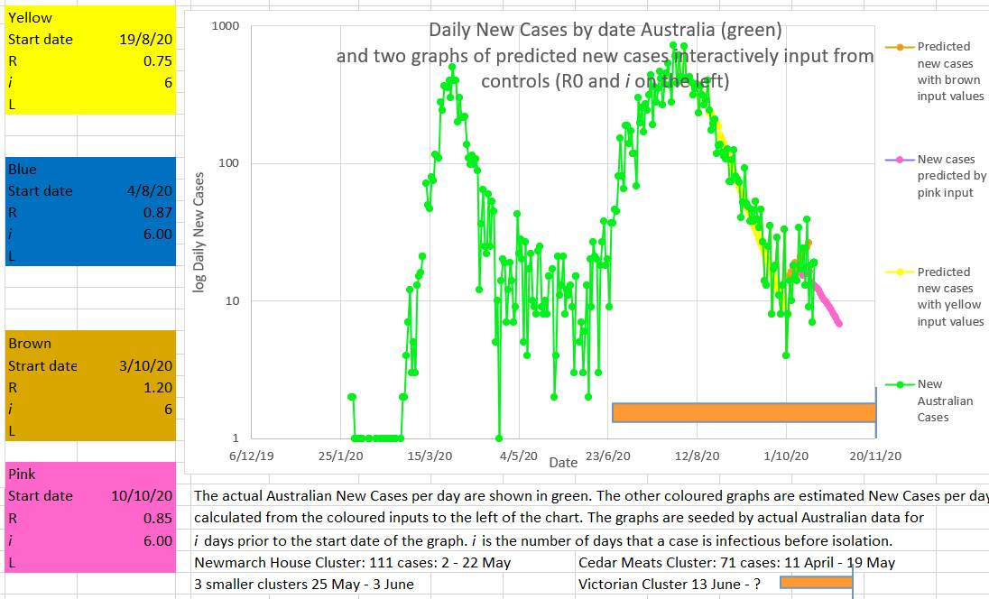 Another way to assess what the recent value of R in Australia has been doing is to try to fit a known curve (grey) to the curve of the Australian new cases curve (green). If a good fit can be made then the values used to draw the grey curve may represent the actual values in Australia. The best fit appears to be with the values input into the grey box to the left of the chart. The values producing the best or closest fit were an R starting at 1.15 on the 3/10/2020 and decreasing by 0.02 every day until 21/10/2020. Why set R to decrease by an small amount each day? Because it appears that R behaves in that way. It is counter-intuitive. You would expect R to decrease immediately, or at least quickly, to a new value as soon as restrictions are put in place. Everybody would comply with restrictions and the R would fall rapidly. But in fact, as can be seen in the top chart above, during the first and second wave the R fell consistently but slowly. The fact is that when restrictions are put in place the R falls much more slowly than the usual mathematical model of infection spread would suggest. Some have called this the wash-in period. But no part of the SIR model accounts for a wash-in period. It might be that individuals in the population have different risk factors for disease spread, like big families or habitually visiting bars, or alternatively by living alone and staying home. Different individuals may differ in their compliance. The initial observed high values of R may represent the virus spreading more easily through a network of high risk individuals (individuals with a high personal Ri). And the observed R may decrease once individuals in the high risk networks are progressively infected and the virus then can only spread through lower risk individuals (lower personal Ri). Perhaps there is another explanation. 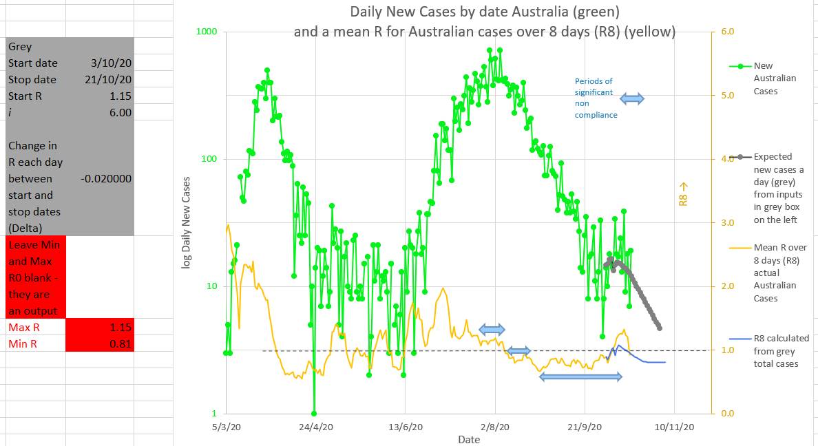
0 Comments
Leave a Reply. |
AuthorDr Michael Cole FRACP LLB Archives
September 2021
Categories |
- Home
- Covid-19 US stats and projections
- The Epidemic Model
- The concept of a personal R
- Contact
- Blog
- Proportion Needed to Vaccinate
- Vaccinating Children
- Cases in Isolation to end the wave
- Model Predictions for 'opening up' in NSW
- The Case Fatality Rate (CFR) in Young Children
- Effective R amongst the Still Susceptible versus eR
- Estimating the 'Safe' rate of reduction of Restrictions
 RSS Feed
