|
Now that the second wave is coming under control are there any lessons from past events? Here are some possible lessons - and below them, the reasons for the suggestions.
 And here are the reasons for the above suggested lessons from the Australian new cases till now:
0 Comments
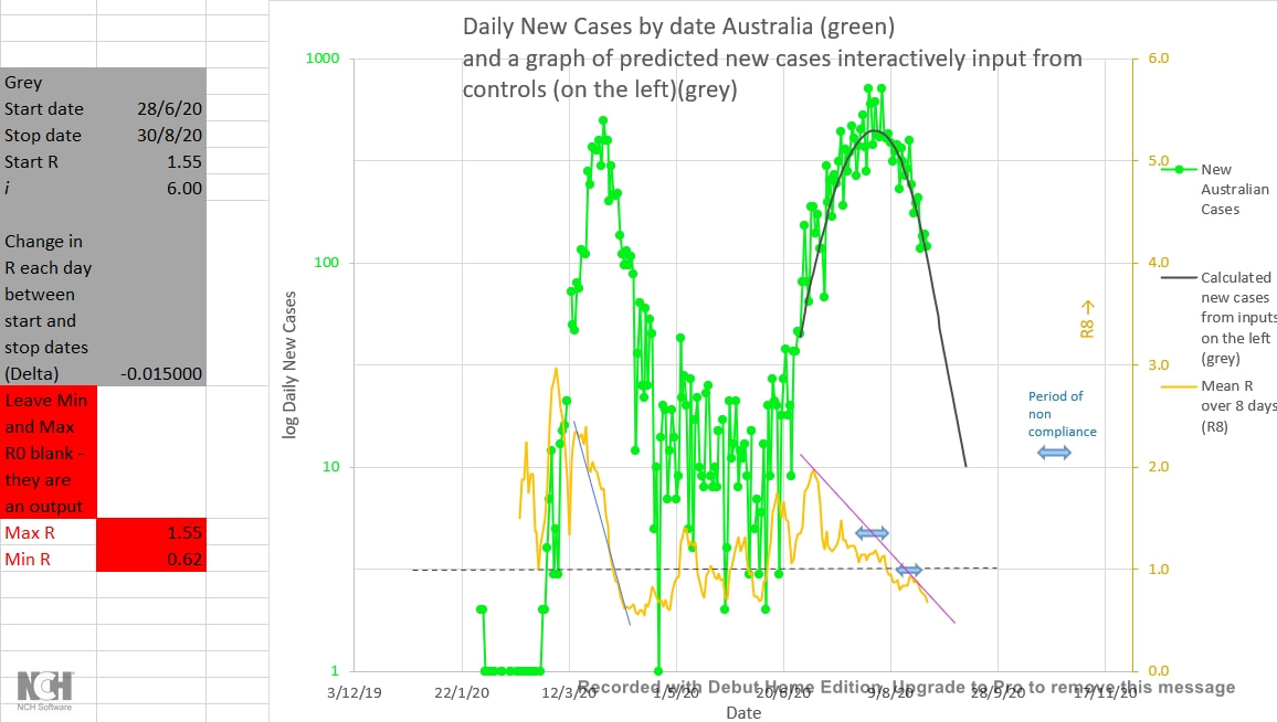
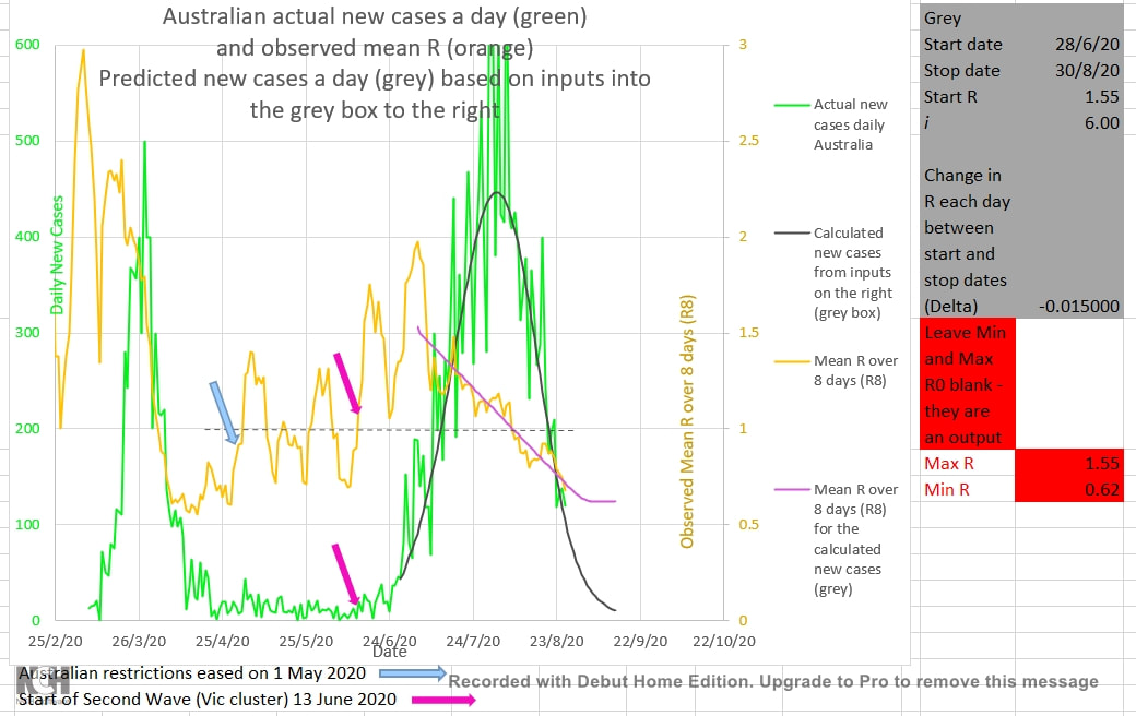
It appears that Victoria (and Australia) are still on track to get down to single digit New Cases per day by mid-September as the second chart below suggested on 26 July 2020. Admittedly, it looked shaky a few times. Some residents were non-compliant with restrictions during the two periods shown with light blue arrows below. And the rate of reduction in the infection ratio (shown by R8, the 8 day mean of the daily R calculated from the actual Australian cases) was slower in this second wave (the purple trend-line) than it was during the first wave (the blue trend-line). The grey curve shows the number of New Cases a day predicted by the epidemic model using the inputs in the grey box to the left of the chart. The curve is seeded from the actual Australian cases for the 8 days prior to the start date of the curve (set at 28/6/2020) and the start date, the initial R, the rate of fall of R, the i , and the stop date for the fall of R (the infection ratio). The best match to the curve of the actual Australian cases was as shown. R is best set set to fall by 0.015 each day from 1.55 between the start date and the stop date (30/8/2020) after which it remains unchanged. R therefore falls from 1.55 to 0.62 during this period. The actual Australian new cases per day is shown in green, and they appear to be following and well matched to the grey curve.  The chart below shows the actual Australian new cases a day on 26 July 2020 in green. Various values had been input into the grey box on the left of the chart in order generate the grey curve to best match the actual Australian new cases up to that time. R increases and i (the number of days a case remains infectious before the cases is removed from the population by isolation) decreases the slope of the grey curve at any point. Thus, only one value of R/i will best match the slope of the curve of actual Australian cases. The value of 6 for i best matched the first wave of Australian cases. R had fallen steadily during the first wave, and so was expected to fall steadily during this second wave. It should be noted that i is not the number of days a case is actually or medically infectious. It is the number of days that a cases can infect another in practice because it is the number of days after infection until the case is removed from infecting the population by being isolated or medically managed. 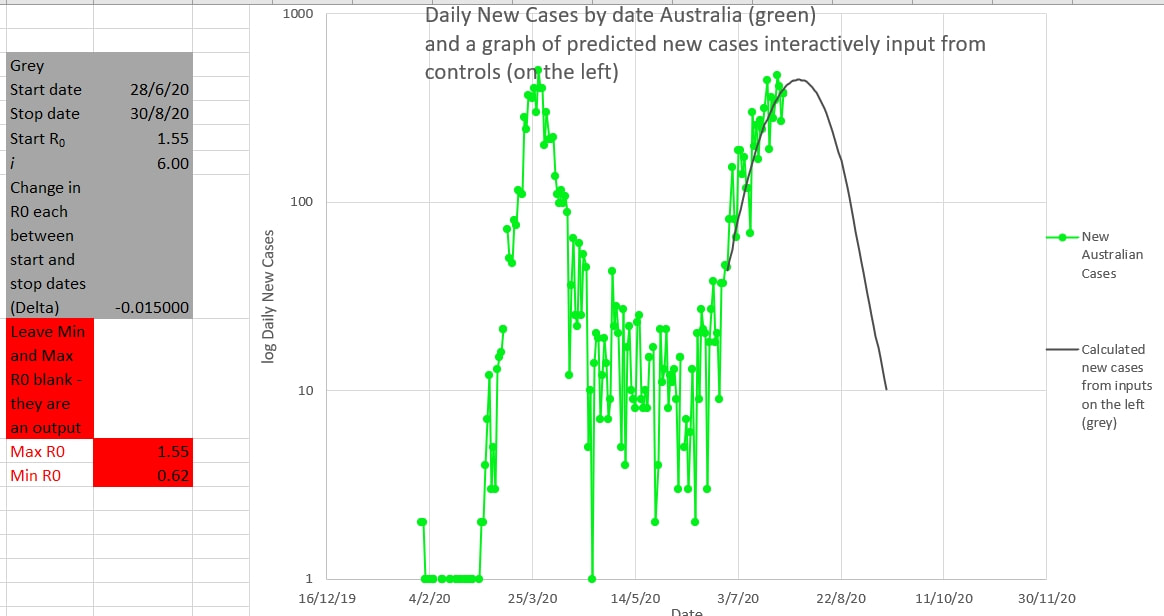 Victoria has probably got the outbreak licked. The mean R calculated over 8 days (R8) is now under 1.0 and falling (light blue). Hopefully the actual Australian New Cases per day (green) will follow the grey graph which predicts the daily new cases if the R follows the values input in the grey box to the right. That is that the R should start at 1.55 on the 28 June (where it actually was) and then fall by 0.015 a day until 30 August. R had been falling at that rate in late June, and with better policing of restrictions R is now falling by at least that rate. So, the cluster (second wave?) may be down to single digit figure new cases by mid-September. An R increasing over 1.0 appears to be a good early warning of the start of a cluster. Waiting for the numbers to increase so that the cluster can be perceived is probably waiting too long. In preventive Medicine 'nothing happened' is a good outcome, not a cause for criticism. 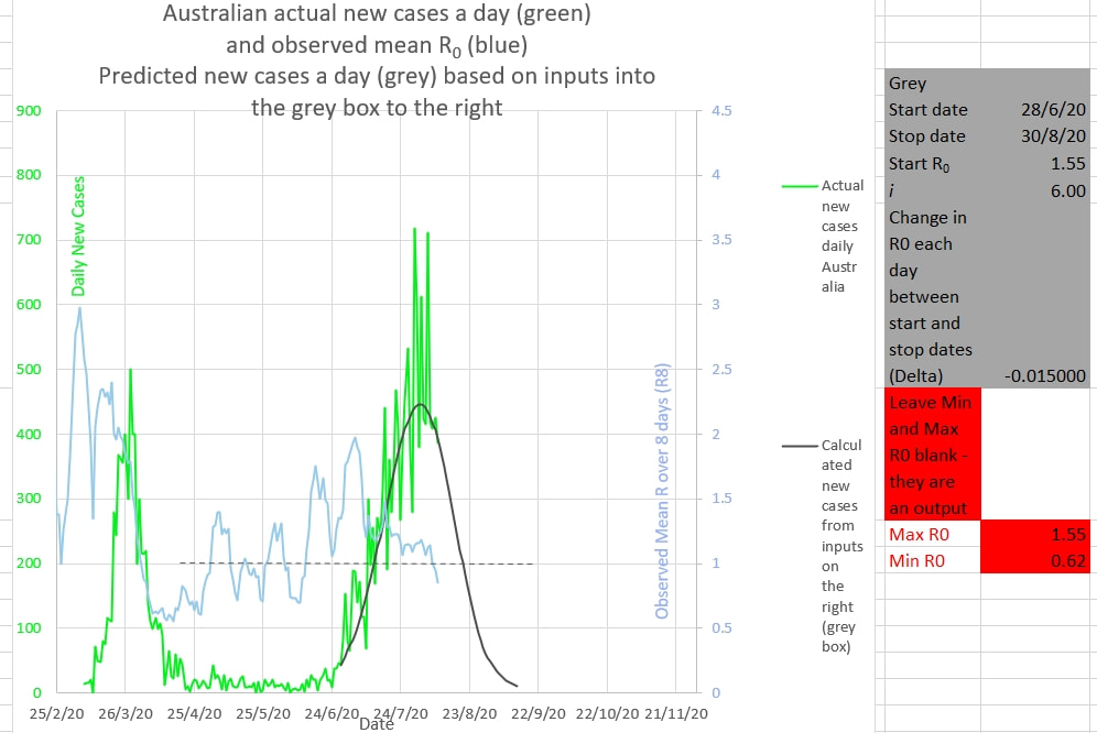 The R0 in Victoria stopped decreasing after the 25th July (in very light blue for the Australian R0). Action taken by the Victorian government to enforce policing of people in isolation will start the R0 deducing again.  The R0 had reduced to 1.1 (shown by the dark blue graph generated mathematically from values input into the blue box on the left), but did not reduce further. So near, but so far, from decreasing below 1. 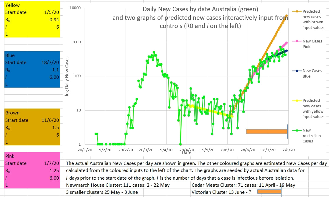 |
AuthorDr Michael Cole FRACP LLB Archives
September 2021
Categories |
 RSS Feed