|
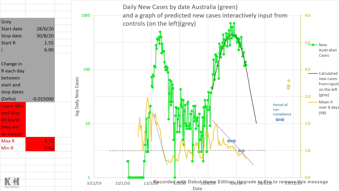
Compliance Fatigue or increasing distrust of authority may well explain the recurrent recent period where the average R (infection rate) for Australia has actually gone up instead of down (orange curve below). When the number of new cases is low that probably represents the behaviour or views of a small number in the population. But it represents a risk because those very individuals may be networked to other similar individuals, making an easy path of 'least resistance' for viral spread. Perhaps (human) behavioural science could suggest ways in which compliance and trust could be improved and fatigue reduced. 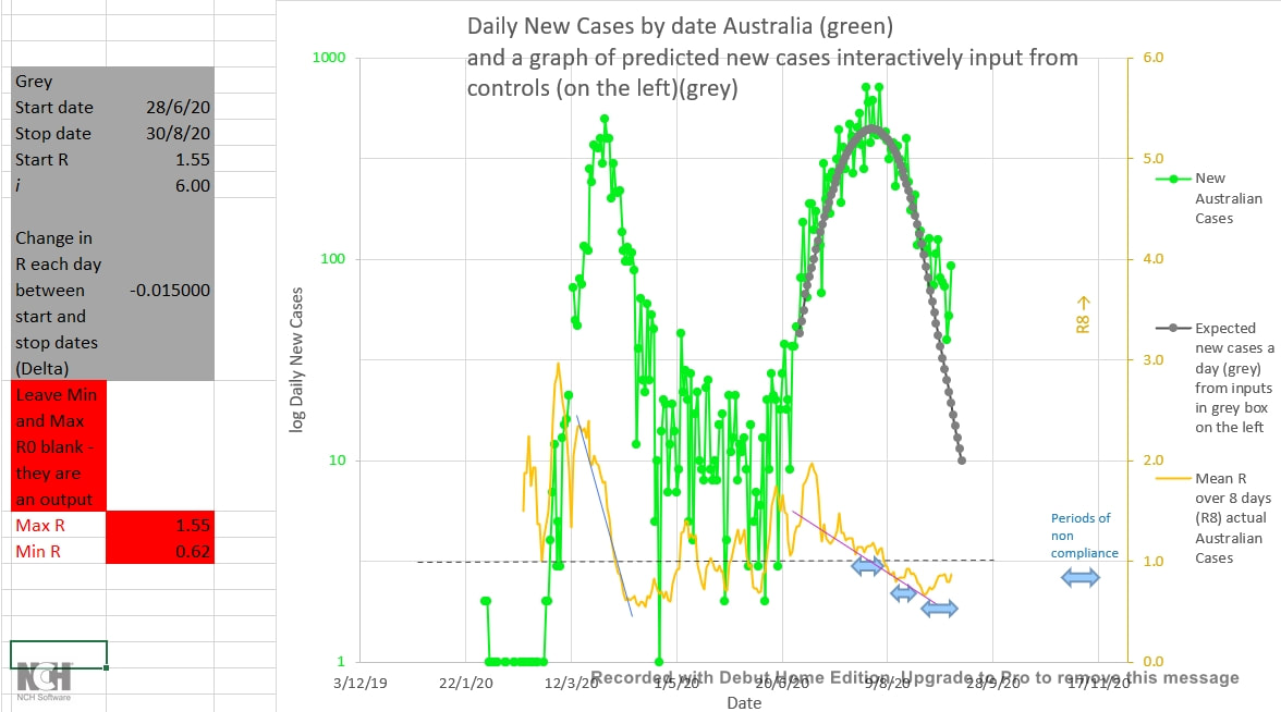 Human Behaviour probably also accounts for the fact that the R8 (apparent average infection rate averaged over 8 days) fell faster in the first wave than the second wave, and fell cleanly in the first wave but often unfortunately rose again in the second wave. (The orange curve above, and the green curve below.) If everyone was 'on board' and compliant as soon as restriction were put in place, the R or R8 should fall immediately and rapidly. Instead R or R8 falls over a number of days, probably indicating that more individuals become adequately compliant over time. Maybe there is a learning curve or a necessary preparation time or a peer effect (a greater pressure to do what others are doing). 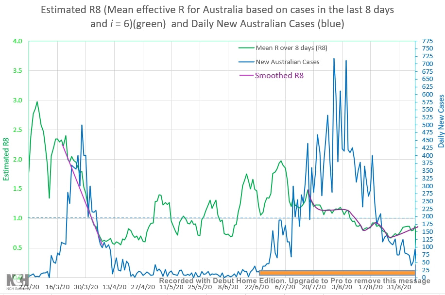 The earlier prediction that Australia would be down to single digit new cases a day by mid-September was based on the inputs shown in the grey box to the right of the chart below. The inputs were based on the shape of the curve of new Australian cases a day (green curve below) during the early part of the second wave. The R was expected to start at 1.55 on 28 June 2020 and decrease by 0.015 a day until 30 August (the purple line or curve below). The earlier prediction was fairly accurate except that the R did not fall steadily as expected, but often rebounded again and is nor rising towards 1 (a definite risk of another cluster or wave; the purple arrow versus the blue arrow). 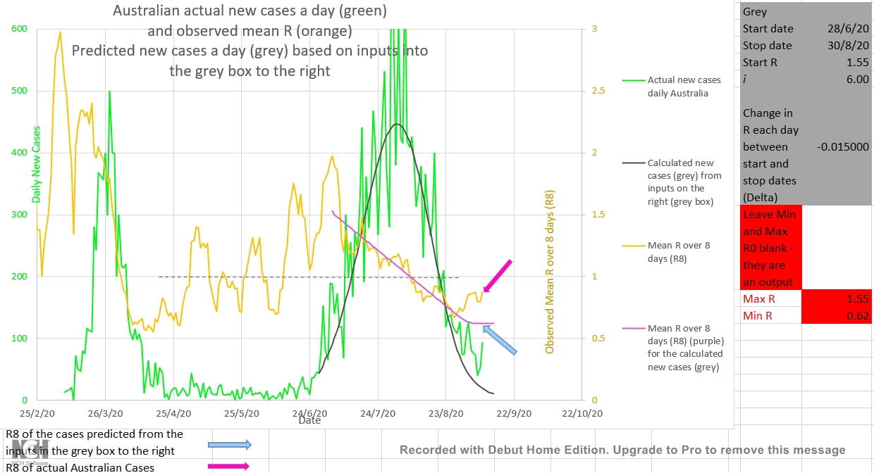 Various coloured curves (below) were fitted to the actual Australian new cases a day (green curve) at different periods during the second wave. Early on an R of 1.5 in the mathematical infection model matched the actual cases (brown curve). Later the pink curve, plotted from inputs in the pink box to the left of the chart, with an input for R of 1.25 matched the actual cases. As the second wave began to come under control an R of 0.87 generated a blue curve which best fitted the actual cases and finally, now, it appears that an R of 0.75 (the yellow curve) best fits the current Australian cases. The earlier prediction seems increasingly unlikely, but a least the cases will continue to fall as long as the R does not continue to rise. The way forward may lie in social behavioural science. 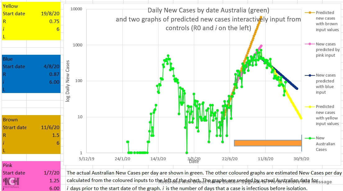
0 Comments
Now that the second wave is coming under control are there any lessons from past events? Here are some possible lessons - and below them, the reasons for the suggestions.
 And here are the reasons for the above suggested lessons from the Australian new cases till now:
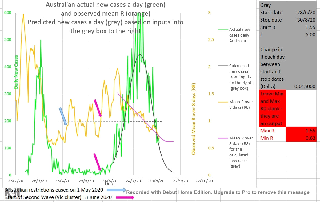 It appears that Victoria (and Australia) are still on track to get down to single digit New Cases per day by mid-September as the second chart below suggested on 26 July 2020. Admittedly, it looked shaky a few times. Some residents were non-compliant with restrictions during the two periods shown with light blue arrows below. And the rate of reduction in the infection ratio (shown by R8, the 8 day mean of the daily R calculated from the actual Australian cases) was slower in this second wave (the purple trend-line) than it was during the first wave (the blue trend-line). The grey curve shows the number of New Cases a day predicted by the epidemic model using the inputs in the grey box to the left of the chart. The curve is seeded from the actual Australian cases for the 8 days prior to the start date of the curve (set at 28/6/2020) and the start date, the initial R, the rate of fall of R, the i , and the stop date for the fall of R (the infection ratio). The best match to the curve of the actual Australian cases was as shown. R is best set set to fall by 0.015 each day from 1.55 between the start date and the stop date (30/8/2020) after which it remains unchanged. R therefore falls from 1.55 to 0.62 during this period. The actual Australian new cases per day is shown in green, and they appear to be following and well matched to the grey curve.  The chart below shows the actual Australian new cases a day on 26 July 2020 in green. Various values had been input into the grey box on the left of the chart in order generate the grey curve to best match the actual Australian new cases up to that time. R increases and i (the number of days a case remains infectious before the cases is removed from the population by isolation) decreases the slope of the grey curve at any point. Thus, only one value of R/i will best match the slope of the curve of actual Australian cases. The value of 6 for i best matched the first wave of Australian cases. R had fallen steadily during the first wave, and so was expected to fall steadily during this second wave. It should be noted that i is not the number of days a case is actually or medically infectious. It is the number of days that a cases can infect another in practice because it is the number of days after infection until the case is removed from infecting the population by being isolated or medically managed. 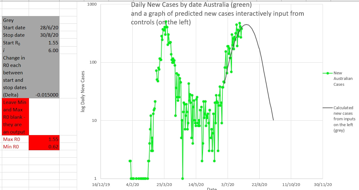 Victoria has probably got the outbreak licked. The mean R calculated over 8 days (R8) is now under 1.0 and falling (light blue). Hopefully the actual Australian New Cases per day (green) will follow the grey graph which predicts the daily new cases if the R follows the values input in the grey box to the right. That is that the R should start at 1.55 on the 28 June (where it actually was) and then fall by 0.015 a day until 30 August. R had been falling at that rate in late June, and with better policing of restrictions R is now falling by at least that rate. So, the cluster (second wave?) may be down to single digit figure new cases by mid-September. An R increasing over 1.0 appears to be a good early warning of the start of a cluster. Waiting for the numbers to increase so that the cluster can be perceived is probably waiting too long. In preventive Medicine 'nothing happened' is a good outcome, not a cause for criticism. 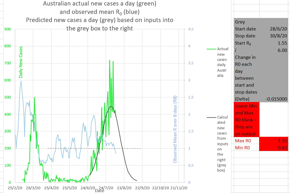 The R0 in Victoria stopped decreasing after the 25th July (in very light blue for the Australian R0). Action taken by the Victorian government to enforce policing of people in isolation will start the R0 deducing again.  The R0 had reduced to 1.1 (shown by the dark blue graph generated mathematically from values input into the blue box on the left), but did not reduce further. So near, but so far, from decreasing below 1. 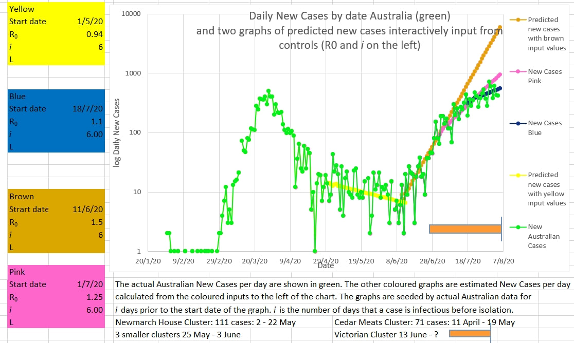 The illustration below shows the green curve of new Australian cases progressively flattening. At first the Victorian cluster matched the brown graph which is set to follow an R0 of 1.5. Then the Australian cases flattened to follow the pink graph which is set to follow an R0 of 1.25. And now the Australian new cases (green) appear to be flattening more and following the blue graph which is set for an R0 of 1.1. The Graph of Australian new cases has highs and lows - hopefully the two recent high new cases figures are just that - highs to be followed by lows to keep the cluster on track for ending. 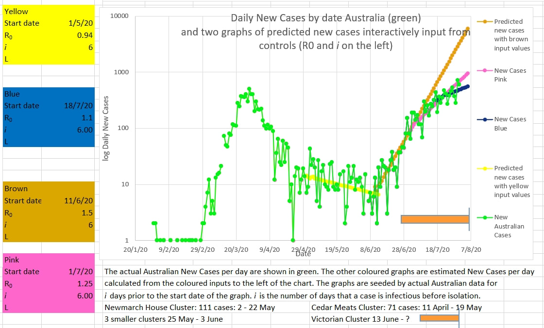 The graph below appears to show the Victorian cluster flattening. The average R0 over 8 days (R8) is shown in very light blue. It has been falling adequately. But is still above 1. The crazies who have not followed sensible and reasonable instructions and laws need to be reined in to ensure the R0 continues to fall. 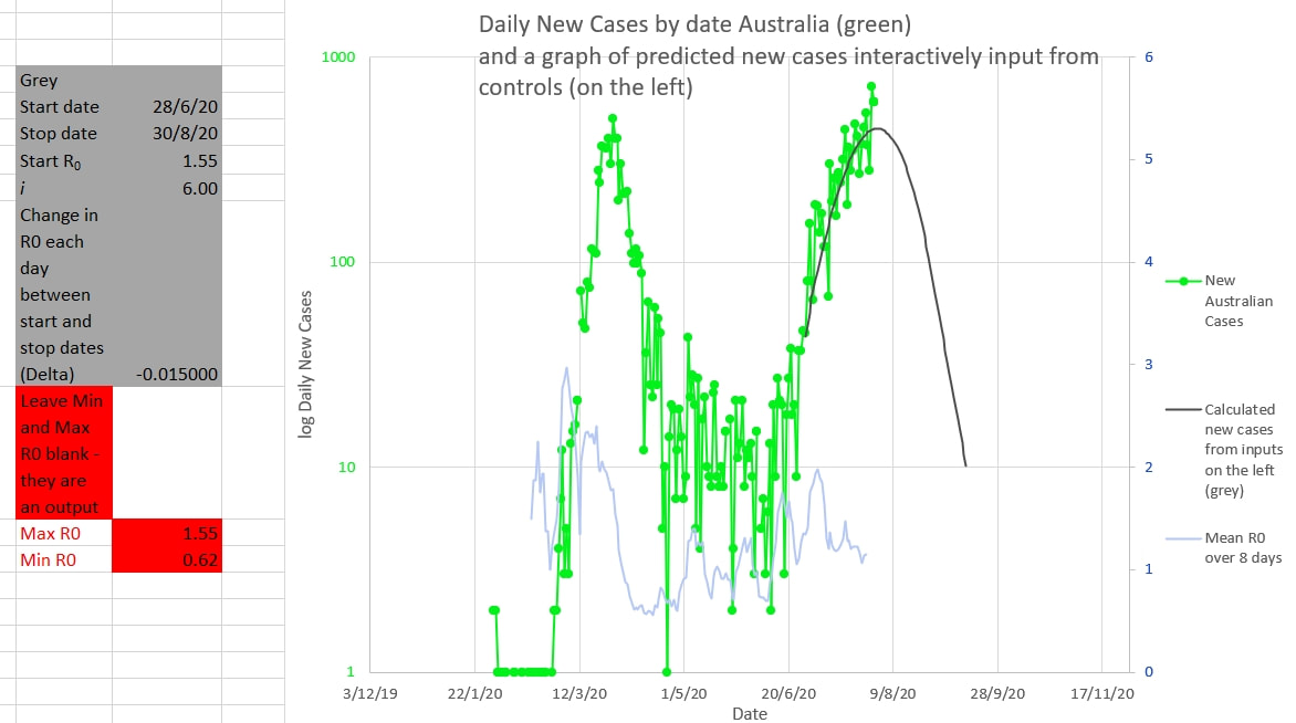 Victoria is still on track to end the cluster by mid September. The grey graph below is drawn using the inputs in the grey box to the right, using the actual Australian cases up to the chosen Start date. The inputs are changed until the grey graph matches the green graph of actual new Australian cases as closely as possible - the same height and same curve as the green graph. The R0 changes each day by the amount called 'Delta' in the grey box. The mean of R0 over 8 days is shown in light blue. The grey graph suggests that cases will be down to single digit numbers by mid September. 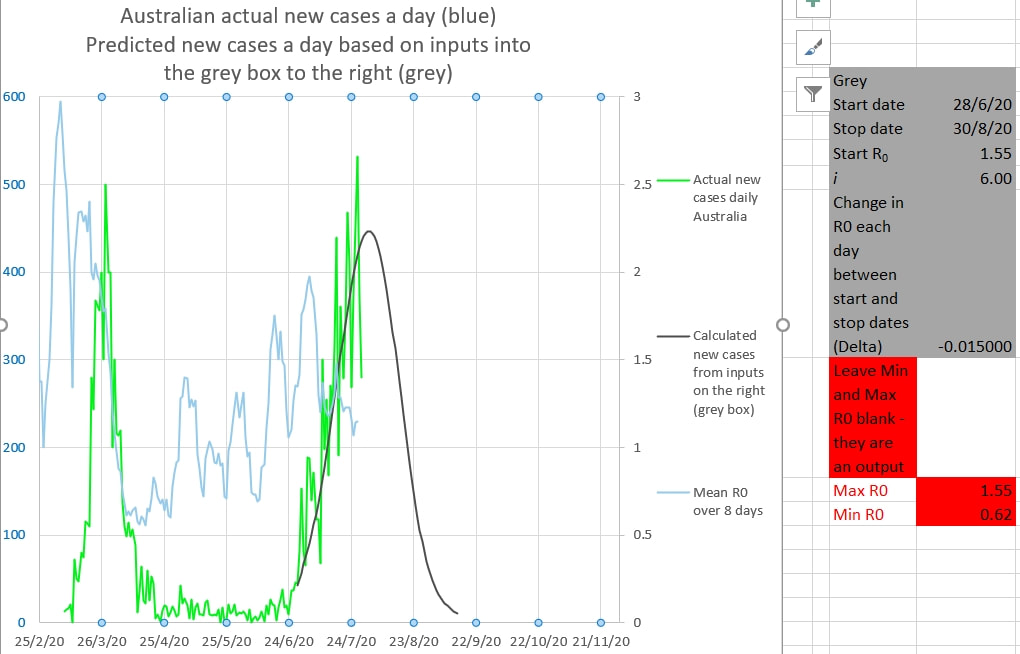 The same thing is shown on the chart below. The daily cases are in log scale.  Why decrease the R0 of the grey graph by a small amount each day? Because the apparent R0 during the 'first wave' decreased each day by a small amount. The apparent R0 during the 'first wave' decreased each day almost linearly (in a straight line) from about 3 to 0.55 from the start to just after the peak of the wave. It seems counter-intuitive, but that is what it was seen to do. Intuitively it might have been expected to drop down to a new steady R0 soon after restrictions were applied or to have changed exponentially or logarithmically. But that was not the case.
Fro the Model calculating the grey curve click here Residents in Aged Care facilities need extra precautions and care. They probably should be treated by the same strategy used for passengers on cruise ships. That is, either very early and very aggressive isolation and quarantine measures, OR early removal of individuals to other safer accommodation. It is possible that this is because the R0 for these individuals is much greater than the average 2.2.
R0 depends on the place or space under consideration as much as it does on the virus itself. The virus that causes Covid-19 is said to have an average R0 of about 2.2, but that is an average. The average person lives in an average home with an average number of family members and uses an average amount of public transport etc and for them the apparent R0 is about 2.2. But if a person lives in a dormitory with many people, or has a large number of family members living in the same house, or travels a lot on crowded public transport, then the chance of infection, and therefore the R0, goes up. The same for crowded workplaces where social distancing is difficult. The same for cruise ships. And the same for Aged Care facilities. In those cases the R0 is probably much higher than 2.2 and the virus spreads quickly. It spreads exponentially. And exponential spread goes from 'no problem' through 'there might be a problem' to 'there is a severe problem' in a flash. Should Aged Care facilities be managed with the same care as a Covid hospital ward early or should the residents be moved out (where possible) to safer accommodation early? I think the answer is Yes. Curve matching suggests that the Victorian Cluster is slowly coming under control. The actual Australian cases are shown in green below. The grey curve is produced by inputting values into the grey box on the left of the chart. The input values can be changed until the grey curve matches the green green curve of the Australian cases. The best match appears to be produced by inputting an initial R0 of 1.55 starting on 28/6/2020 (which is consistent with estimates of the R0 at the time) and decreasing R0 by 0.015 (Delta) until 30/8/2020 - which results in a final R0 of 0.62 (which is consistent with the observed R0 at the end of the March/April cluster). The grey curve certainly appears to match the actual Australian cases that it overlies. And it may continue to match the future daily cases, but that is not certain. The curve matching suggests that if current restictions continue the cluster may be down to single digit figures by mid September. It is probably not reasonable to predict new case numbers near or below 10 using this Epidemic Model. Click Here. The chart below shows the same curves without the new cases being in log scale 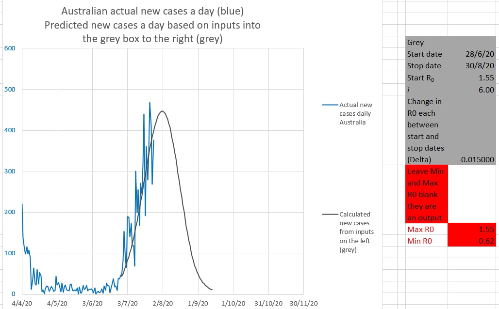 The chart below shows the curves matching recent Australian new cases. The Victorian cluster appeared to have an R0 of 1.5 (the matching brown curve) initially, which then appeared to reduce to an R0 of 1.25 in late June (the matching pink curve). These curves are drawn from the data entered into the boxes on the left. 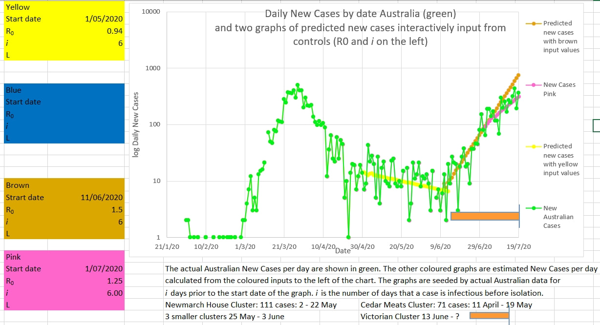 The chart below suggests that the effective mean R0 over the past 8 days (called R8 in the Model) is at last approaching the critical value of 1 a point at which new infections would no longer be exponential. 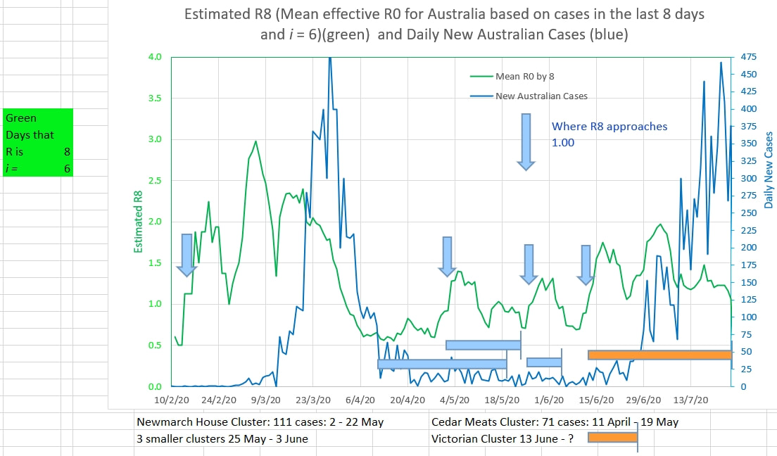 The graph below suggests that the R0 in Australia has fallen from 1.5 to 1.25 since the middle of June. The green graph is the total cases a day in Australia and the brown and pink graphs are 'best fitted' to the green graph by inputting various values of R0 and i (days a case can infect others until isolated) into the brown and pink boxes on the right. 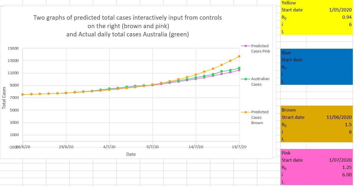 |
AuthorDr Michael Cole FRACP LLB Archives
September 2021
Categories |
 RSS Feed