|
The illustration below shows the green curve of new Australian cases progressively flattening. At first the Victorian cluster matched the brown graph which is set to follow an R0 of 1.5. Then the Australian cases flattened to follow the pink graph which is set to follow an R0 of 1.25. And now the Australian new cases (green) appear to be flattening more and following the blue graph which is set for an R0 of 1.1. The Graph of Australian new cases has highs and lows - hopefully the two recent high new cases figures are just that - highs to be followed by lows to keep the cluster on track for ending. 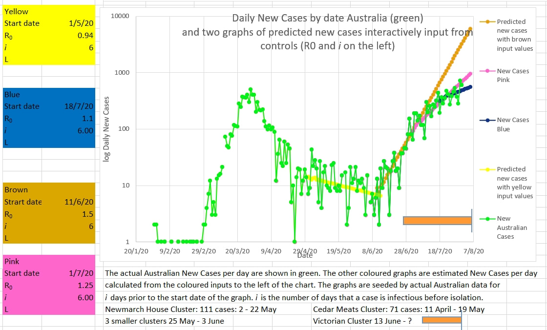 The graph below appears to show the Victorian cluster flattening. The average R0 over 8 days (R8) is shown in very light blue. It has been falling adequately. But is still above 1. The crazies who have not followed sensible and reasonable instructions and laws need to be reined in to ensure the R0 continues to fall. 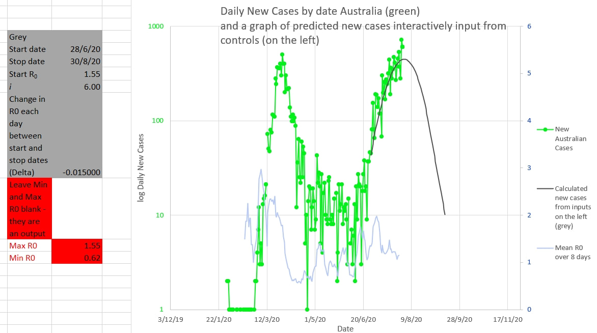
0 Comments
Leave a Reply. |
AuthorDr Michael Cole FRACP LLB Archives
September 2021
Categories |
- Home
- Covid-19 US stats and projections
- The Epidemic Model
- The concept of a personal R
- Contact
- Blog
- Proportion Needed to Vaccinate
- Vaccinating Children
- Cases in Isolation to end the wave
- Model Predictions for 'opening up' in NSW
- The Case Fatality Rate (CFR) in Young Children
- Effective R amongst the Still Susceptible versus eR
- Estimating the 'Safe' rate of reduction of Restrictions
 RSS Feed
