|
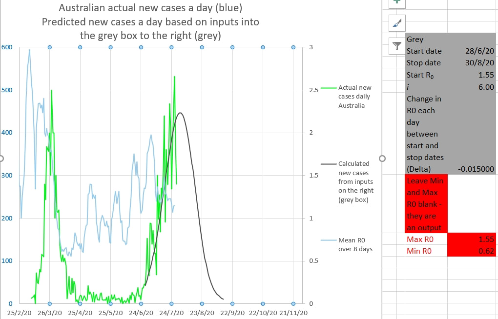
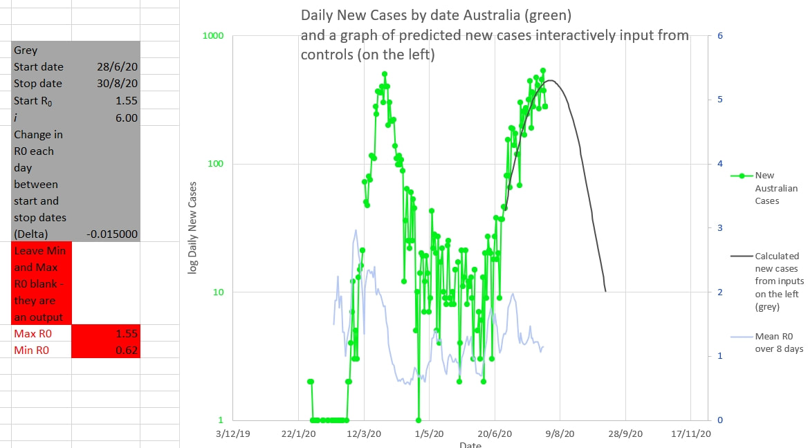
Victoria is still on track to end the cluster by mid September. The grey graph below is drawn using the inputs in the grey box to the right, using the actual Australian cases up to the chosen Start date. The inputs are changed until the grey graph matches the green graph of actual new Australian cases as closely as possible - the same height and same curve as the green graph. The R0 changes each day by the amount called 'Delta' in the grey box. The mean of R0 over 8 days is shown in light blue. The grey graph suggests that cases will be down to single digit numbers by mid September. The same thing is shown on the chart below. The daily cases are in log scale. Why decrease the R0 of the grey graph by a small amount each day? Because the apparent R0 during the 'first wave' decreased each day by a small amount. The apparent R0 during the 'first wave' decreased each day almost linearly (in a straight line) from about 3 to 0.55 from the start to just after the peak of the wave. It seems counter-intuitive, but that is what it was seen to do. Intuitively it might have been expected to drop down to a new steady R0 soon after restrictions were applied or to have changed exponentially or logarithmically. But that was not the case.
Fro the Model calculating the grey curve click here
0 Comments
Leave a Reply. |
AuthorDr Michael Cole FRACP LLB Archives
September 2021
Categories |


 RSS Feed