|
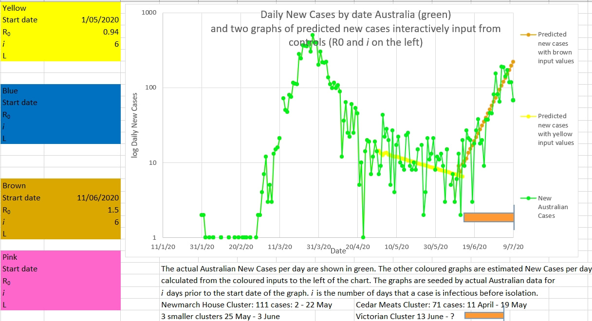
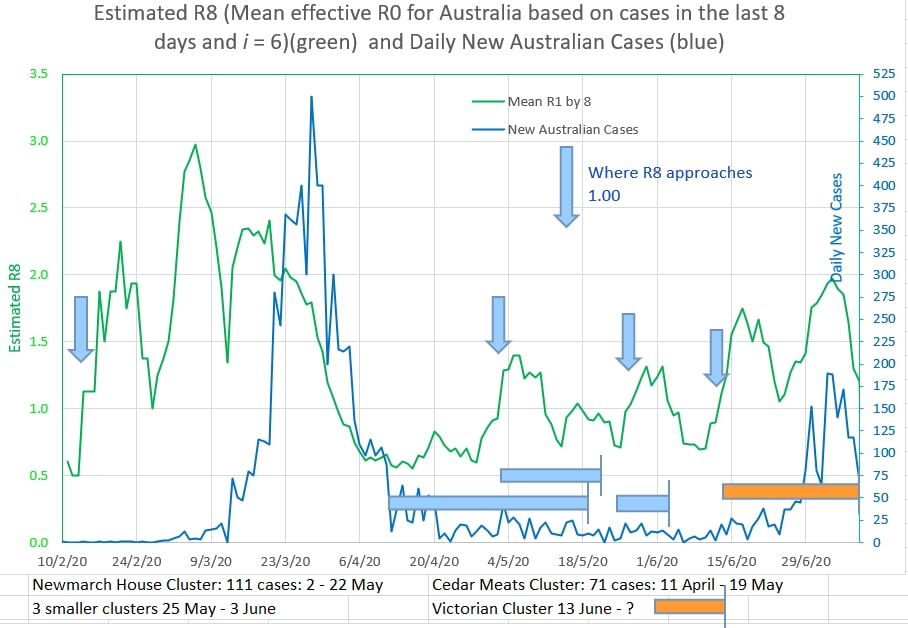
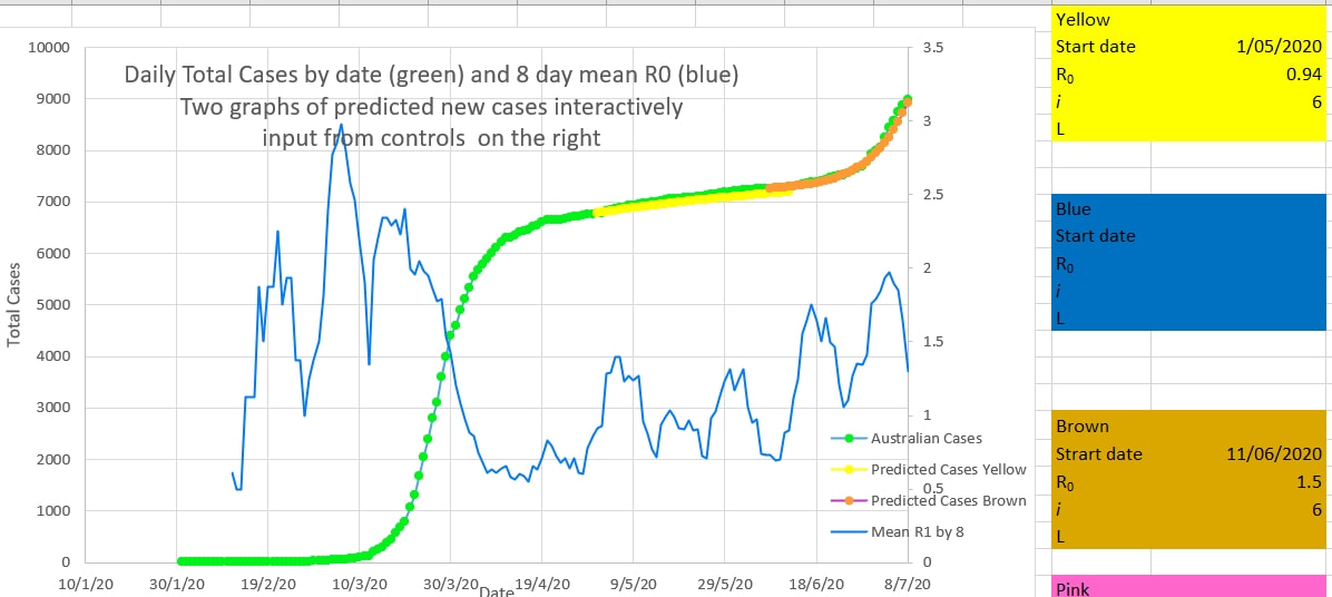
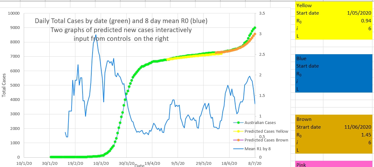
The Victorian cluster appears to be coming under control. The recent trend in new cases (brown on the chart below) appears to have ended and new cases will probably continue to decline (on average) from now on. The apparent R0 has been 1.5 during the onset of the cluster. Inputs for R0 and i (the number of days a case is infectious before being isolated from the population) are input into the brown box to the left of the chart. The brown graph is plotted using these inputs. The inputs are changed interactively until the brown graph best fits the actual cases (green). An i of 6 best fitted the graph during the first wave in Australia. It is likely that Australia's rapid removal of cases into isolation, because they were symptomatic or tested positive, was successful in reducing i to 6. The inputs required to best fit the brown graph to the green actual cases suggests that the R0 during that period was 1.5 The mean R0 over 8 days (green) suggests a declining R0 together with declining new cases per day (blue). The cluster may come under control fairly rapidly, as long as no case is outside the lock-down perimeters. When fitting the curves above to the new cases it is important to fit the curve to the total cases. A good fit on either one of the new cases or the total cases does not necessarily mean that there will be a good fit on the other, as shown below where an R0 of 1.45 or 1.5 fits the new cases equally well, but 1.5 is definitely a better fit on the total cases.
0 Comments
Leave a Reply. |
AuthorDr Michael Cole FRACP LLB Archives
September 2021
Categories |


 RSS Feed