|
The graph below suggests that the R0 in Australia has fallen from 1.5 to 1.25 since the middle of June. The green graph is the total cases a day in Australia and the brown and pink graphs are 'best fitted' to the green graph by inputting various values of R0 and i (days a case can infect others until isolated) into the brown and pink boxes on the right. 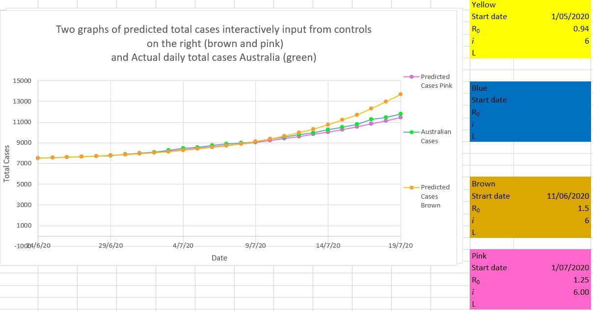
0 Comments
Leave a Reply. |
AuthorDr Michael Cole FRACP LLB Archives
September 2021
Categories |
- Home
- Covid-19 US stats and projections
- The Epidemic Model
- The concept of a personal R
- Contact
- Blog
- Proportion Needed to Vaccinate
- Vaccinating Children
- Cases in Isolation to end the wave
- Model Predictions for 'opening up' in NSW
- The Case Fatality Rate (CFR) in Young Children
- Effective R amongst the Still Susceptible versus eR
- Estimating the 'Safe' rate of reduction of Restrictions
 RSS Feed
