|
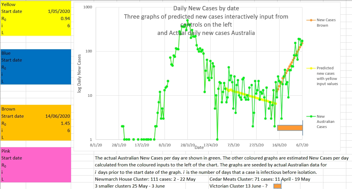
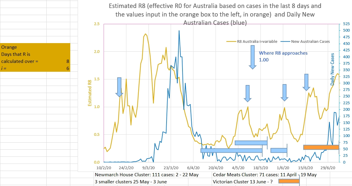
The Victorian cluster may be nearing its peak. If the new cases a day is 100 or less then it is likely the cluster cases have peaked and daily cases would fall. 100 is below the upward trend line of the lowest lows that have been reported during the rise in cases. In traditional chart trading crossing the trend of the lowest lows of an uptrend signals a change of trend to downwards. The math model for graphing the yellow and brown graphs is here . The input values in the coloured boxes on the left of the chart are inputs for the yellow and brown graphs - R0 is the input infection rate and i is the input number of days on average a case is infectious to others before being removed from the population by effective isolation. R8 is the estimated R0 calculated from the cases over the previous 8 days. i is input into the orange box to the left of the chart and is the number of days on average a cases is infectious to others before being removed from the population and isolated. i was estimated to be 6 during the first wave in Australia using this model.
1 Comment
|
AuthorDr Michael Cole FRACP LLB Archives
September 2021
Categories |


 RSS Feed