|
The pink graph below, which is 'fitted' to the actual Australian new cases a day using the values input into the pink box to the left of the chart, suggests that the apparent R0 is falling from 1.5 (the brown fitted graph) to about 1.25 (the pink graph). However, it is still too early to call a change of trend because the trend-line, shown in a graph yesterday, remain unbroken. 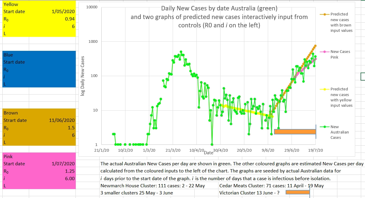
0 Comments
Leave a Reply. |
AuthorDr Michael Cole FRACP LLB Archives
September 2021
Categories |
- Home
- Covid-19 US stats and projections
- The Epidemic Model
- The concept of a personal R
- Contact
- Blog
- Proportion Needed to Vaccinate
- Vaccinating Children
- Cases in Isolation to end the wave
- Model Predictions for 'opening up' in NSW
- The Case Fatality Rate (CFR) in Young Children
- Effective R amongst the Still Susceptible versus eR
- Estimating the 'Safe' rate of reduction of Restrictions
 RSS Feed
