|
Curve matching suggests that the Victorian Cluster is slowly coming under control. The actual Australian cases are shown in green below. The grey curve is produced by inputting values into the grey box on the left of the chart. The input values can be changed until the grey curve matches the green green curve of the Australian cases. The best match appears to be produced by inputting an initial R0 of 1.55 starting on 28/6/2020 (which is consistent with estimates of the R0 at the time) and decreasing R0 by 0.015 (Delta) until 30/8/2020 - which results in a final R0 of 0.62 (which is consistent with the observed R0 at the end of the March/April cluster). The grey curve certainly appears to match the actual Australian cases that it overlies. And it may continue to match the future daily cases, but that is not certain. The curve matching suggests that if current restictions continue the cluster may be down to single digit figures by mid September. It is probably not reasonable to predict new case numbers near or below 10 using this Epidemic Model. Click Here. 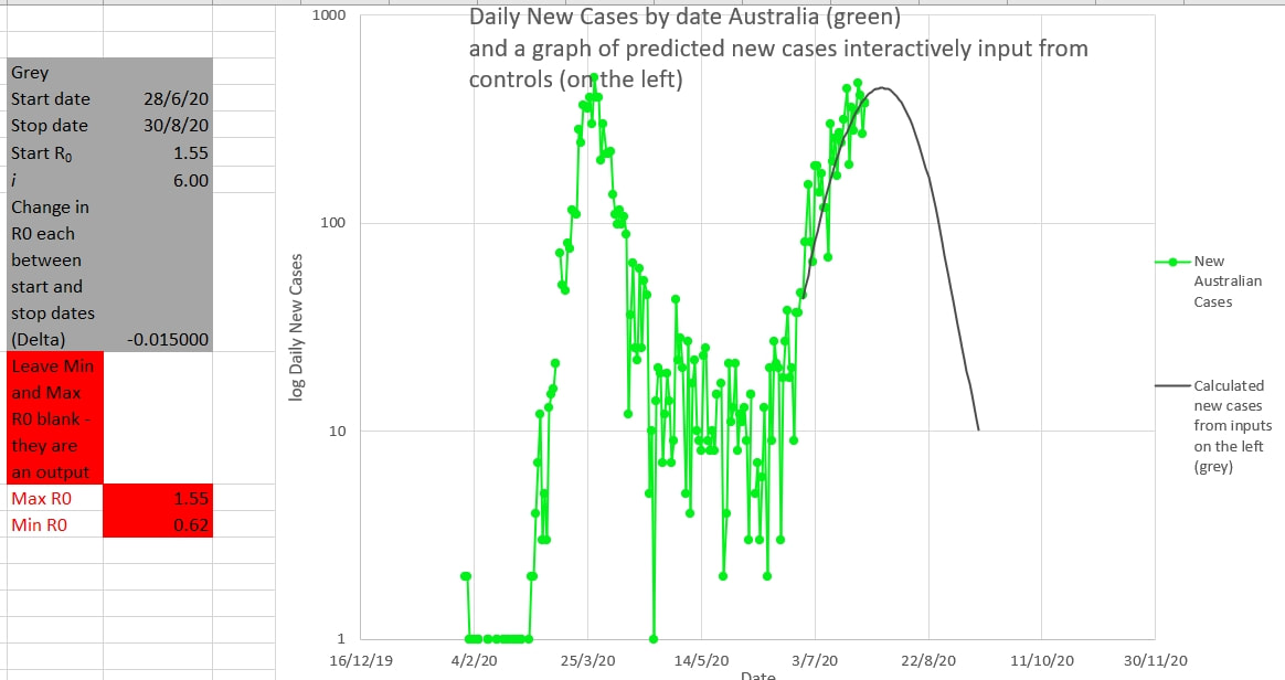 The chart below shows the same curves without the new cases being in log scale 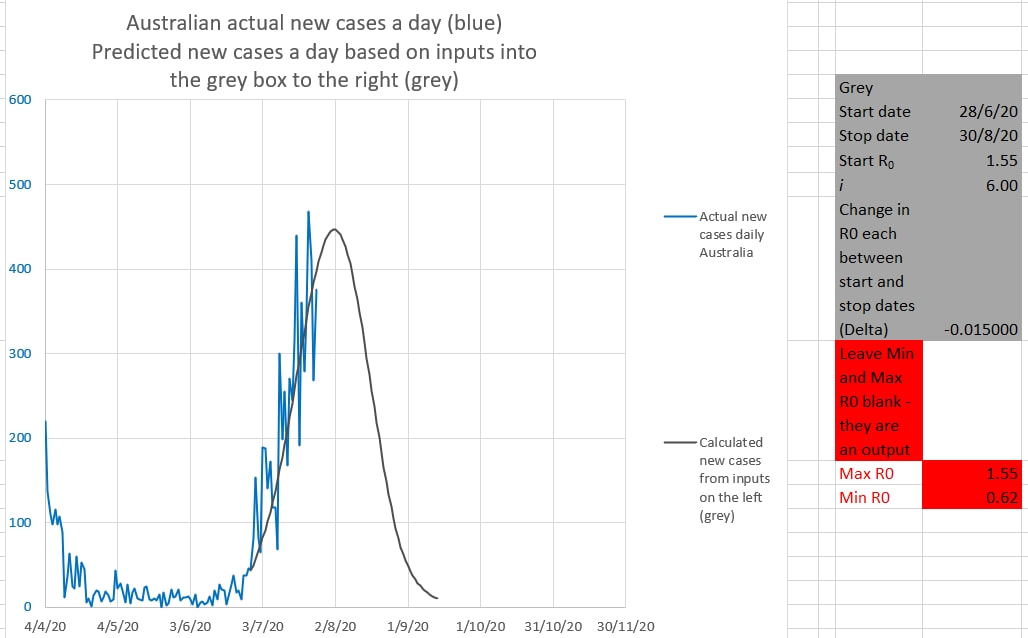 The chart below shows the curves matching recent Australian new cases. The Victorian cluster appeared to have an R0 of 1.5 (the matching brown curve) initially, which then appeared to reduce to an R0 of 1.25 in late June (the matching pink curve). These curves are drawn from the data entered into the boxes on the left. 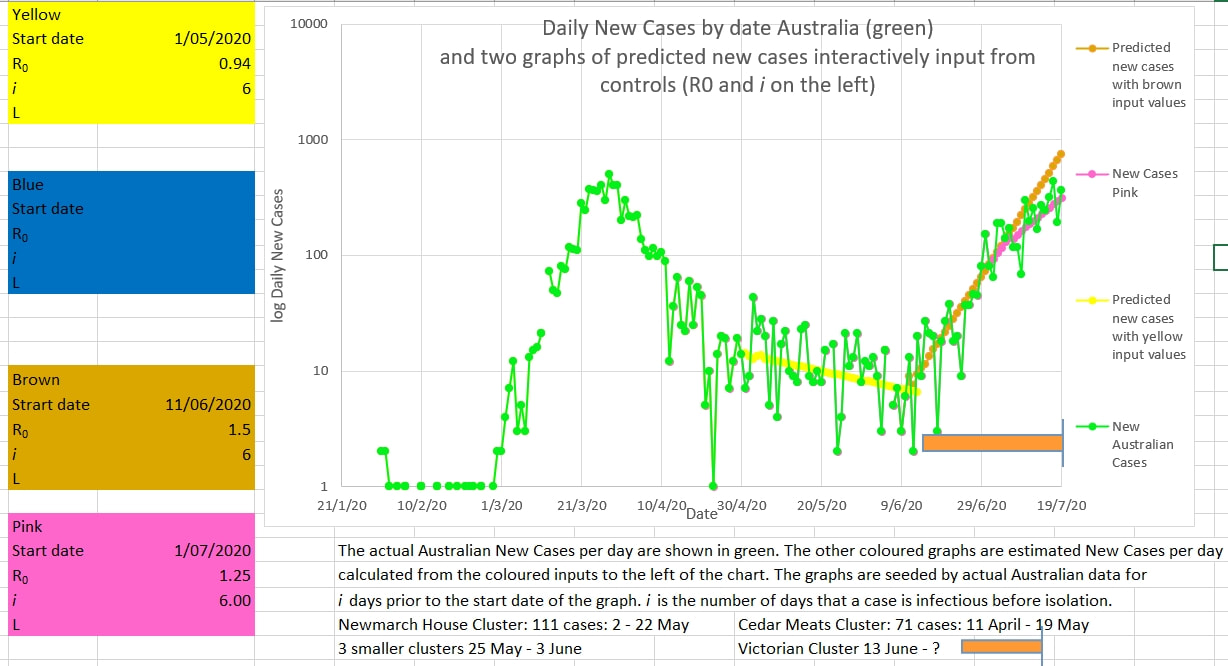 The chart below suggests that the effective mean R0 over the past 8 days (called R8 in the Model) is at last approaching the critical value of 1 a point at which new infections would no longer be exponential. 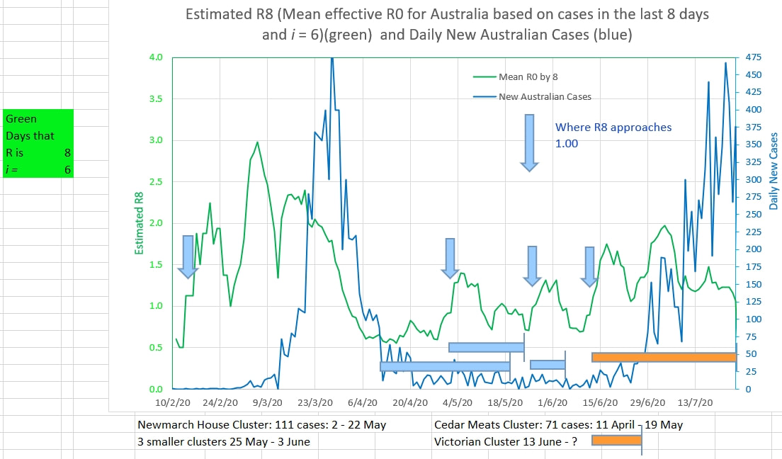
0 Comments
Leave a Reply. |
AuthorDr Michael Cole FRACP LLB Archives
September 2021
Categories |
- Home
- Covid-19 US stats and projections
- The Epidemic Model
- The concept of a personal R
- Contact
- Blog
- Proportion Needed to Vaccinate
- Vaccinating Children
- Cases in Isolation to end the wave
- Model Predictions for 'opening up' in NSW
- The Case Fatality Rate (CFR) in Young Children
- Effective R amongst the Still Susceptible versus eR
- Estimating the 'Safe' rate of reduction of Restrictions
 RSS Feed
