|
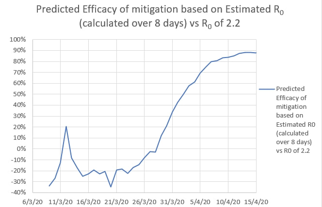
Ro and infection time (i, the time a case remains infectious) are often determined empirically by case tracing and contact tracing in the field. It is usually considered difficult to estimate Ro and i from population data and models, like new and total cases. It does appear that Ro and i can be estimated graphically by plotting curves with various values for Ro and i such that the curves match the actual data of new and total cases. Restrictions were put in place in Australia on 20 March and the maximum new cases a day occurred on 28 March 2020. 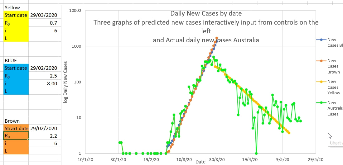 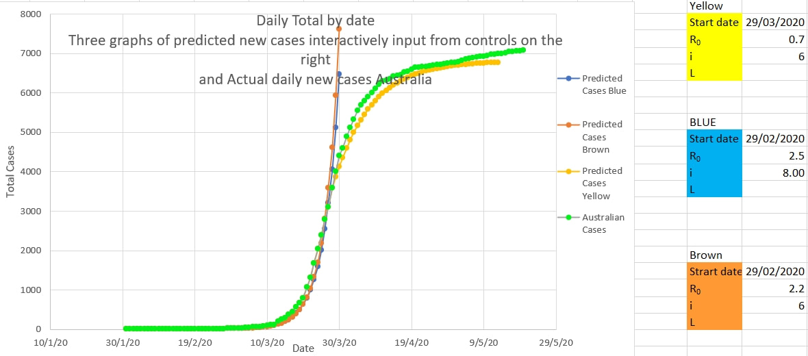 Ro and i change the slope of log new cases graph in opposite directions, so there are a number of 'sets' of Ro and i which fit the actual data equally well. It may be possible to determine which 'set' of Ro and i best agrees with the empiric field data.
Ro and i produce different shapes in the graph of the total cases near the end of the epidemic. Presumably i should have the same value in both graphs. Then R at this time can be more easily estimated and may suggest the effective R while the restrictions are in place. The efficacy of restrictions appears to be 1- 0.7/2.2 which is 68%.
0 Comments
Trump says he is taking hydroxychloroquine because it is a good idea. It seems promising and there is minimal downside.
But it is said - in set theory apparently - that there are a great number of reasonable explanations for any given set of facts. Presumably only one of those reasonable explanations will be true or correct. So the probability that any one reasonable explanation is in fact the true or correct one is close to zero. One correct reasonable explanation and a great many not-correct reasonable explanations. That appears to be why almost all good ideas in medicine are wrong. And in every other field as well. The corollary is well known. Thoroughly test each good idea before accepting it. Double blinded randomised trials are the gold standard in medicine. The FDA and similar organisations require convincing trials before releasing any 'good idea' on the public. It is not a good idea to accept even very good ideas till they have been thoroughly tested. Good ideas are usually wrong. Cluster or single case management. Apparently speed is of the essence. It makes sense because cases are most infectious early, and in a space with more people who stay or meet for longer the Ro is much higher than the quoted 'average' Ro.
https://www.recover-europe.eu/wp-content/uploads/2020/05/Time_is_of_the_essence_15052020.pdf The problem of dealing with isolated cases and clusters of Covid-19 may be a lack of understanding about the meaning of Ro.
The virus is thought to have an Ro of 2.2 - that is, one infected person infects 2.2 other people on average. The words 'on average' are important. One infected person can, in fact, infect a large number of people depending on the circumstances. For example, in a dormitory, a large family home, a crowded workplace, a crowded family home or a place where a group resides - a single infected person could infect large numbers. Ro is only 2.2 on average. It is almost certainly much greater than 2.2 anywhere where a greater number of people occupy a space for a longer time. So a single case is probably going to infect many others in a dormitory, ship, a workplace where workers must necessarily work close to others or a 'care home' where the space is shared by many. And the others will infect still others and so on. And some of the new infections will be asymptomatic and undetected. It is probably unwise to keep those infected cases, or their contacts, together (in the dormitory, workplace or care home) because the Ro may be considerably higher than 2.2 in those circumstances, and even a 90% mitigation of viral spread will not reduce the Ro adequately. It may be that the best way to deal with a cluster is to nip it in the bud early by removing all the people in question from the space and isolating and monitoring them separately elsewhere. Everyone in a risk prone space should probably be considered a cluster as soon as a single infected person is discovered there. It looked like there might have been trouble brewing a few days ago when there was a rise in new cases per day. Was it a break out of control and a possible start to a second spike? Or was it a spot fire? It looks like it was a spot fire - with delayed detection of a cluster of cases in one workplace. Spot fires are probably to be expected when an epidemic is nearly under control. Each spot fire creates a small spike of its own which subsides as cases are traced and isolated. The graph of new cases a day appears to have returned to the yellow line graphing out the course predicted if the mitigation in place is 80% effective in reducing the infection rate of the virus (from a presumed 2.2 to 0.44). 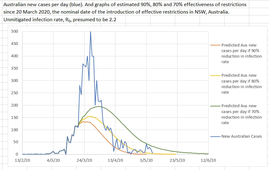 The sudden spike in new cases on 3 May may have suggested that the relaxation of restrictions in NSW on 1 May might have reduced the restrictions efficacy below 50%, which would have signaled a second spike. But those cases probably turned out to be a spot fire and new cases have subsequently safely returned to near the 80% effectiveness of restrictions area of the graph. 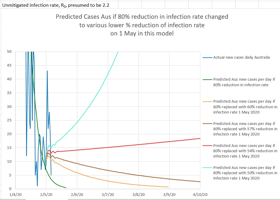 The Australians, who mainly introduced their own restrictions and isolation well ahead of the Federal Government, and Gladys Berejiklian continue to do a good job.
In Australia, NSW started the first stage of gradually lifting restrictions on the 1st May 2020. The change in NSW was that 'two adults and their dependent children' could visit a home. in order to monitor the effect of easing restrictions, the new cases per day can be plotted over a graph of the predicted cases for various percentage of apparent effectiveness of the restrictions. Up until 1st May it appeared that the restriction were about 80% effective in reducing the infection rate of the virus causing Covid_19. 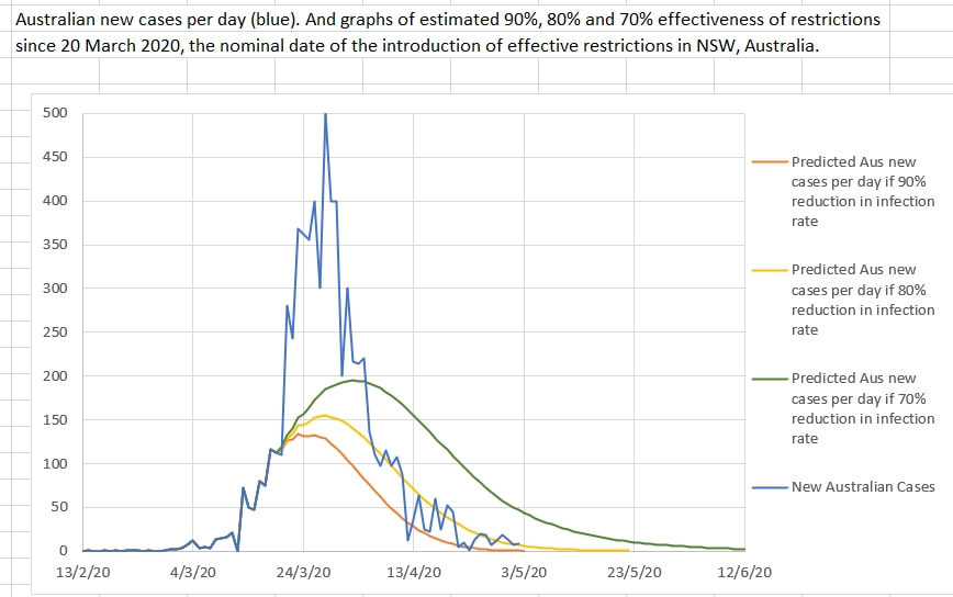 The graph below shows the model's predicted daily new cases if the easing of restrictions caused the effectiveness of restriction to reduce to various percentage effectiveness values. The model includes a 14 day logarithmic 'wash-out' of the effectiveness of restrictions from 80% to a lower percentage (each in a separate, coloured graph). 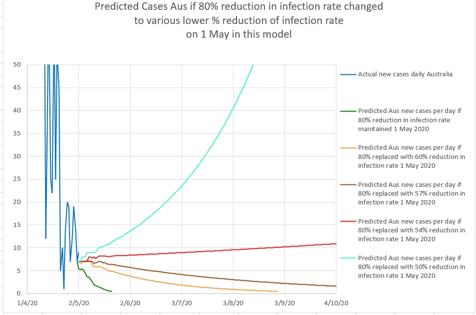 The model seems to suggest that the restrictions should remain at at least 60% effectiveness to suppress the virus locally. Slightly less than 60% effectiveness results in a prolonged flat curve, and less than 54% effectiveness results in a significant second spike.
Australia could keep the restrictions in place and then the last predictable case using this model could be as early as early May 2020. After that only an unexpected 'spot fire' or cases from overseas would likely need to be dealt with. Or restrictions could be eased to being 60% effective in reducing the infection rate, and then the last predictable case might be in late July 2020. 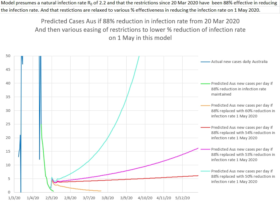 It would require a delicate balance, because reducing the restriction from 60% to 54% effectiveness in reducing the viral infection rate would be disastrous, resulting in a prolonged second slow peak. or worse (unless halted by the reintroduction of more effective restrictions). The number of extra cases that would occur by reducing the effectiveness of restrictions to 60% compared to keeping the restrictions at about 88% is only about 200 extra cases. The reduction of restrictions would be very good for some businesses - but how to do it fairly would be a major problem. Allowing some businesses to reopen, but under strict conditions, would be good for the economy, and not cost a lot in terms of sickness. The danger would be in the easing approaching anywhere near a 55% reduction in effectiveness of restrictions. That is a narrow margin. Restrictions that are 60% to 88% effective are fine. But to under 56% is a disaster. Obviously it will take a lot of care and perhaps some slow faltering steps to lessen the restrictions but not precipitate a disaster. 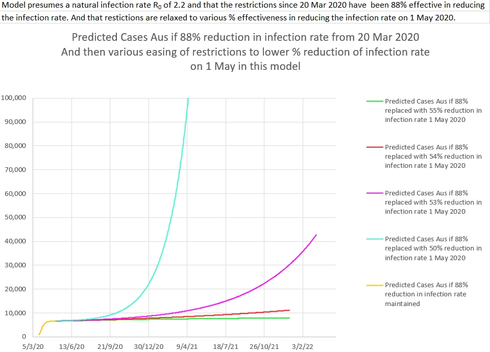 The number of cases if 88% effectiveness is maintained peaks at about 6550 cases (orange). And for 60% effectiveness it peaks at about 6750 cases.
Plotting the deaths per 1000 Covid 19 cases against the population densities (people living per square kilometer in the area) shows a (log) relationship. There are many possible confounding factors (especially the kinds of things make people live in high density areas) but it may suggest that viral load at the time of infection (crowding, contact time, being unable to socially distance) is a factor related to the likelihood that a case ends in death. Social distancing and lowering of the number of people in a building or shop at any one time may be important restrictions to maintain as restrictions are slowly rolled back. 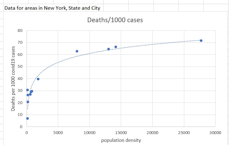 Data Source: https://www.citypopulation.de/en/usa/admin/
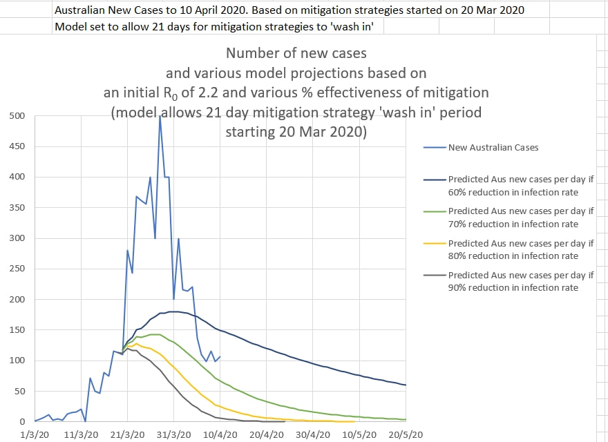
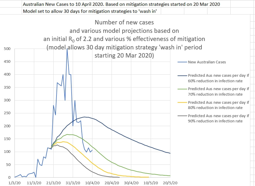
The current restrictions in Australia appear to be edging closer to 90% effective in reducing the infection rate. The number of new cases a day is dropping towards low numbers. So the question is: Given that the restrictions are hurting the economy, what level of reduction in infection rate should Australia aim for in lifting the restrictions? The short answer is one that keeps the apparent infection rate R0 below 1. And since the 'natural' R0 of the virus appears to be about 2.2 the restriction should at least achieve a 54.6% reduction in the infection rate to bring the apparent R0 to 1 or less. The graph produced by the infection model, below, shows the same thing as does the zoomed out version lower down. The 'wobbles' in the graph are artifacts caused by the sudden change in level of restrictions, rather than a more likely 'wash-in' of the effects over a few days. 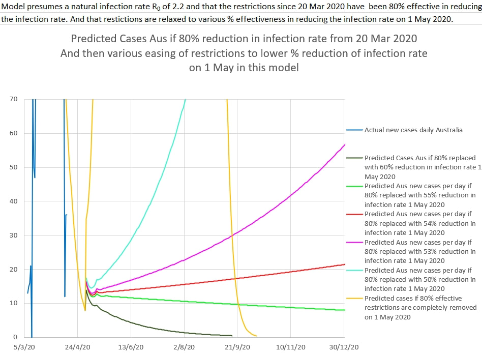 If restrictions are eased till they are only 54%, or less, effective at reducing the infection rate, then it simply sets off another exponential rise in new cases. The rise is either slow but very prolonged (years) or sudden and overwhelming. The good news is that if the eased restrictions are 55% effective or better, the new cases of infection steadily drops. But that level of restrictions would need to be maintained. If the restrictions were eased till they were still 60% effective at reducing the infection rate, new cases could be very low by September, and contact tracing could be very effective as long as the border was kept secure against surprise re-entry of the virus from elsewhere. 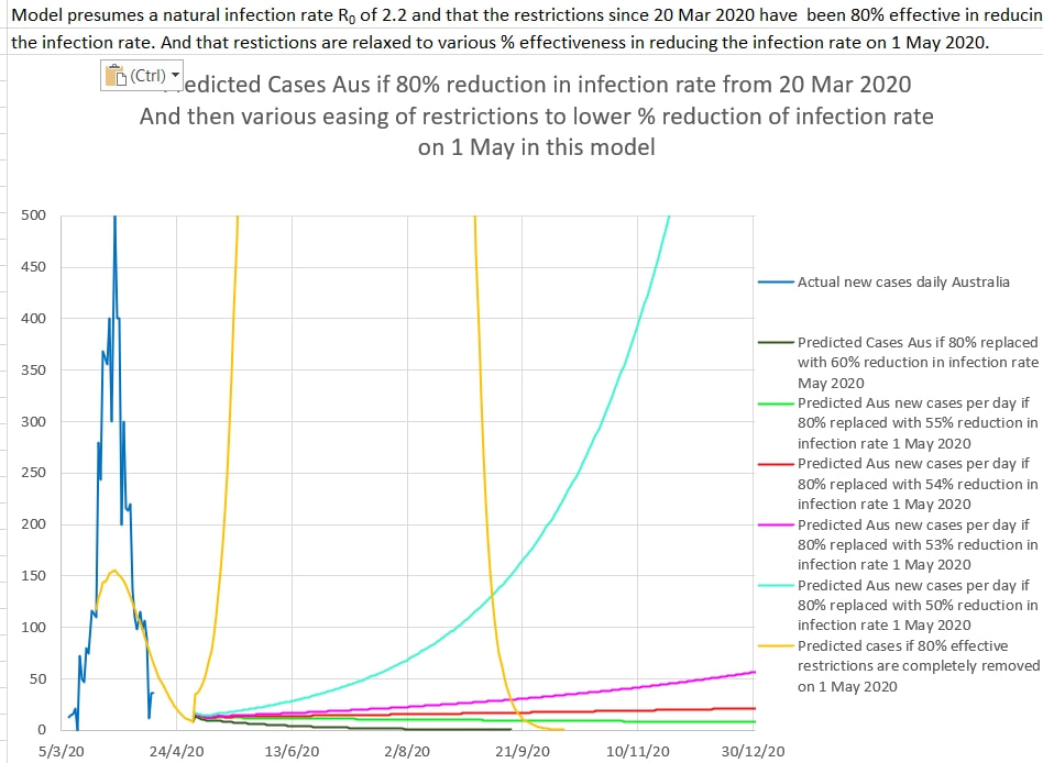 The apparent efficacy of the current restrictions in Australia seems to be at least 80% effective. The apparent R0 is well under 1.0 and generally the number of new cases each day is dropping. But this is probably not the time to back off. In fact, as NZ epidemiologist David Skegg argues, "it would be a terrible waste [of all the effort so far] if we don’t pull out all the stops now” and maintain lock-down while contact tracing eliminates the virus as much as possible and "tighten restrictions on those in quarantine after arriving from overseas" to prevent re-entry of the virus. After that is done, restrictions could be carefully lifted and business and the economy restarted. 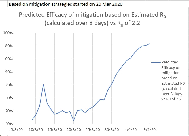 It is informative to plot Australia's new cases each day against a model estimating the percent efficacy of the restrictions supposedly started on 20 March 2020. The actual new cases per day should fall somewhere near the estimated new cases per day for 80% efficacy of the restrictions. From the graphs below, it seems to do that only for about a 40 day exponential wash-in period .
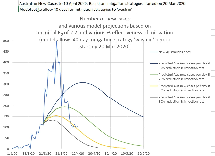 It appears that the wash-in period for restrictions to take full effect may be about 40 days. The 'bump' up above the 80% effective graph line (yellow) may be due to an excess of up to 350 new cases a day from the Ruby Princess.
There are some factors to consider when examining these curves. They presume that the restrictions were started on 20 March 2020 when, in fact, they were introduced piecemeal. And the model assumes that the unrestricted R0 was 2.2, a rough figure that is generally accepted. And luckily Australians were smart and started working from home, often at their employers request, and not sending their kids to preschool and school much earlier that the government and health department 'experts' enforced. |
AuthorDr Michael Cole FRACP LLB Archives
September 2021
Categories |
 RSS Feed