|
The pink graph below, which is 'fitted' to the actual Australian new cases a day using the values input into the pink box to the left of the chart, suggests that the apparent R0 is falling from 1.5 (the brown fitted graph) to about 1.25 (the pink graph). However, it is still too early to call a change of trend because the trend-line, shown in a graph yesterday, remain unbroken. 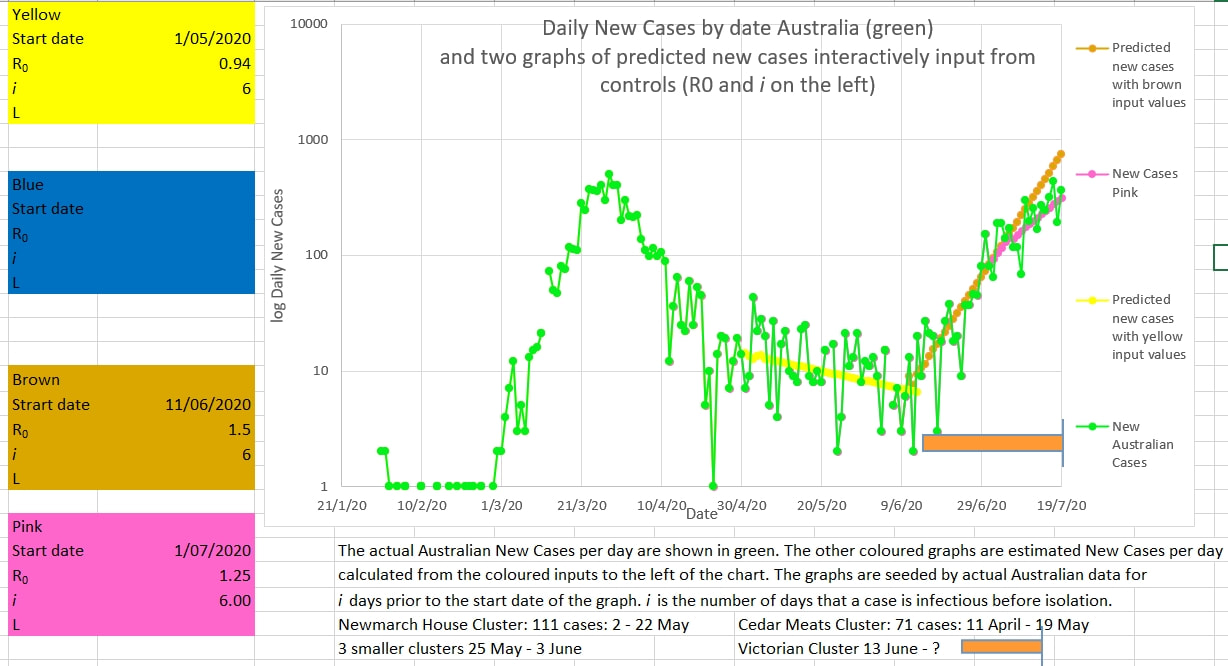
0 Comments
Earlier hopes that the Victorian cluster was coming under control were unfounded. It appears that the R0 continues to be 1.5  The R0 appeared to be as high as 0.94 in Australia prior to the onset of the Victorian cluster - perilously close to the critical epidemic threshold of 1. Perhaps an apparent R0 near to 1 does not give a safe enough margin. The graph below of daily new cases does not appear to have broken the upward trend of the cluster. 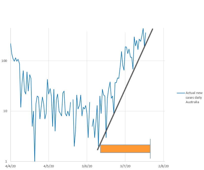 The chart below suggests that the value of 1 in R8 (the 8 day average of the daily estimated R0) is a good indicator of an impending exponential increase in cases, either as an epidemic or cluster. 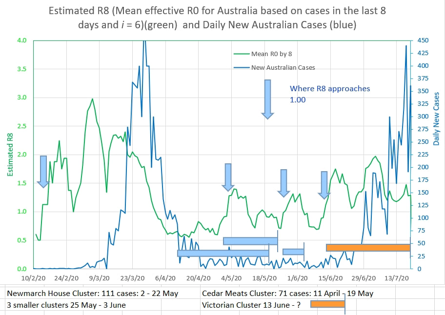 See the Mathematical Model Here
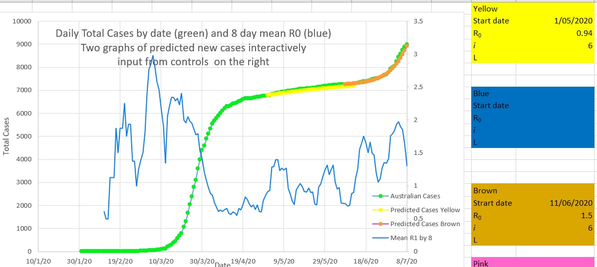
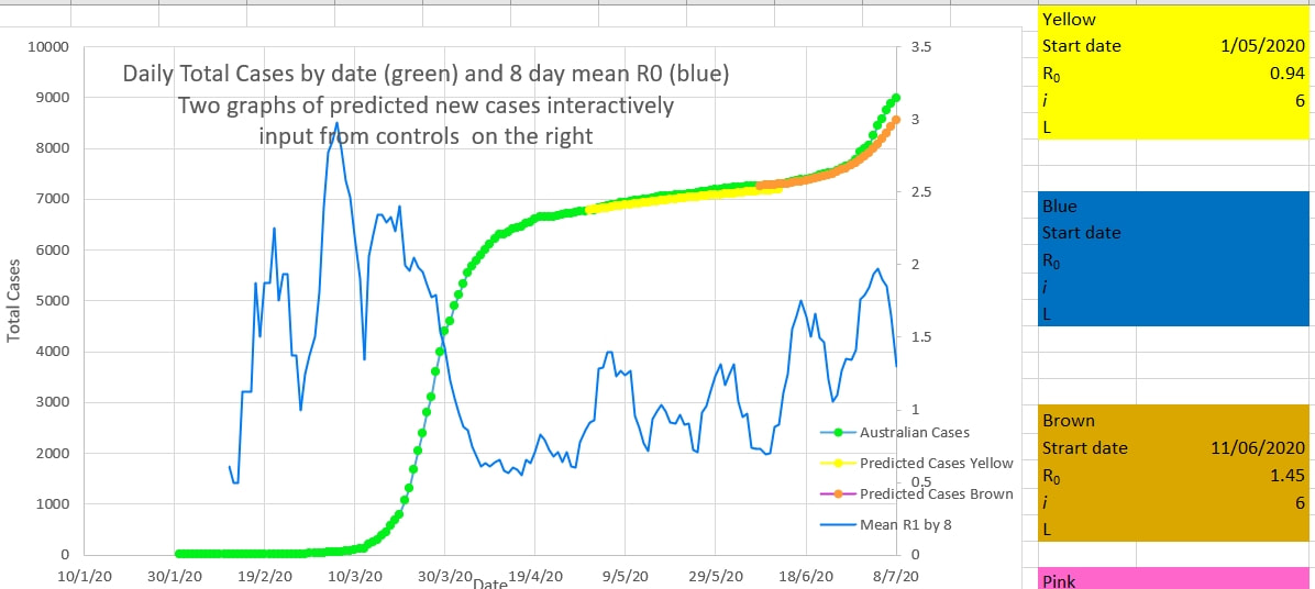
The Victorian cluster appears to be coming under control. The recent trend in new cases (brown on the chart below) appears to have ended and new cases will probably continue to decline (on average) from now on. The apparent R0 has been 1.5 during the onset of the cluster. Inputs for R0 and i (the number of days a case is infectious before being isolated from the population) are input into the brown box to the left of the chart. The brown graph is plotted using these inputs. The inputs are changed interactively until the brown graph best fits the actual cases (green). An i of 6 best fitted the graph during the first wave in Australia. It is likely that Australia's rapid removal of cases into isolation, because they were symptomatic or tested positive, was successful in reducing i to 6. The inputs required to best fit the brown graph to the green actual cases suggests that the R0 during that period was 1.5 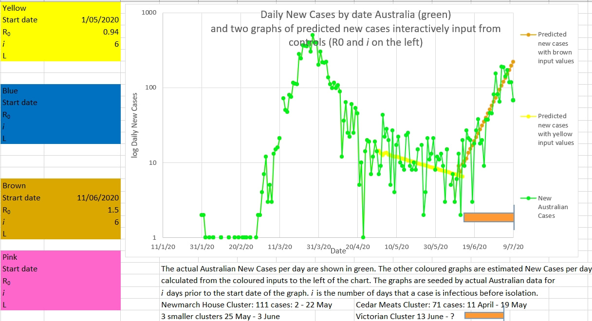 The mean R0 over 8 days (green) suggests a declining R0 together with declining new cases per day (blue). The cluster may come under control fairly rapidly, as long as no case is outside the lock-down perimeters. 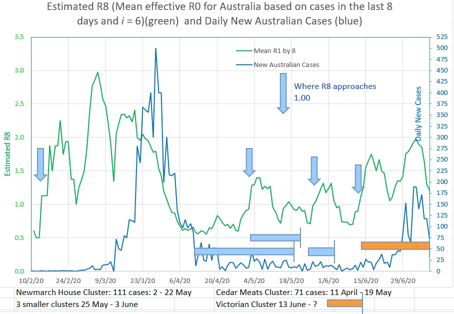 When fitting the curves above to the new cases it is important to fit the curve to the total cases. A good fit on either one of the new cases or the total cases does not necessarily mean that there will be a good fit on the other, as shown below where an R0 of 1.45 or 1.5 fits the new cases equally well, but 1.5 is definitely a better fit on the total cases.
The Victorian cluster may be nearing its peak. If the new cases a day is 100 or less then it is likely the cluster cases have peaked and daily cases would fall. 100 is below the upward trend line of the lowest lows that have been reported during the rise in cases. In traditional chart trading crossing the trend of the lowest lows of an uptrend signals a change of trend to downwards. The math model for graphing the yellow and brown graphs is here . The input values in the coloured boxes on the left of the chart are inputs for the yellow and brown graphs - R0 is the input infection rate and i is the input number of days on average a case is infectious to others before being removed from the population by effective isolation. 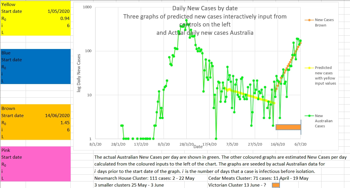 R8 is the estimated R0 calculated from the cases over the previous 8 days. i is input into the orange box to the left of the chart and is the number of days on average a cases is infectious to others before being removed from the population and isolated. i was estimated to be 6 during the first wave in Australia using this model. 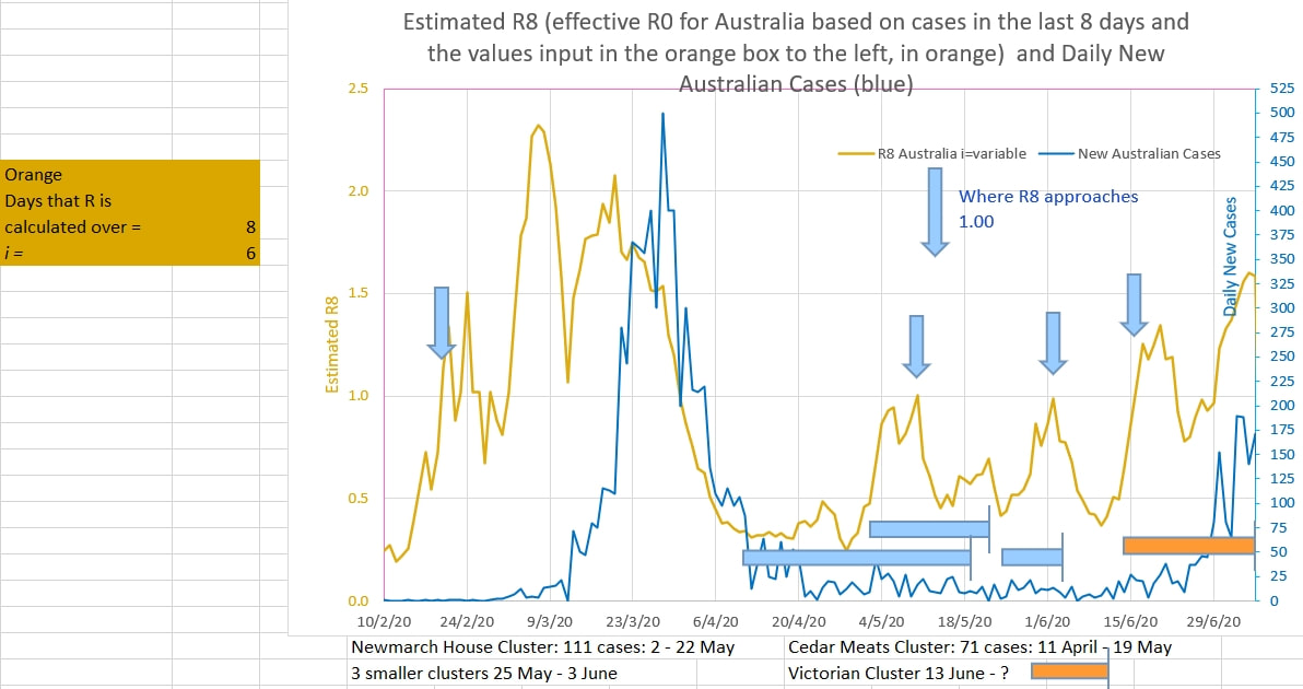 The closure of the Vic - NSW border is welcome. So is the Victorian judicial inquiry into the security of the isolation process. Looking at the successive lows in the recent graphs of new cases in Australia, if appears that the daily new cases needs to be under 100 to signal control of the Victorian 'cluster'. 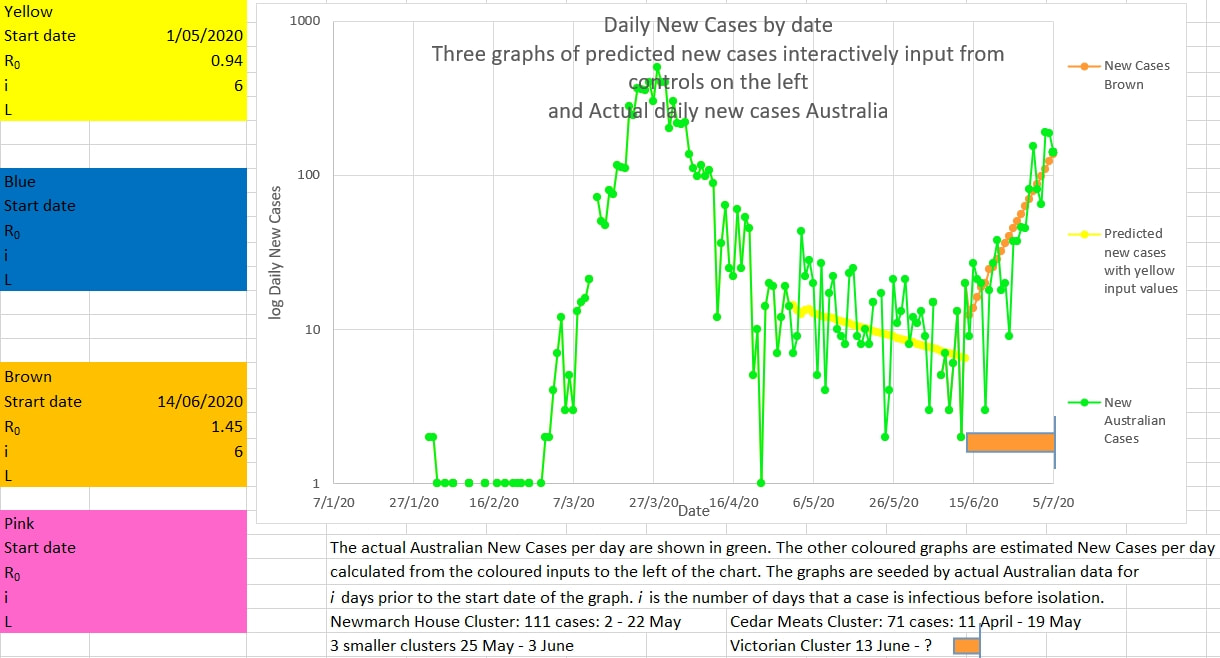 After the 1 May, when restrictions were eased, the effective estimated R0 was 0.94 which is very close to the epidemic R0 of 1 or more. So only a slight error in process or policing or compliance would result in a large cluster or second wave. And it did. It would appear that the only effective way to deal with a cluster or second wave is to act fast and effectively - the 'hit it hard and fast and early' policy. The critics will claim that time and money was wasted because nothing happened. But that is the point. In preventive medicine the biggest success is when nothing happens. When the R8 is 1 or more then something is definitely happening. And it needs to be Hit Hard and Hurriedly. R8 is the estimated recent apparent R0 calculated from the cases over the preceding 8 days. The chart below also suggests that the New Cases would need to be below 100 to be lower than the trend of the recent 'lowest lows', and signal a new downward trend. It could be tomorrow.  'Curve fitting' onto the graph of new Australian cases below definitely suggests that the estimated effective infection rate R0 of the virus is 1.3 or more. It is epidemic in nature. And it is time for a return to the previous levels of lockdown for those who, without fault, live where the virus is currently spreading. And it is time to close the border with NSW where there are no clusters that have not been controlled. The R0 of 0.94 after the restrictions were substantially lifted after 1 May and which was so close to the epidemic threshold of 1 was needed to allow the economy to survive. But it also meant that Australia was skating on thin ice; or playing with matches on a hot windy summers day. A local cluster could easily escape control and become locally epidemic. 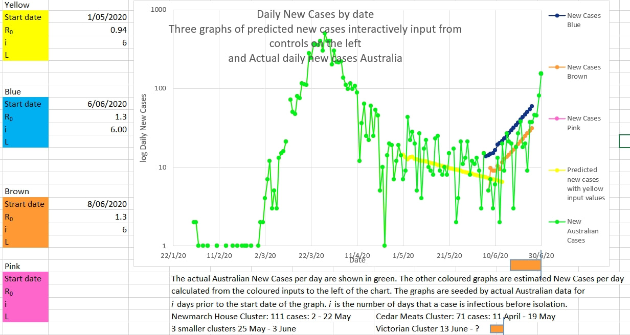 The graph below shows the R8 (an estimate of R0 from cases over the previous 8 days) in orange and the actual Australian new cases each day in blue. The estimated R0 exceeded 1 on the 16 June and has been substantially over 1 ever since. Locally Victoria is in the about the same position as Australia was on the 20 March 2020 when effective restrictions were put in place. Previous experience has shown that communities recover better with early comprehensive restrictions than they do with slow responsive measures (the latter probably from a mixture of denial and political expediency). It is probably true that with epidemics now is always the best time to act. 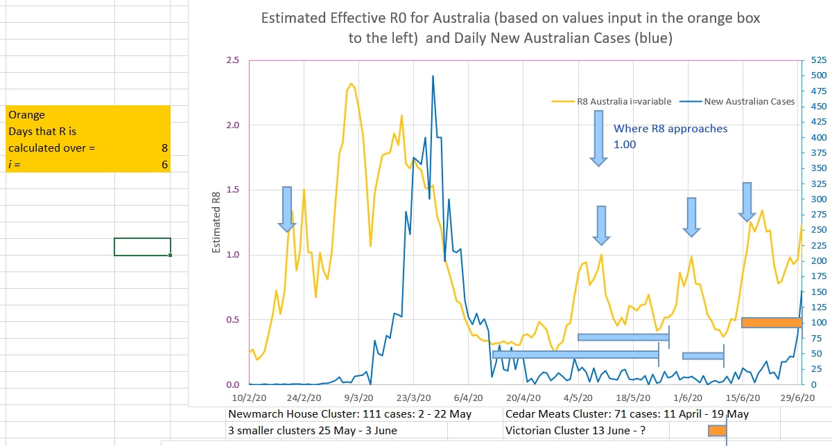 From the graph below it seems that Victoria needs to do more to contain the current cluster. Australia's new cases are plotted in green (log scale). The the yellow graph is 'fitted' to the recent new case (green graph) by trying various values of R0 and i until the slope of the yellow graph approaches the slope of the green graph. The values of R0 and i and are input into the yellow box on the left of the graph. It appears that an R0 of 1.3 and an i if 6 produce a graph that best matches the actual new Australian cases. R0 is the infection rate (the number of cases infected directly by each infectious person) and i is the number of days that a person is infectious. i may be smaller than otherwise reported because it is the 'number of days that a person is infectious to others in reality' and lasts from when the person becomes infectious until they are detected and isolated; they may remain 'positive' to tests after this but they cease to be 'infectious' in reality because they are isolated or in hospital and not usually able to infect others. An R0 of 1.3 is greater than 1 which means that the spread of infection is increasing exponentially and is 'locally epidemic'. Further restriction need to be put in place to reduce the R0 to less than 1 in Victoria. 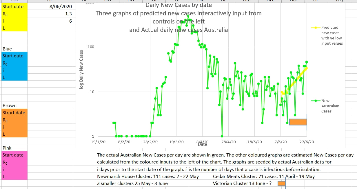 The graph below also suggests that Victoria needs to do more to reduce the infection rate, R0. The new cases a day in Australia is shown in the blue graph. The R0 calculated by the model (explained here) is shown in orange. R0 is calculated over a number of days (8 days in this case, and therefore called R8) and for a particular value of i (6 days in this case); These values are input into the orange box to the left of the graph. Blue arrows show where the R8 (R0 estimated from new cases over the last 8 days) approaches or exceeds 1 (an exponential infectious rate seen in epidemics). Since the 13 June 2020 the R8 (R0) has been mainly over 1 showing that tighter restrictions are required to suppress an epidemic rate of rise in cases. R8 also approached 1 at the time of the meat works and the nursing home clusters. The R8 also exceeded 1 on the 20 February and should have been a red flag warning of an exponential spread of the virus in the population entering Australia and in the population from which they were travelling. It is not probable mathematically for there to be an exponential increase in infection in those entering Australia if there was not already an exponential increase in infection in the population from which they came. That is, the infection was already epidemic in practice (R0 greater than 1) on 20 February, a month before adequate restrictions were put in place. 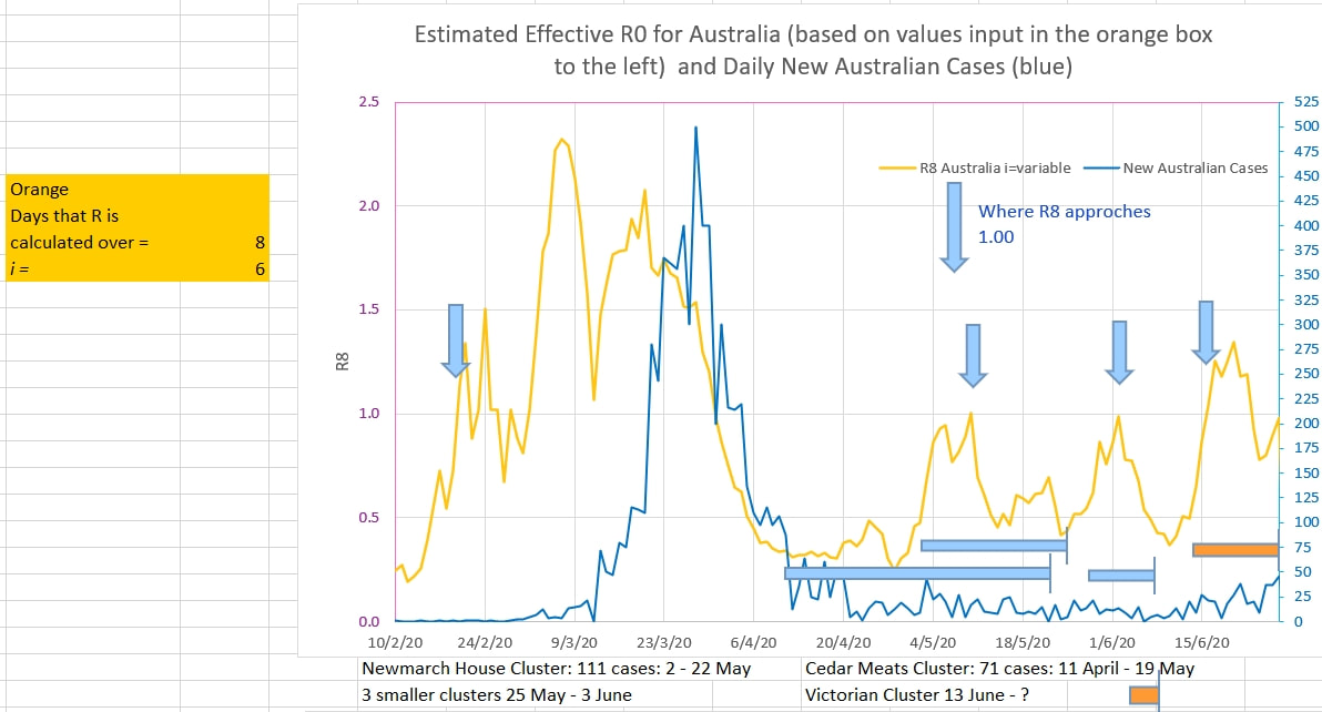 The Black Lives Matter (BLM) protests in Australia were held on and after 13 June 2020. Many protesters wore masks and some maintained social distancing. Never the less the number of people involved was outside the prescribed limits for gatherings during the viral crisis. But is there any evidence of a cluster of cases related in time to the demonstrations? The effective R0 of the virus in the population has been estimated over the previous 8 days (R8) in the pink graph below, using the model here. Arrows mark where R8 neared a value of 1.00 in the past; at the start of the epidemic, for a cluster at a meat works and for a period that had three smaller but almost simultaneous clusters. R8 appears to have neared and now exceeds slightly 1.00. Potentially this is the start of a new cluster. (shown by the orange bar). 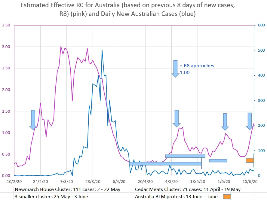 The graph below shows the new daily Australian cases in green (log axis). For comparison, graphs in pink and yellow have been superimposed using the values for R0 and i input into the boxes to the left of the graph in such a way as to mimic the slope of the Australian new cases graph.. The similar slope of the Australian new cases to the pink graph suggests that the Australian cases were showing an estimated R0 of under 1.00, and the cases were infectious for 6 days on average. The slope of the yellow graph from 12 June to today suggests the Australian new cases are showing an estimated R0 of 2.2 and that cases are infectious for 6 days on average. However, there are only 5 data points in that series so far; too few to draw any conclusion at all. 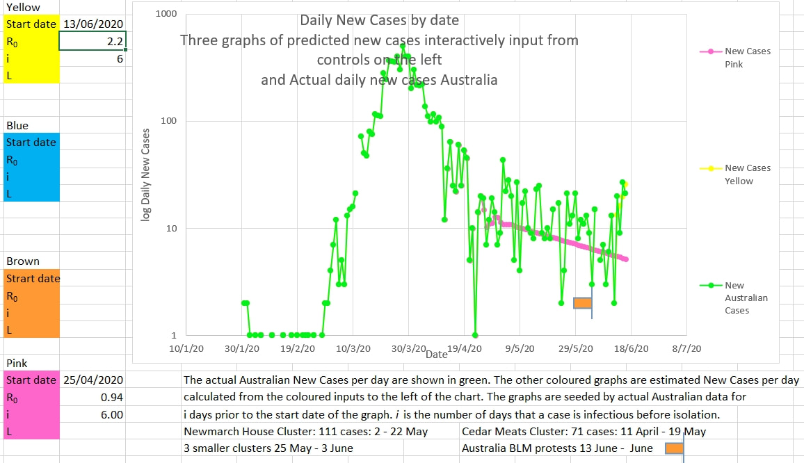 Since restrictions have been eased in NSW since 1 May 2020 new cases have appeared to increase or decrease randomly each day. The randomness is probably explained by delays and 'catch up' in case reporting and other systemic errors. Until now the trend in daily cases has looked to be downward. But today's graph of New Australian Cases could also be interpreted as steady (the pink graph below). That would mean an effective infection rate, Ro, of near 1. And that would bring Australia close to the start of a second wave. 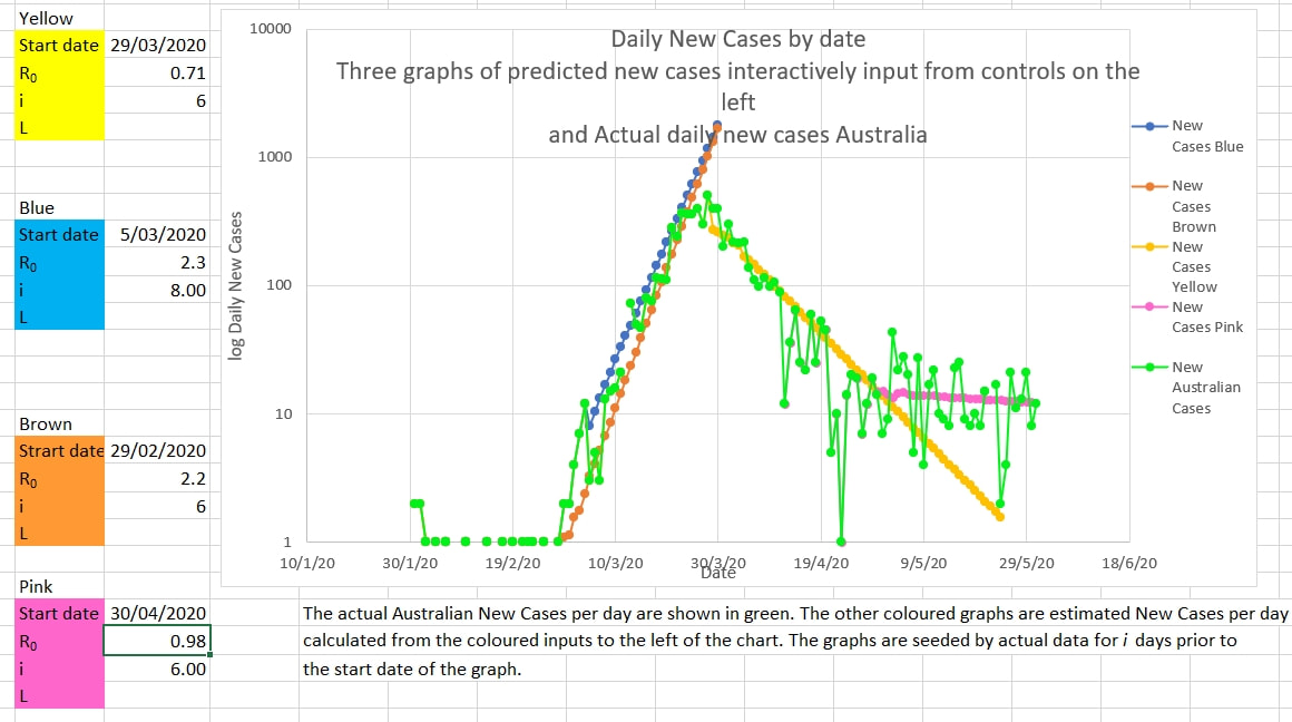 The pink graph is the number of new cases a day predicted by the model if the Ro is 0.98 and the number of days a case is infectious is 6 (which is possible since cases are isolated, and infection prevented, soon after they become symptomatic. The pink graph fits reasonably well the actual Australian New Cases a day. 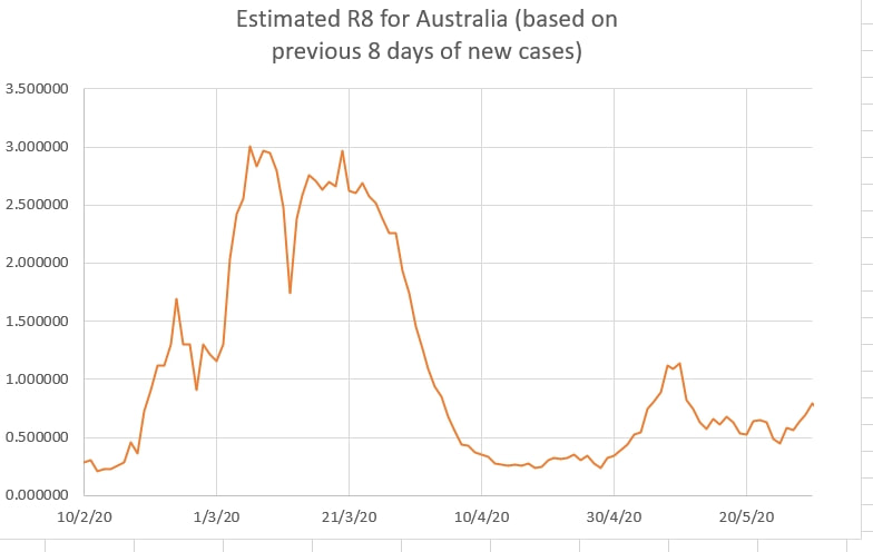 R8, the effective Ro calculated by the model from the last 8 days of data, appears to be approaching 1. This suggests that vigilance is needed to detect the start of a second wave. 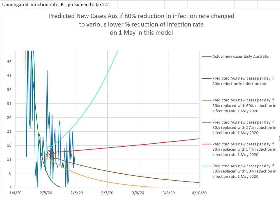 In the chart above, Australian New Cases per day, in dark blue, are plotted against 4 graphs of predictions of daily new cases if the restrictions since 1 May 2020 were 50%, 54%, 57% and 60% effective.
Critically, the area between 54% effective restrictions and 57% effective restrictions is the difference between a second wave and a steady decrease in cases. The natural day to day error in case reporting makes it difficult to predict in which area, safe or second wave, Australia's cases fall. But it is a close call. So vigilance is required. Since restrictions were eased in Australia, starting on 1 May 2020, the simple model presented here suggests that the efficacy of the restrictions still in place remain above 60%. To keep the effective R0 below 1 the efficacy of restrictions needs to be above 55% (an E of 0.55). E = 1 - R/R0.  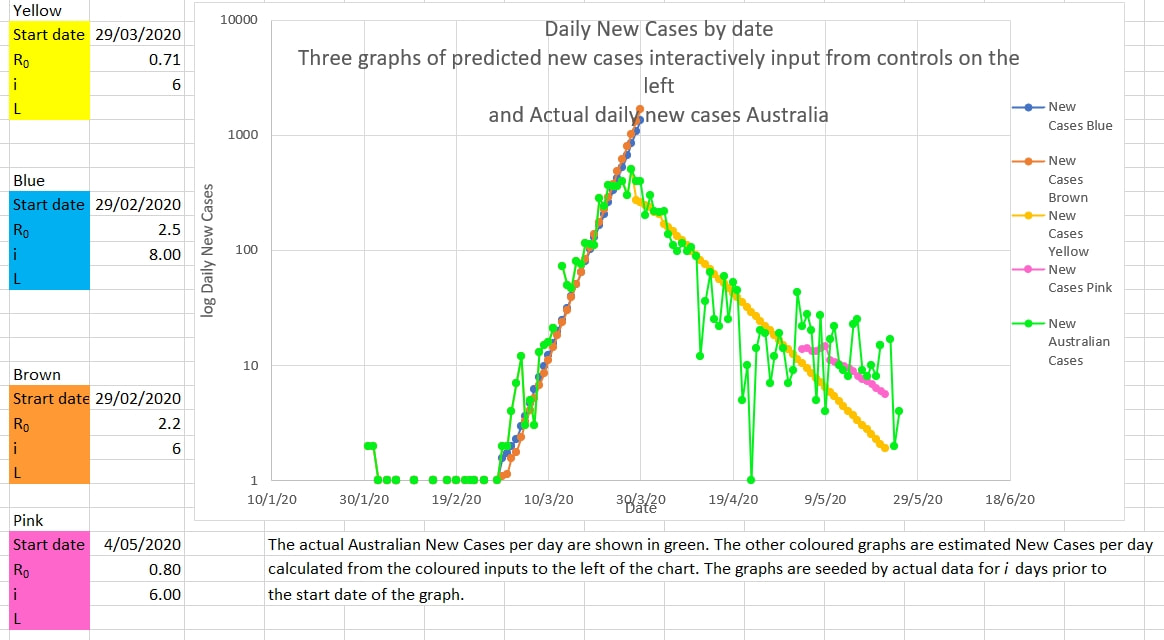 |
AuthorDr Michael Cole FRACP LLB Archives
September 2021
Categories |

 RSS Feed