|
Since restrictions have been eased in NSW since 1 May 2020 new cases have appeared to increase or decrease randomly each day. The randomness is probably explained by delays and 'catch up' in case reporting and other systemic errors. Until now the trend in daily cases has looked to be downward. But today's graph of New Australian Cases could also be interpreted as steady (the pink graph below). That would mean an effective infection rate, Ro, of near 1. And that would bring Australia close to the start of a second wave. 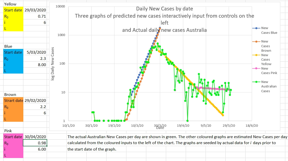 The pink graph is the number of new cases a day predicted by the model if the Ro is 0.98 and the number of days a case is infectious is 6 (which is possible since cases are isolated, and infection prevented, soon after they become symptomatic. The pink graph fits reasonably well the actual Australian New Cases a day. 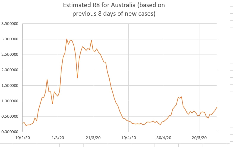 R8, the effective Ro calculated by the model from the last 8 days of data, appears to be approaching 1. This suggests that vigilance is needed to detect the start of a second wave. 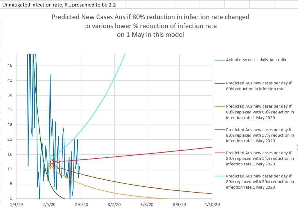 In the chart above, Australian New Cases per day, in dark blue, are plotted against 4 graphs of predictions of daily new cases if the restrictions since 1 May 2020 were 50%, 54%, 57% and 60% effective.
Critically, the area between 54% effective restrictions and 57% effective restrictions is the difference between a second wave and a steady decrease in cases. The natural day to day error in case reporting makes it difficult to predict in which area, safe or second wave, Australia's cases fall. But it is a close call. So vigilance is required.
0 Comments
Leave a Reply. |
AuthorDr Michael Cole FRACP LLB Archives
September 2021
Categories |
- Home
- Covid-19 US stats and projections
- The Epidemic Model
- The concept of a personal R
- Contact
- Blog
- Proportion Needed to Vaccinate
- Vaccinating Children
- Cases in Isolation to end the wave
- Model Predictions for 'opening up' in NSW
- The Case Fatality Rate (CFR) in Young Children
- Effective R amongst the Still Susceptible versus eR
- Estimating the 'Safe' rate of reduction of Restrictions
 RSS Feed
